

三角形
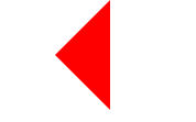
<div class="box"></div>
<style>
.box{
            width: 0;
            height: 0;
            border-top: 50px solid transparent;
            border-bottom: 50px solid transparent;
            border-left: 50px solid transparent;
            border-right: 50px solid red;
}
</style>
平行四边形图标

<div class="box"></div>
<style>
 .box{
            width: 50px;
            height: 50px;
            margin: 100px auto;
            background-color: red;
            transform: skew(-25deg);
        }
</style>
暂停按钮
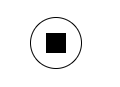
<div class="box"></div>
    <style>
        .box{
            width: 50px;
            height: 50px;
            margin: 100px auto;
            color: #000;
            border: 1px solid;
            border-radius: 50%;
            outline: 10px solid;
            outline-offset: -26px;
        }
    </style>
暂停按钮的实现原理就是边框用border,里面的正方形用outline。因为outline有一个offset属性可以用来设置偏移量,并且是按照比例来的。
其实如果再将outline-offset的值设置小一点,一个加好就出来了
加号
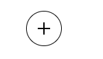
<div class="box"></div>
<style>
    .box{
        width: 50px;
        height: 50px;
        margin: 100px auto;
        color: #000;
        border: 1px solid;
        border-radius: 50%;
        outline: 10px solid;
        outline-offset: -35px;
    }
</style>
如果再将其旋转,就变成了一个关闭按钮
关闭按钮
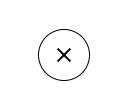
<div class="box"></div>
<style>
    .box{
        width: 50px;
        height: 50px;
        margin: 100px auto;
        color: #000;
        border: 1px solid;
        border-radius: 50%;
        outline: 10px solid;
        outline-offset: -35px;
        transform: rotate(45deg);
    }
汉堡按钮
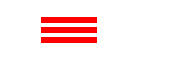
<div class="box"></div>
<style>
    .box{
        width: 50px;
        height: 0px;
        margin: 100px auto;
        box-shadow: 36px 10px 0 3px red,
        36px 0 0 3px red,
        36px 20px 0 3px red;
    }
</style>
汉堡按钮2:
<div class="box"></div>
<style>
    .box{
        width: 30px;
        height: 3px;
        margin: 100px auto;
        padding: 2px 0;
        border-top: 3px solid red;
        border-bottom: 3px solid red;
        background-clip: content-box;
        background-color: red;
    }
</style>
单选按钮
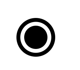
因为box-shadow会按比例缩放,因此将第一个值设置为白色,然后将第二个值设置的比第一个值大就可以了
<div class="box"></div>
<style>
    .box{
        width: 30px;
        height: 30px;
        margin: 100px auto;
        background-color: #000;
        border-radius: 50%;
        box-shadow: 0 0 0 5px #fff,0 0 0 10px #000;
    }
</style>
圆圈中带个十字
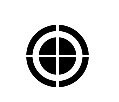
<div class="box"></div>
<style>
    .box {
        width: 30px;
        height: 30px;
        margin: 100px auto;
        background-color: #000;
        border-radius: 50%;
        box-shadow: 0 0 0 5px #fff, 0 0 0 10px #000;
        outline: 36px solid #fff;
        outline-offset: -50px;
    }
</style>
田型图标
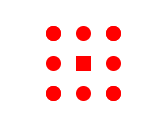
<div class="box"></div>
<style>
    .box {
        width: 0;
        margin: 100px auto;
        border: 3px solid red;
        outline: 6px dotted red;
        outline-offset: 6px;
    }
</style>
下载箭头
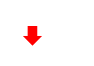
使用border制作三角形,使用box-shadow制作正方形,主要用了偏移
<div class="box"></div>
<style>
    .box {
        width: 0;
        margin: 100px auto;
        color: red;
        border: 8px solid transparent;
        border-top: 8px solid red;
        box-shadow: 0 -12px 0 -4px;
    }
</style>
书签
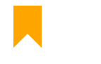
实现这种效果的原理就是讲三角形设置成背景色,这样空心的三角形就出现了
<div class="box"></div>
<style>
    .box {
        width: 0;
        height: 8px;
        background-color:orange;
        border: 8px solid transparent;
        border-bottom: 8px solid #fff;
    }
</style>
两个半圆图标
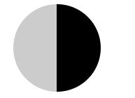
这个比较简单,就是通过渐变函数来实现,然后来个圆角边框
<div class="box"></div>
<style>
    .box {
       width: 50px;
        height: 50px;
        border-radius: 50%;
        background-image: linear-gradient(to right,#ccc 50%,#000 50%);
    }
</style>
禁用图标
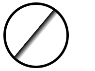
外圈利用圆角边框,里面的竖线用渐变来做,然后再用旋转属性即可
<div class="box"></div>
<style>
    .box {
       width: 50px;
        height: 50px;
        border-radius: 50%;
        border:2px solid #000;
        background: linear-gradient(to right,#fff  45%,#000 45%,#000 45%,#fff 55%);
        transform: rotate(40deg);
    }
</style>
左右箭头图标
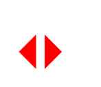
既然能做出一个三角形,那么就可以做出两个三角形。
<div class="box"></div>
<style>
    .box {
        width: 0;
        height: 0;
        margin: 100px auto;
        border: 10px solid transparent;
        border-left: 10px solid red;
        -webkit-box-reflect: left 5px;
        box-reflect:left 5px;
    }
</style>
需要在Chrome浏览器中打开,因为其他浏览器或许不支持
鹰嘴图标

<div class="box"></div>
<style>
    .box {
       width: 32px;
        margin: 100px auto;
        border-top: 50px solid transparent;
        border-right: 22px solid #096;
        border-bottom-right-radius: 100%;;
    }
</style>
以上就是本文的全部内容,希望对大家的学习有所帮助,也希望大家多多支持脚本之家。


