1、自适应的椭圆
<div class="div1"> 鼠标划上来看看</div>
<style>
.div1{ background:#fb3; width:200px; height:200px; line-height:200px;
text-align: center; border-radius: 50%; transition: all 0.25s ease-in;
}
.div1:hover{ background: #ff1d50; width:400px; height:200px; border-radius: 50%;
-webkit-transition: all 0.2s ease-in; transition: all 0.2s ease-in;
}
/* -> 首先你得知道,border-radius不仅仅支持整数,还支持百分比 */
</style></p>
<p>

运动的椭圆
2、半椭圆
<div class="div2"></div>
<div class="div3"></div>
<style>
.div2{ background:#fb3; width:100px; height:100px; border-radius: 100% 0 0 0; transition: all 0.25s ease-in; }
.div3{ background:#fb3; width:100px; height:100px; border-radius: 0 0 0 100%; transition: all 0.25s ease-in; }
/* -> 首先你得知道,border-radius不仅仅支持整数,还支持百分比 */
</style>
本来一个div就可以,不过我用了两个四十五度的,自己玩。
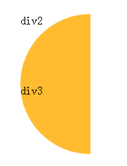
半椭圆
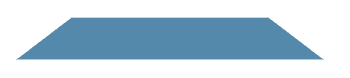
3、平行四边形
<div class="div4">首先</div>
<style>
.div4{ position:relative; width:100px; height:100px; line-height:100px; text-align: center; color: #fff; }
.div4::before { content: ''; /* 用伪元素来生成一个矩形*/
position:absolute; top:0; right:0; bottom:0; left:0; z-index: -1;
background:#58a; transform:skew(15deg); }
</style>

平行四边形
4、平行四边形
<div class="div5">
<img src="../w658.jpg"/>
</div>
<style>
.div5{
width:100px;
height: 100px;
transform:rotate(45deg);
overflow:hidden; }
.div5 >img {
max-width:100%;
transform: rotate(-45deg)scale(1.42);
}
</style>
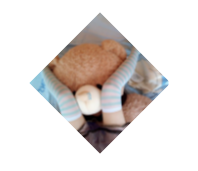
平行四边形
5、切角矩形
<div class="div6"></div>
<style>
.div6{
width:200px;
height:100px;
background:#58a;
background:
linear-gradient(-45deg,transparent 15px, #58a 0) right,
linear-gradient(45deg,transparent 15px, #655 0) left;
background-size:50% 100%;
background-repeat: no-repeat;
}
</style>

切角矩形
6、凹角矩形
<div class="div7"></div>
<style>
.div7{
width:240px;
height:50px;
background:#58a;
background:
radial-gradient(circle at top left,
transparent 8px,#58a 0)top left,
radial-gradient(circle at top right,
transparent 8px,#58a 0)top right,
radial-gradient(circle at bottom right,
transparent 8px, #58a 0)bottom right,
radial-gradient(circle at bottom left,
transparent 8px,#58a 0)bottom left;
background-size:50% 50%;
background-repeat:no-repeat;
}
</style>

凹角矩形
7、切角矩形(SVG)
<div class="div8"></div>
<style>
.div8{
width:240px;
height:50px;
background:#58a;
border:15px solid #58a;/* 当切角存在时,则显示切角,不支持时,则显示边框 */
border-image:1 url('data:image/svg+xml,<svg xmlns="<a href="http://www.w3.org/2000/svg">http://www.w3.org/2000/svg</a>" width="3" height="3" fill="%2358a">\
<polygon points="0,1 1,0 2,0 3,1 3,2 2,3 1,3 0,2"/></svg>');
background-clip:padding-box; }
</style>

切角矩形
8、梯形
<div class="div9"></div>
<style>
.div9{
width:240px;
height:40px;
position:relative;
color: white;
}
.div9:before{
content: ''; /* 用伪元素来生成一个矩形*/
position:absolute;
top: 0;
right:0;
bottom:0;
left:0;
z-index:-1;
background:#58a;
transform:perspective(.5em)rotateX(5deg);
}
</style>
梯形
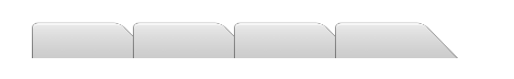
9、梯形
<div class="div10"></div>
<div class="div10"></div>
<div class="div10"></div>
<div class="div10"></div>
<style>
.div10{
float:left;
width:60px;
height:40px;
position:relative;
padding:.3em 1em 0;
}
.div10:before{
content: '';
position: absolute;
width:110px;
top:0;right:0;
bottom:0;
left:0;
z-index:-1;
background:#ccc;
background-image:linear-gradient(
hsla(0,0%,100%,.6),
hsla(0,0%,100%,0));
border:1px solid rgba(0,0,0,.4);
border-bottom:none;
border-radius:.5em .5em 0 0;
box-shadow:0 .15em white inset;
transform:perspective(.5em)rotateX(5deg);
transform-origin:bottom;
}
</style>

梯形
10、梯形
<div class="div11"></div>
<div class="div11"></div>
<div class="div11"></div>
<div class="div11"></div>
<style> .div11{
float:left;
width:60px;
height:40px;
position:relative;
padding:.3em 1em 0;
}
.div11:before{
content: '';
position: absolute;
width:110px;
top:0;right:0;
bottom:0;left:0;
z-index:-1;
background:#ccc;
background-image:linear-gradient(
hsla(0,0%,100%,.6),
hsla(0,0%,100%,0));
border:1px solid rgba(0,0,0,.4);
border-bottom:none;
border-radius:.5em .5em 0 0;
box-shadow:0 .15em white inset;
transform:perspective(.5em) rotateX(4deg);
transform-origin:bottom left;
}
</style>
梯形
11、div饼图
<div class="div12">
<div></div>
<div><div></div></div>
<div></div> <div></div>
</div>
<style>
.div12{
float:left;
width:100px;
height:100px;
border-radius: 50%;
background: #655;
overflow:hidden; position:relative;
}
.div12:after{
content:'';
display:table;
clear:both;
position:absolute;
top:0;bottom:0;left:0;right:0;
}
.div12 div{
position:absolute;
float:left;
width:100px;
height:100px;
border-radius: 50%;
}
.div12>div:first-child{
background-image:
linear-gradient(to right,transparent 50%, rgba(198, 179, 129, 0.94) 0); }
.div12>div:first-child:before{
content: '';
display:block;
margin-left:50%;
height:100%;
border-radius:0 100% 100% 0 /50%;
background-color:#655;
transform-origin:left;
transform: rotate(50deg);
}
.div12>div:nth-child(2){
background-image:
linear-gradient(140deg,transparent 50%, rgba(35, 198, 41, 0.94) 0);
}
.div12>div:nth-child(2):before{
content: '';
display:block;
margin-left:50%;
height:100%;
border-radius:0 100% 100% 0 /50%;
background-color:#655;
transform-origin:left;
transform: rotate(145deg);
}
</style>
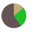
饼图
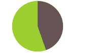
12、饼图
<svg width="100" height="100">
<circle r="25" cx="50" cy="50" />
</svg>
<style>
@keyframes fillup { to { stroke-dasharray: 100 100; } }
circle {
fill:yellowgreen;
stroke:#655;
stroke-width: 50;
stroke-dasharray:38 100; /* 可得到比率为38%的扇区*/
}
svg{
width:100px;height:100px;
transform:rotate(-90deg);
background:yellowgreen;
border-radius:50%;
}
</style>

饼图
13、js绘制饼图
<div class="pie1">20%</div>
<div class="pie2">60%</div>
<script>
function $$(selector,context) {
context =context || document;
var elements =context.querySelectorAll(selector);
return Array.prototype.slice.call(elements);
}
$$('.pie1').forEach(function(pie) {
var p = parseFloat(pie.textContent);
var NS = "<a href="http://www.w3.org/2000/svg">http://www.w3.org/2000/svg</a>";
var svg = document.createElementNS(NS, "svg");
var circle =document.createElementNS(NS, "circle");
var title = document.createElementNS(NS, "title");</p>
<p> circle.setAttribute("r", 25); circle.setAttribute("cx",16);
circle.setAttribute("cy",16); circle.setAttribute("stroke-dasharray",p + 100);
console.log(p + 100);
svg.setAttribute("viewBox", "0 0 32 32");
title.textContent = pie.textContent;
pie.textContent = '';
svg.appendChild(title);
svg.appendChild(circle);
pie.appendChild(svg); });
</script>
<style>
@keyframes fillup { to { stroke-dasharray: 100 100; } }
.pie1 circle {
fill:yellowgreen;
stroke:#655;
stroke-width: 50;
stroke-dasharray:70 160; /* 可得到比率为38%的扇区*/
}
.pie1 svg{
width:100px;height:100px;
transform:rotate(-90deg);
background:yellowgreen;
border-radius:50%;
}
</style>
js绘制饼图
备注:这里的大多数例子,都是从LEA VEROU的《css揭秘》这本书上借鉴来的,感兴趣的童鞋不如去买这本书,简直是CSS神书,就和Js的蝴蝶一样,前端必备。
总结
以上就是这篇文章的全部内容了,希望本文的内容对大家学习或者使用Css3能有所帮助,如果有疑问大家可以留言交流。


