一款基于css3的列表toggle特效实例教程

所属分类: 网页制作 / CSS 阅读数: 1741
收藏 0 赞 0 分享

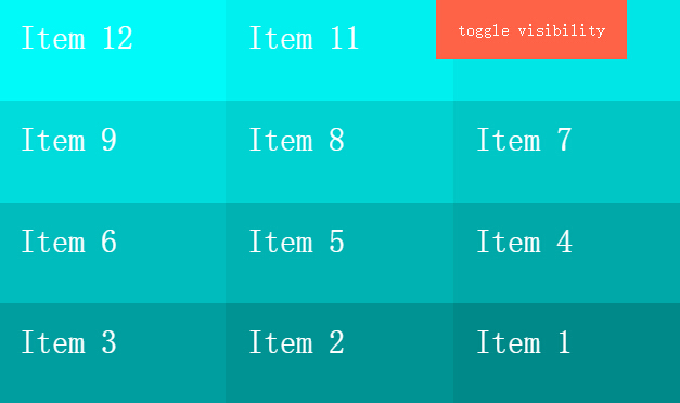
  今天给大家带来一款基于css3的列表toggle特效。右上角一个按钮,当列表不显示的时候,单击按钮列表动画出现,当列表显示时,单击按钮,列表动画消失,效果图如下:

  实现的代码。

  htm代码:

复制内容到剪贴板
  1. <div class='menu'>   
  2.         toggle visibility</div>   
  3.     <ul class='list reverse'>   
  4.         <li class='item'>Item 1</li>   
  5.         <li class='item'>Item 2</li>   
  6.         <li class='item'>Item 3</li>   
  7.         <li class='item'>Item 4</li>   
  8.         <li class='item'>Item 5</li>   
  9.         <li class='item'>Item 6</li>   
  10.         <li class='item'>Item 7</li>   
  11.         <li class='item'>Item 8</li>   
  12.         <li class='item'>Item 9</li>   
  13.         <li class='item'>Item 10</li>   
  14.         <li class='item'>Item 11</li>   
  15.         <li class='item'>Item 12</li>   
  16.     </ul>  

  css3代码:

CSS Code复制内容到剪贴板
  1. * {   
  2.   -moz-box-sizing: border-box;   
  3.        box-sizing: border-box;   
  4. }   
  5.   
  6. body {   
  7.   margin: 0;   
  8.   padding: 0;   
  9.   font-family'Avenir Next';   
  10.   background#000;   
  11.   colorwhite;   
  12. }   
  13.   
  14. .menu {   
  15.   background: tomato;   
  16.   padding20px;   
  17.   positionabsolute;   
  18.   z-index: 1;   
  19.   height55px;   
  20.   top: 0;   
  21.   rightright50px;   
  22. }   
  23.   
  24. .list {   
  25.   -webkit-perspective: 100vw;   
  26.           perspective: 100vw;   
  27.   width: 100vw;   
  28.   height: 100vh;   
  29.   display: -webkit-flex;   
  30.   display: -ms-flexbox;   
  31.   display: flex;   
  32.   -webkit-flex-flow: column wrap;   
  33.       -ms-flex-flow: column wrap;   
  34.           flex-flow: column wrap;   
  35. }   
  36. .list.hidden {   
  37.   pointer-events: none;   
  38. }   
  39. .list.hidden .item {   
  40.   -webkit-animation: disappear both;   
  41.           animation: disappear both;   
  42.   -webkit-animation-direction: alternate;   
  43.           animation-direction: alternate;   
  44. }   
  45. .list.reverse {   
  46.   -webkit-flex-flow: row-reverse wrap-reverse;   
  47.       -ms-flex-flow: row-reverse wrap-reverse;   
  48.           flex-flow: row-reverse wrap-reverse;   
  49. }   
  50.   
  51. .item {   
  52.   font-size30px;   
  53.   padding20px;   
  54.   height100px;   
  55.   width: calc(100vw / 3);   
  56.   height: calc(100vh / 4);   
  57.   -webkit-animation: appear both;   
  58.           animation: appear both;   
  59. }   
  60.   
  61. .item:nth-child(1) {   
  62.   background#008a8a;   
  63.   -webkit-animation-delay: 0.03333s !important;   
  64.   -webkit-animation-duration: 0.1s !important;   
  65. }   
  66.   
  67. .item:nth-child(2) {   
  68.   background#009494;   
  69.   -webkit-animation-delay: 0.06667s !important;   
  70.   -webkit-animation-duration: 0.2s !important;   
  71. }   
  72.   
  73. .item:nth-child(3) {   
  74.   background#009f9f;   
  75.   -webkit-animation-delay: 0.1s !important;   
  76.   -webkit-animation-duration: 0.3s !important;   
  77. }   
  78.   
  79. .item:nth-child(4) {   
  80.   background#00a9a9;   
  81.   -webkit-animation-delay: 0.13333s !important;   
  82.   -webkit-animation-duration: 0.4s !important;   
  83. }   
  84.   
  85. .item:nth-child(5) {   
  86.   background#00b3b3;   
  87.   -webkit-animation-delay: 0.16667s !important;   
  88.   -webkit-animation-duration: 0.5s !important;   
  89. }   
  90.   
  91. .item:nth-child(6) {   
  92.   background#00bdbd;   
  93.   -webkit-animation-delay: 0.2s !important;   
  94.   -webkit-animation-duration: 0.6s !important;   
  95. }   
  96.   
  97. .item:nth-child(7) {   
  98.   background#00c7c7;   
  99.   -webkit-animation-delay: 0.23333s !important;   
  100.   -webkit-animation-duration: 0.7s !important;   
  101. }   
  102.   
  103. .item:nth-child(8) {   
  104.   background#00d2d2;   
  105.   -webkit-animation-delay: 0.26667s !important;   
  106.   -webkit-animation-duration: 0.8s !important;   
  107. }   
  108.   
  109. .item:nth-child(9) {   
  110.   background#00dcdc;   
  111.   -webkit-animation-delay: 0.3s !important;   
  112.   -webkit-animation-duration: 0.9s !important;   
  113. }   
  114.   
  115. .item:nth-child(10) {   
  116.   background#00e6e6;   
  117.   -webkit-animation-delay: 0.33333s !important;   
  118.   -webkit-animation-duration: 1s !important;   
  119. }   
  120.   
  121. .item:nth-child(11) {   
  122.   background#00f0f0;   
  123.   -webkit-animation-delay: 0.36667s !important;   
  124.   -webkit-animation-duration: 1.1s !important;   
  125. }   
  126.   
  127. .item:nth-child(12) {   
  128.   background#00fafa;   
  129.   -webkit-animation-delay: 0.4s !important;   
  130.   -webkit-animation-duration: 1.2s !important;   
  131. }   
  132.   
  133. @-webkit-keyframes appear {   
  134.   from {   
  135.     opacity: 0;   
  136.     -webkit-transform: scale(0.8);   
  137.             transform: scale(0.8);   
  138.   }   
  139.   to {   
  140.     opacity: 1;   
  141.     -webkit-transform: scale(1);   
  142.             transform: scale(1);   
  143.   }   
  144. }   
  145.   
  146. @keyframes appear {   
  147.   from {   
  148.     opacity: 0;   
  149.     -webkit-transform: scale(0.8);   
  150.             transform: scale(0.8);   
  151.   }   
  152.   to {   
  153.     opacity: 1;   
  154.     -webkit-transform: scale(1);   
  155.             transform: scale(1);   
  156.   }   
  157. }   
  158. @-webkit-keyframes disappear {   
  159.   from {   
  160.     opacity: 1;   
  161.     -webkit-transform: scale(1);   
  162.             transform: scale(1);   
  163.   }   
  164.   to {   
  165.     opacity: 0;   
  166.     -webkit-transform: scale(0.9) rotateX(0deg) translateZ(-1500px);   
  167.             transform: scale(0.9) rotateX(0deg) translateZ(-1500px);   
  168.   }   
  169. }   
  170. @keyframes disappear {   
  171.   from {   
  172.     opacity: 1;   
  173.     -webkit-transform: scale(1);   
  174.             transform: scale(1);   
  175.   }   
  176.   to {   
  177.     opacity: 0;   
  178.     -webkit-transform: scale(0.9) rotateX(0deg) translateZ(-1500px);   
  179.             transform: scale(0.9) rotateX(0deg) translateZ(-1500px);   
  180.   }   
  181. }  
更多精彩内容其他人还在看

Opera中国的WEB标准课程

网页制作Webjx文章简介:在这篇文章里,我要向大家介绍我和其他很多人花费数月时间开发的一个课程——Web标准课程,该课程旨在向大家提供Web设计和开发的坚实基础,无论读者是谁,此教程完全免费、可访问,并且不需要预备知识。当然,我主要还
收藏 0 赞 0 分享

CSS样式表渐进增强的基本概念

网页制作Webjx文章简介:如果你挠着头想弄清楚优雅降级和渐进增强的区别,我告诉你,这是视角问题。优雅降级和渐进增强都考虑网站在各种设备的各种浏览器上如何良好运转。两者区别的关键在于它们各自关注的焦点,以及这种关注对工作流程的影响
收藏 0 赞 0 分享

简单介绍Web Developer插件制作网页

网页制作Webjx文章简介:Firefox浏览器是一个良好支持W3C标准的开放源代码的浏览器,拥有Linux/Windows/Mac版本。因为Firefox浏览器良好支持W3C标准,所以使用Firefox来调试网页是非常好的。 Firefox浏览器是
收藏 0 赞 0 分享

CSS布局带来的巨大影响:CSS display属性值

网页制作Webjx文章简介:网页元素应用上那些与表格相关的display属性值后,能够模仿出与表格相同的特性。我将会在该文中给大家演示这种方法给CSS布局带来的巨大影响。 应原书编辑要求,先在文章顶部给出链接:《Everything You
收藏 0 赞 0 分享

用div css模拟表格对角线

这只是探讨一种CSS模拟表格对角线的用法,实际在工作中可能觉得这样做有点小题大作,这不是本主题讨论的重点。如果对此深以为然的朋友,请一笑过之 首先声明: 这只是探讨一种CSS模拟表格对角线的
收藏 0 赞 0 分享

IE Firefox在css中的差别 (部分)

1、单位问题 问题:任何距离的数值ie可以不加单位,ff必须要求写单位(0除外) 解决:写全单位如padding:0px; 2、水平居中 问题:div里的内容,ie默认为center,而ff默认left 解决:mairgin:0px auto; 3、高度问题
收藏 0 赞 0 分享

不用js可以实现信息提示效果

[code] <style> body { font:verdena; font-size:14px; color:#000 } h1{ font:verdena; font-size:22px; color:#000 } h2{ font:verdena;
收藏 0 赞 0 分享

CSS解决未知高度的垂直水平居中自适应问题

今天有人问起,晚上试着写出来,供参考; 以下代码兼容主流浏览器IE6、IE7、Firefox、Opera。 从最简单的开始………… 一、如何让一个DIV水平居中? 这个简单不作过多说明! [code] <st
收藏 0 赞 0 分享

CSS cursor 属性 -- 鼠标指针样式效果

取值: [ [<uri> ,]* [ auto | crosshair | default | pointer | move | e-resize | ne-resize | nw-resize | n-resize | se-resize | sw-resize |
收藏 0 赞 0 分享

css 简单区别ie6,ie7,firefox的写法

同一样式里可以这样 [code] margin:17px; FF +margin:17px; IE6 IE7 _margin:17px; IE6 [/code] 按这个顺序,刚好区分开三个浏览器
收藏 0 赞 0 分享
查看更多