一、CSS3画机器猫 哆啦A梦效果图:

可用于浏览器对CSS3支持情况的测试
但最近有人对这个测试表示怀疑,指该测试使用了偏向性代码,测试的CSS代码偏向于支持Chrome,Safari等Webkit浏览器。
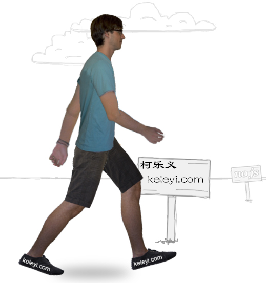
二、纯CSS3动画 发现一个有趣的CSS3效果,可以研究研究,先放到柯乐义网上。
http://keleyi.com/keleyi/phtml/html5/6.htm
请使用支持CSS3(HTML5)的浏览器访问查看效果:
支持HTML5的浏览器,例如:Chrome,火狐
效果图:
<!DOCTYPE html PUBLIC "-//W3C//DTD XHTML 1.0 Transitional//EN" "http://www.w3.org/TR/xhtml1/DTD/xhtml1-transitional.dtd">
<html xmlns="http://www.w3.org/1999/xhtml">
<head>
<title>纯CSS3实现动画</title>
<link rel="stylesheet" href="http://keleyi.com/keleyi/phtml/html5/6/webkit_keyframes.css" type="text/css">
<link rel="stylesheet" href="http://keleyi.com/keleyi/phtml/html5/6/moz_keyframes.css" type="text/css">
<link rel="stylesheet" href="http://keleyi.com/keleyi/phtml/html5/6/common.css" type="text/css">
<style type="text/css">
.ke-content{backgroud:none}
</style>
</head>
<body>
<div><a href="http://keleyi.com/a/bjac/nmwpqgag.htm" target="_blank">原文</a></div>
<div id="canvas">
<div class="sky">
<div class="cloud-1"></div>
<div class="cloud-2"></div>
<div class="cloud-3"></div>
<div class="cloud-4"></div>
<div class="cloud-5"></div>
<div class="cloud-6"></div>
<div class="cloud-7"></div>
<div class="cloud-8"></div>
</div>
<div class="horizon"></div>
<div class="ground">
<div class="sign-best"></div>
<div class="sign-no-js"></div>
<div class="sign-lots-of-divs"></div>
<div class="sign-all-css"></div>
</div>
<!-- skeleton and shadow -->
<div class="shadow"></div>
<div class="me">
<div class="torso">
<div class="left leg">
<div class="left thigh">
<div class="left shin">
<div class="left foot">
<div class="left toes"></div>
</div>
</div>
</div>
</div>
<!-- left leg -->
<div class="right leg">
<div class="right thigh">
<div class="right shin">
<div class="right foot">
<div class="right toes"></div>
</div>
</div>
</div>
</div>
<!-- right leg -->
<div class="left arm">
<div class="left bicep">
<div class="left forearm"></div>
</div>
</div>
<!-- left arm -->
<div class="right arm">
<div class="right bicep">
<div class="right forearm"></div>
</div>
</div>
<!-- right arm -->
</div>
<!-- torso -->
</div>
<!-- me -->
<div class="overlay"></div>
</div>
</body>
</html>


