Unique “About”-Pages
A great way to distinguish yourself from the crowd is to have a truly unique about page.
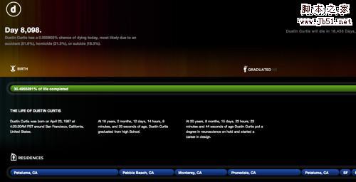
Dustin Curtis has taken a truly unique approach to the about page. What he has created is a death clock of sorts; a timeline of his life up until now and to beyond. It’s an about page that truly speaks to the designer’s capabilities and creativity. It accomplishes the most important thing about a website and a great about page - it’s something you won’t soon forget.
While the content is slight, the
“Floating Asian Kid” gag below is cute. Move your mouse around the graphic to see why. It is both memorable and unique
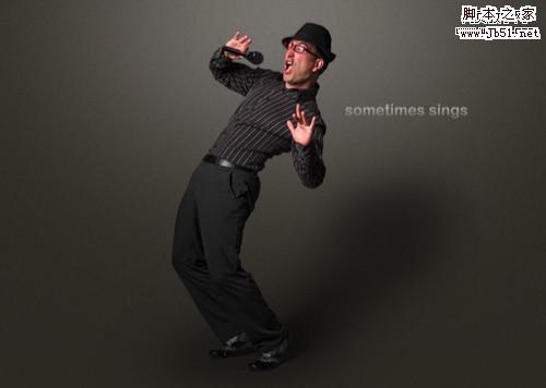
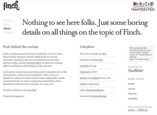
 Quomo
Quomo has taken a very unique approach to the about page - a series of full-body action shots on a horizontal carousel.
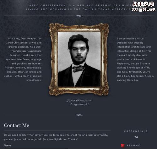
 Jared
Jared has taken a very clever approach to the self portrait (quite literally).
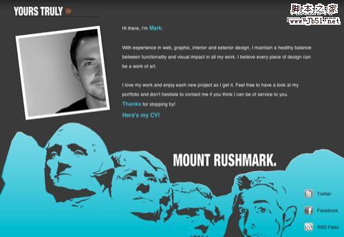
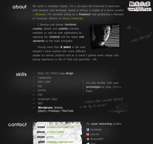
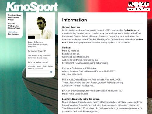
 Mark
Mark has put his face on Mount Rushmore.
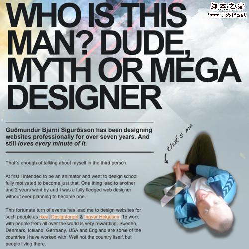
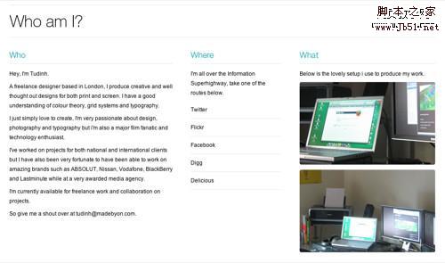
 Guðmundur
 has used big typography and an interesting perspective for his portrait.
Big Photograph
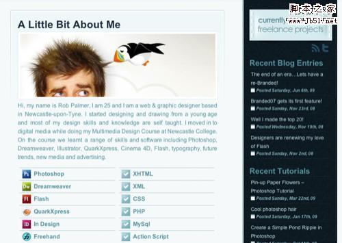
A large photograph of yourself can leave a lasting impression in your users minds if it’s done well.
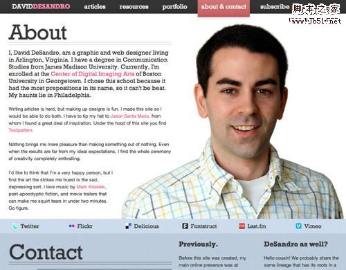
The more we use computers to communicate, the less face-to-face interaction we get. This is why
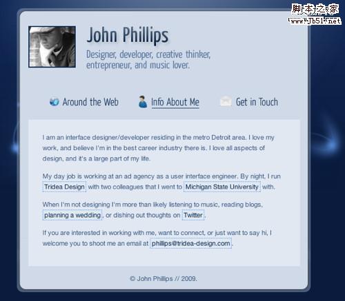
David DeSandro’s about page is so effective. His headshot is as big as any I’ve seen on an about page makes you really feel as thought you’re meeting a real person rather than some web designer on some website. Once the introduction is made, you can easily connect up with David via his social networking presence or the handy contact form below his picture. It’s worth noting his about page is well organized as well.
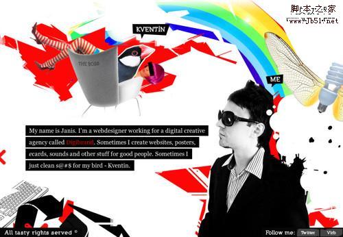
 Janis’ about page
 is short on copy but big on artistic design. You get a good impression in short order.
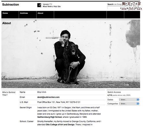
 Subtraction.com
, in addition to being one of the coolest domain names ever, is a picture perfect study in minimalism. Khoi chose an incredible picture for his about page and organized his biography into an easily digested format. It doesn’t hurt that he threw his adorable black lab in there for good measure.
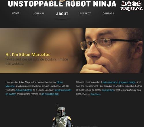
Aside from having an incredibly awesome domain name (
unstoppablerobotninja.com),
Ethan has a great about page too.
#p#
Well Organized
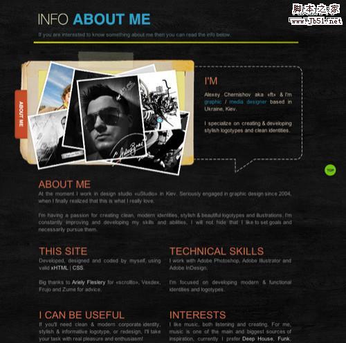
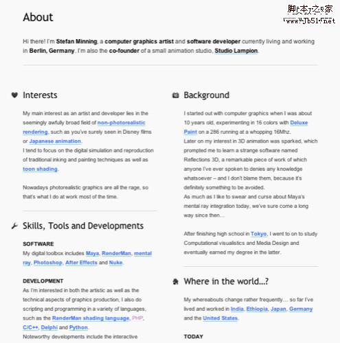
The best about pages we found were the ones that had a lot of information but were excellently organized, making them easily digestible. When faced with the task of creating an about page, it’s easy to get overwhelmed and put it off indefinitely because the subject you are dealing with is yourself. It is a subject we know more about than anything else and it can be difficult to know just how much and how little we should tell the world about ourselves. A good about page must be informative without being too wordy.
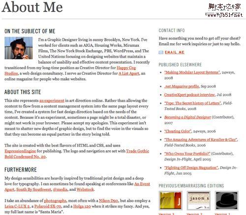
Jason is Creative Director for
A List Apart and it’s clear why. He has pioneered the idea of the “fast design direction” approach to updating websites, a method where instead of doing a major re-design of a site after a long period of time, each article or update gets its own unique design. David and Dustin from above use the same sort of system. Jason’s about page is clean, organized, and personable. We can see at a glance what he has written elsewhere, what he’s about, and what he’s capable of.
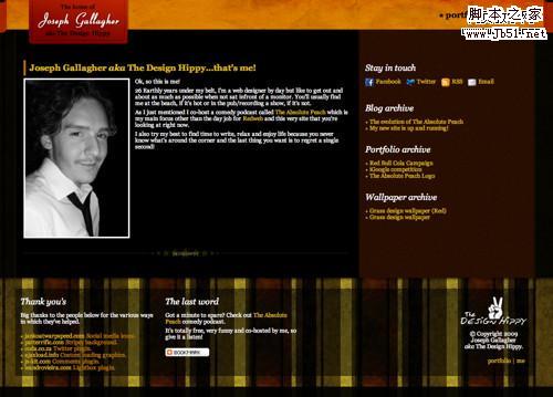
 Joseph
 makes sure to give thanks and credit where it’s due on his about page.
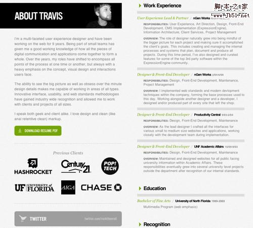
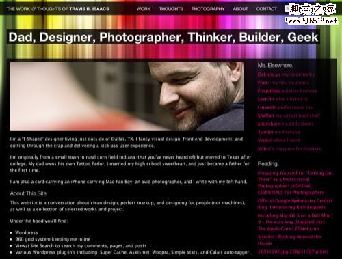
The 2-column layout used by
Travis neatly encapsulates everything about who he is and what he does. You can easily scan for the information you need.
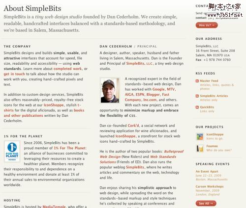
SimpleBits has always been an inspiration to many web designers and it’s no surprise
Dan Cederholm’s about page is one of the best organized and informative out there.
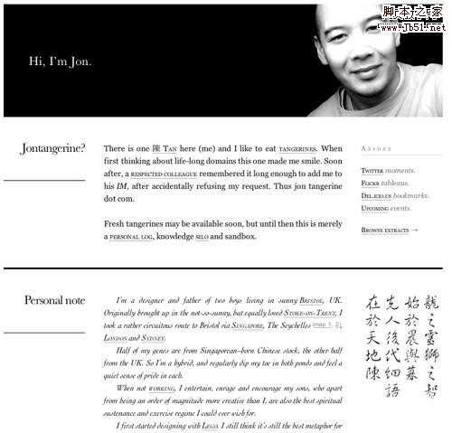
 Jon Tangerine
 is a master of typography. The first time I visited his site I was amazed at what he was able to accomplish without the help of sIFR or other font rendering engines. His about page is a joy to view. Every section is deliberate, informative, and attractive.
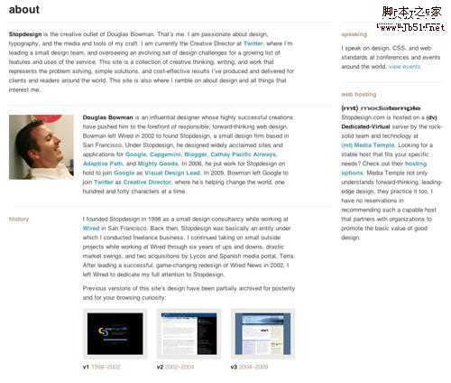
 Douglas Bowman
 is a creative director for Twitter and has been working on the web for as long as its been around. His about page is succinct and entertaining. We as graphic designers get exactly what we want in the section devoted to previous design iterations of his website over the years. Check out his footer when you’re on the about page, too, for a bit of cleverness.
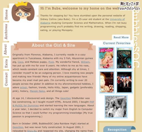
 Bubs
Bubs has quite a lot of information but it’s neatly categorized and amusing.
#p#
Front and Center
Some designers have gone as far as making their about pages their home pages.
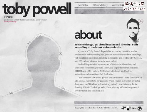
Toby’s about page is actually his home page, which for a personal website (and formal name as his domain name) is a great idea. After all, if we’re visitng Toby’s site for the first time it’d be nice to know who the designer is. He also flips the large portrait concept on its head by giving us a large silhouette where it’s supposed to be.
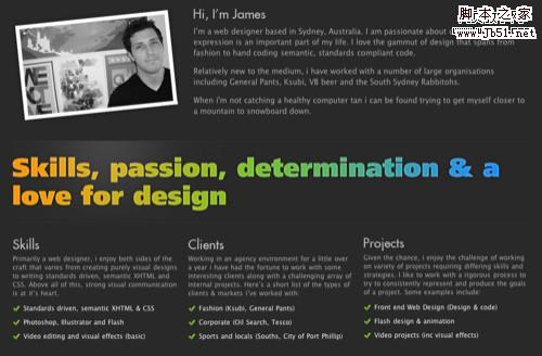
 Jason Reed
 uses an excellent hand drawn illustration portrait as his about page centerpiece, and his about page in turn is his website’s centerpiece and the first thing you see when you land on jasonreedwebdesign.com. His professional details are neatly organized into a horizontal accordian and there’s no fluff - just the most important information one might want to know when considering Jason for a freelance project.
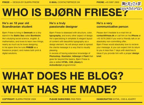
 This website
 is hard to ignore not only because of its striking yellow background, but Bjørn’s organization of information.
 Vlad
Vlad has a very distinct goal in mind with his site and he accomplishes it with great typography and layout.
 Kyle
Kyle pokes fun at the traditional folio site with his one-page offering. You can easily find out all about him and his internet presence.
#p#
Direct
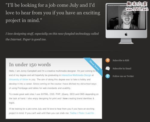
A few of the about pages had very deliberate goals.
Jonny gets straight to the point with a mission statement and a brief summary of who he is.
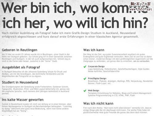
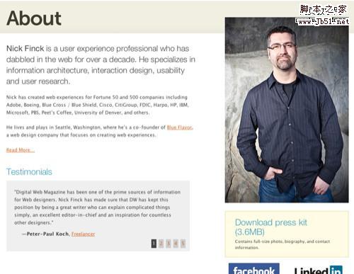
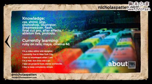
 Nick
Nick has created an extremely professional about page, complete with testemonials, great portrait, and a press kit to boot.
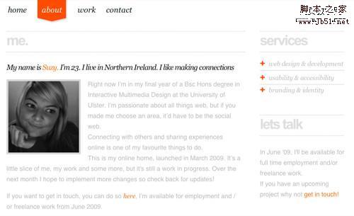
 Suzy
Suzy sums up herself up well in one sentence, goes into depth for those who are interested, and gives straightforward information about her capabilities and availability.
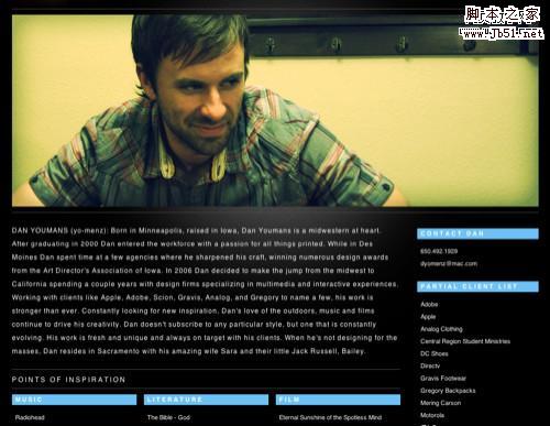
 Dan
Dan has a clever portrait and a great succinct description of his talents and abilities complete with his resume and a link to contact him.

#p#
Minimalist
A minimalist approach can be a great way to convey important information about yourself without distracting the user.
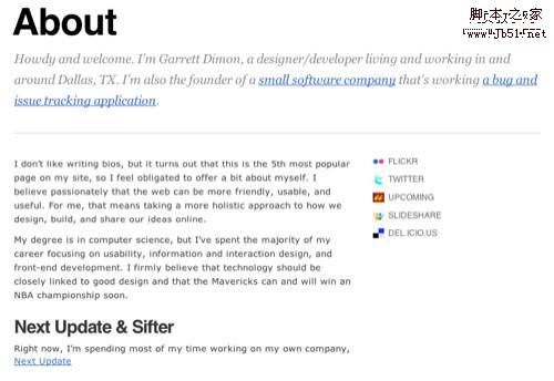
 Garret
 actually acknowledges the fact that his about page is more popular than he first thought it would be, citing this as the reason for giving it more attention.
Drop-Down
A few of the about pages we found were actually accessible not from a traditional page but an ajax driven drop-down modal. It’s a great way to make the information about yourself easily accessible to anyone from any page without forcing users to navigate away from the page their currently reading.
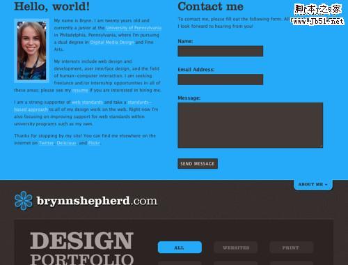
Brynn’s about page is always easily accessible via a drop down effect. This also doubles as her contact form.
#p#
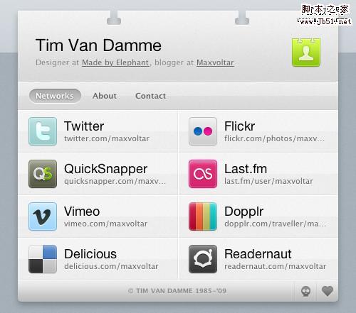
Business Card Websites (BCW)
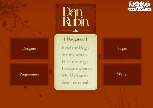
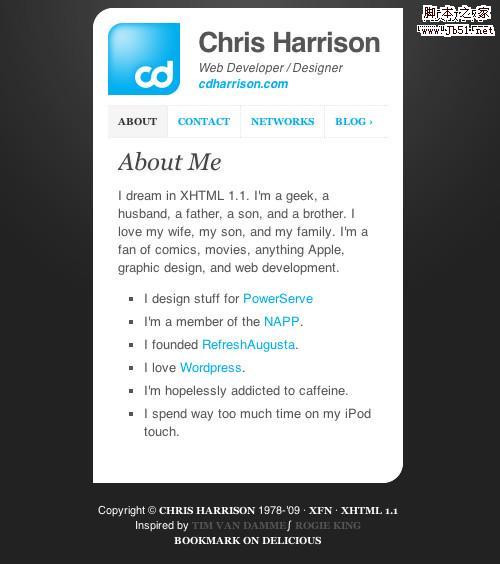
Made By Elephant’s Tim Van Damme recently started a trend he coined Business Card Websites (BCW), or specialized contact/about pages for individuals that are heavy on ajax and great design. Once Tim got his BCW online other designers started following suit. BCW’s are a great place to send people if they want to get an overview of your social networking presence, portfolio and capabilities, contact information, etc. We have a feeling we’re going to start seeing more of these pop up in the near future. Here are a few of the best we’ve found so far:
Tim has three tabs on this BCW which tell you how to find him on the net, who he is, and how to get in touch with him.
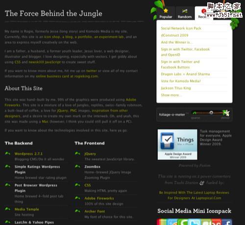
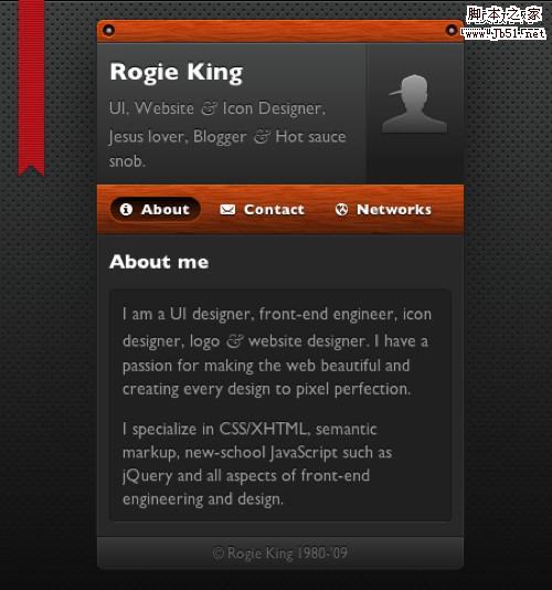
 Rogie King
 runs Komodo Media, and his BCW retains some of the design elements he uses there. Great consistency.
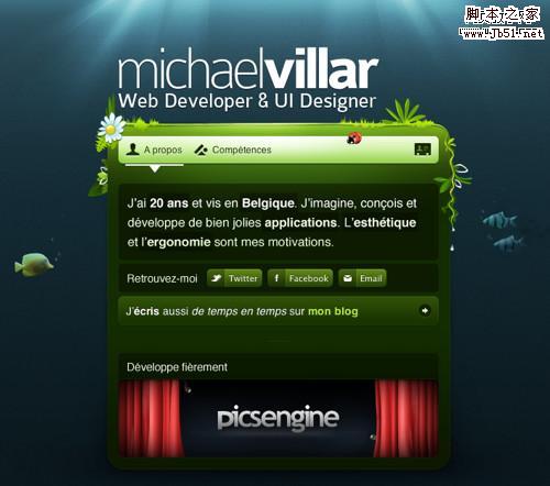
 Michael’s BCW
 has a stunning underwater effect with appealing organic treatments.
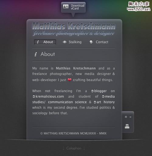
 Matthias
 blogs over at kremalicious.com and has also chosen to keep his design consistent across his BCW.
 Daniel
 has taken a minimalistic approach that works quite well. It’s clean, simple, to-the-point, and friendly.

There you have it: 60 beautiful and effective about pages from personal websites, blogs, and portfolios. Hopefully this will inspire you to revisit their about pages and come up with some unique and innovative ways of representing yourself on the web.


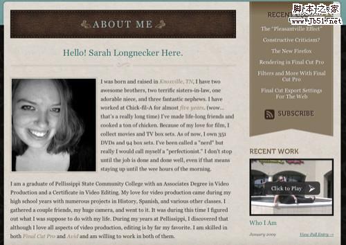
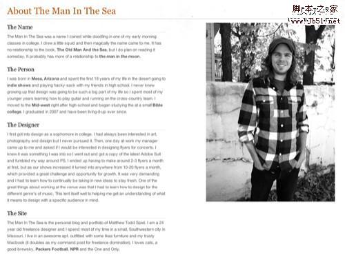
 Big Photograph


 Drop-Down


