
一、和导航的区别
1.导航条比导航多了一个条字
2.直接上图
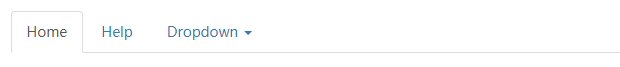
导航:
导航条:

简单文字描述: 由两张图看出,导航内容比较简单,而导航条可以包含导航及其他元素,如表单,搜索框等,并且通常导航条会有一个区别于页面的背景色。
二、在页面中定义导航条
方法:
为父容器添加类名navbar navbar-default。navbar-default类用来规定导航条的颜色,可以更改为navbar-inverse来让导航条反色显示。bootstrap官网建议使用nav元素。但也常用div元素,建议用div元素时增加role="navigation"属性,该属性对一些特殊的辅助设备友好。
结构:
标题或者logo放在类名为.navbar-header>.navbar-brand的容器中,其他条目可以放在类名为.nav navbar-nav的容器中
<div class="navbar navbar-default" role="navigation">
  <div class="navbar-header">
   <a href="#" rel="external nofollow" rel="external nofollow" rel="external nofollow" rel="external nofollow" rel="external nofollow" rel="external nofollow" rel="external nofollow" rel="external nofollow" rel="external nofollow" rel="external nofollow" rel="external nofollow" rel="external nofollow" rel="external nofollow" rel="external nofollow" rel="external nofollow" rel="external nofollow" rel="external nofollow" rel="external nofollow" rel="external nofollow" rel="external nofollow" rel="external nofollow" class="navbar-brand">MY WEBSITE</a>
  </div>
 <ul class="nav navbar-nav">
  <li class="active"><a href="#" rel="external nofollow" rel="external nofollow" rel="external nofollow" rel="external nofollow" rel="external nofollow" rel="external nofollow" rel="external nofollow" rel="external nofollow" rel="external nofollow" rel="external nofollow" rel="external nofollow" rel="external nofollow" rel="external nofollow" rel="external nofollow" rel="external nofollow" rel="external nofollow" rel="external nofollow" rel="external nofollow" rel="external nofollow" rel="external nofollow" rel="external nofollow" >首页</a></li>
   <li><a href="#" rel="external nofollow" rel="external nofollow" rel="external nofollow" rel="external nofollow" rel="external nofollow" rel="external nofollow" rel="external nofollow" rel="external nofollow" rel="external nofollow" rel="external nofollow" rel="external nofollow" rel="external nofollow" rel="external nofollow" rel="external nofollow" rel="external nofollow" rel="external nofollow" rel="external nofollow" rel="external nofollow" rel="external nofollow" rel="external nofollow" rel="external nofollow" >条目一</a></li>
   <li><a href="#" rel="external nofollow" rel="external nofollow" rel="external nofollow" rel="external nofollow" rel="external nofollow" rel="external nofollow" rel="external nofollow" rel="external nofollow" rel="external nofollow" rel="external nofollow" rel="external nofollow" rel="external nofollow" rel="external nofollow" rel="external nofollow" rel="external nofollow" rel="external nofollow" rel="external nofollow" rel="external nofollow" rel="external nofollow" rel="external nofollow" rel="external nofollow" >条目二</a></li>
   <li><a href="#" rel="external nofollow" rel="external nofollow" rel="external nofollow" rel="external nofollow" rel="external nofollow" rel="external nofollow" rel="external nofollow" rel="external nofollow" rel="external nofollow" rel="external nofollow" rel="external nofollow" rel="external nofollow" rel="external nofollow" rel="external nofollow" rel="external nofollow" rel="external nofollow" rel="external nofollow" rel="external nofollow" rel="external nofollow" rel="external nofollow" rel="external nofollow" >条目三</a></li>
   <li><a href="#" rel="external nofollow" rel="external nofollow" rel="external nofollow" rel="external nofollow" rel="external nofollow" rel="external nofollow" rel="external nofollow" rel="external nofollow" rel="external nofollow" rel="external nofollow" rel="external nofollow" rel="external nofollow" rel="external nofollow" rel="external nofollow" rel="external nofollow" rel="external nofollow" rel="external nofollow" rel="external nofollow" rel="external nofollow" rel="external nofollow" rel="external nofollow" >条目四</a></li>
 </ul>
</div>
包含元素:
1.表单:form 添加类名navbar-form
2.按钮:添加类名navbar-btn(需和类名为“navbar-nav”或"navbar-brand"的元素配合使用,且数量不能多)
3.文本:添加类名navbar-text(需和类名为“navbar-nav”或"navbar-brand"的元素配合使用,且数量不能多)
4.链接:添加类名navbar-link(需和类名为“navbar-nav”或"navbar-brand"的元素配合使用,且数量不能多)
5.二级菜单:(见下面代码)
<div class="navbar navbar-default" role="navigation">
  <div class="navbar-header">
   <a href="#" rel="external nofollow" rel="external nofollow" rel="external nofollow" rel="external nofollow" rel="external nofollow" rel="external nofollow" rel="external nofollow" rel="external nofollow" rel="external nofollow" rel="external nofollow" rel="external nofollow" rel="external nofollow" rel="external nofollow" rel="external nofollow" rel="external nofollow" rel="external nofollow" rel="external nofollow" rel="external nofollow" rel="external nofollow" rel="external nofollow" rel="external nofollow" class="navbar-brand">MY WEBSITE</a>
  </div>
 <ul class="nav navbar-nav">
  <li class="active"><a href="#" rel="external nofollow" rel="external nofollow" rel="external nofollow" rel="external nofollow" rel="external nofollow" rel="external nofollow" rel="external nofollow" rel="external nofollow" rel="external nofollow" rel="external nofollow" rel="external nofollow" rel="external nofollow" rel="external nofollow" rel="external nofollow" rel="external nofollow" rel="external nofollow" rel="external nofollow" rel="external nofollow" rel="external nofollow" rel="external nofollow" rel="external nofollow" >首页</a></li>
  <li class="dropdown">
   <a href="#" rel="external nofollow" rel="external nofollow" rel="external nofollow" rel="external nofollow" rel="external nofollow" rel="external nofollow" rel="external nofollow" rel="external nofollow" rel="external nofollow" rel="external nofollow" rel="external nofollow" rel="external nofollow" rel="external nofollow" rel="external nofollow" rel="external nofollow" rel="external nofollow" rel="external nofollow" rel="external nofollow" rel="external nofollow" rel="external nofollow" rel="external nofollow" data-toggle="dropdown" class="dropdown-toggle">水果<span class="caret"></span></a>
   <ul class="dropdown-menu">
   <li><a href="#" rel="external nofollow" rel="external nofollow" rel="external nofollow" rel="external nofollow" rel="external nofollow" rel="external nofollow" rel="external nofollow" rel="external nofollow" rel="external nofollow" rel="external nofollow" rel="external nofollow" rel="external nofollow" rel="external nofollow" rel="external nofollow" rel="external nofollow" rel="external nofollow" rel="external nofollow" rel="external nofollow" rel="external nofollow" rel="external nofollow" rel="external nofollow" >苹果</a></li>
   <li><a href="#" rel="external nofollow" rel="external nofollow" rel="external nofollow" rel="external nofollow" rel="external nofollow" rel="external nofollow" rel="external nofollow" rel="external nofollow" rel="external nofollow" rel="external nofollow" rel="external nofollow" rel="external nofollow" rel="external nofollow" rel="external nofollow" rel="external nofollow" rel="external nofollow" rel="external nofollow" rel="external nofollow" rel="external nofollow" rel="external nofollow" rel="external nofollow" >橘子</a></li>
   <li ><a href="#" rel="external nofollow" rel="external nofollow" rel="external nofollow" rel="external nofollow" rel="external nofollow" rel="external nofollow" rel="external nofollow" rel="external nofollow" rel="external nofollow" rel="external nofollow" rel="external nofollow" rel="external nofollow" rel="external nofollow" rel="external nofollow" rel="external nofollow" rel="external nofollow" rel="external nofollow" rel="external nofollow" rel="external nofollow" rel="external nofollow" rel="external nofollow" >香蕉</a></li>
   </ul>
  </li>
  <li><a href="##" rel="external nofollow" rel="external nofollow" rel="external nofollow" >蔬菜</a></li>
  <li><a href="##" rel="external nofollow" rel="external nofollow" rel="external nofollow" >哈哈</a></li>
  <li><a href="##" rel="external nofollow" rel="external nofollow" rel="external nofollow" >呵呵</a></li>
 </ul>
</div>
位置样式:
•导航条内元素左浮动:左浮动的元素添加类名navbar-left
•导航条内元素右浮动:右浮动的元素添加类名navbar-right
•导航条固定在浏览器窗口顶部:导航条父容器添加类名navbar-fixed-top
•导航条固定在浏览器窗口底部:导航条父容器添加类名navbar-fixed-bottom
注意:让导航条固定在浏览器窗口顶部或底部会遮盖到页面顶部或底部的内容,解决办法为:给body设置合适的内边距(温馨提示:导航条默认高度为50px)。
三、响应式
目的: 让导航条内容比较多的时候,在窄屏幕设备上显示更加友好
表现: 宽屏正常显示,窄屏时隐藏一部分条目,并调整其排列方式为垂直排列,然后通过一个按钮单击显示
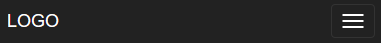
宽屏显示:

窄屏显示:
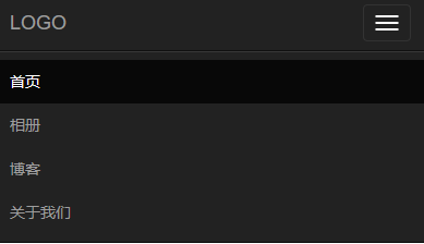
窄屏展开:
方法:
1.将想要被折叠的元素包裹在一个类名为"collapse navbar-collapse"的div中
2.定义想要显示的图标,可以将其放在类名为“navbar-header”的元素中
<button class="navbar-toggle" type="button" data-toggle="collapse">
 <span class="sr-only">Toggle Navigation</span>
 <span class="icon-bar"></span>
 <span class="icon-bar"></span>
 <span class="icon-bar"></span>
</button>
完整代码:
<div class="navbar navbar-default" role="navigation">
 <div class="navbar-header">
  <button class="navbar-toggle" type="button" data-toggle="collapse" data-target=".test">
   <span class="sr-only">Toggle Navigation</span>
   <span class="icon-bar"></span>
   <span class="icon-bar"></span>
   <span class="icon-bar"></span>
  </button>
  <a href="#" rel="external nofollow" rel="external nofollow" rel="external nofollow" rel="external nofollow" rel="external nofollow" rel="external nofollow" rel="external nofollow" rel="external nofollow" rel="external nofollow" rel="external nofollow" rel="external nofollow" rel="external nofollow" rel="external nofollow" rel="external nofollow" rel="external nofollow" rel="external nofollow" rel="external nofollow" rel="external nofollow" rel="external nofollow" rel="external nofollow" rel="external nofollow" class="navbar-brand">LOGO</a>
 </div>
 <div class="collapse navbar-collapse test">
  <ul class="nav navbar-nav">
   <li class="active"><a href="#" rel="external nofollow" rel="external nofollow" rel="external nofollow" rel="external nofollow" rel="external nofollow" rel="external nofollow" rel="external nofollow" rel="external nofollow" rel="external nofollow" rel="external nofollow" rel="external nofollow" rel="external nofollow" rel="external nofollow" rel="external nofollow" rel="external nofollow" rel="external nofollow" rel="external nofollow" rel="external nofollow" rel="external nofollow" rel="external nofollow" rel="external nofollow" >首页</a></li>
   <li><a href="#" rel="external nofollow" rel="external nofollow" rel="external nofollow" rel="external nofollow" rel="external nofollow" rel="external nofollow" rel="external nofollow" rel="external nofollow" rel="external nofollow" rel="external nofollow" rel="external nofollow" rel="external nofollow" rel="external nofollow" rel="external nofollow" rel="external nofollow" rel="external nofollow" rel="external nofollow" rel="external nofollow" rel="external nofollow" rel="external nofollow" rel="external nofollow" >条目一</a></li>
   <li><a href="#" rel="external nofollow" rel="external nofollow" rel="external nofollow" rel="external nofollow" rel="external nofollow" rel="external nofollow" rel="external nofollow" rel="external nofollow" rel="external nofollow" rel="external nofollow" rel="external nofollow" rel="external nofollow" rel="external nofollow" rel="external nofollow" rel="external nofollow" rel="external nofollow" rel="external nofollow" rel="external nofollow" rel="external nofollow" rel="external nofollow" rel="external nofollow" >条目二</a></li>
   <li><a href="#" rel="external nofollow" rel="external nofollow" rel="external nofollow" rel="external nofollow" rel="external nofollow" rel="external nofollow" rel="external nofollow" rel="external nofollow" rel="external nofollow" rel="external nofollow" rel="external nofollow" rel="external nofollow" rel="external nofollow" rel="external nofollow" rel="external nofollow" rel="external nofollow" rel="external nofollow" rel="external nofollow" rel="external nofollow" rel="external nofollow" rel="external nofollow" >条目三</a></li>
   <li><a href="#" rel="external nofollow" rel="external nofollow" rel="external nofollow" rel="external nofollow" rel="external nofollow" rel="external nofollow" rel="external nofollow" rel="external nofollow" rel="external nofollow" rel="external nofollow" rel="external nofollow" rel="external nofollow" rel="external nofollow" rel="external nofollow" rel="external nofollow" rel="external nofollow" rel="external nofollow" rel="external nofollow" rel="external nofollow" rel="external nofollow" rel="external nofollow" >条目四</a></li>
   <li><a href="#" rel="external nofollow" rel="external nofollow" rel="external nofollow" rel="external nofollow" rel="external nofollow" rel="external nofollow" rel="external nofollow" rel="external nofollow" rel="external nofollow" rel="external nofollow" rel="external nofollow" rel="external nofollow" rel="external nofollow" rel="external nofollow" rel="external nofollow" rel="external nofollow" rel="external nofollow" rel="external nofollow" rel="external nofollow" rel="external nofollow" rel="external nofollow" >条目五</a></li>
  </ul>
 </div>
</div>
1.为隐藏元素的父标签添加一个class类名或id名,然后让button的data-target链接到该元素:data-target=".class/#id"
响应式的临界点为768px,即当屏幕大于768px时原样显示,小于768px时改变样式
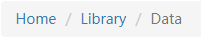
路径导航(面包屑导航)
<ol class="breadcrumb">
 <li><a href="#" rel="external nofollow" rel="external nofollow" rel="external nofollow" rel="external nofollow" rel="external nofollow" rel="external nofollow" rel="external nofollow" rel="external nofollow" rel="external nofollow" rel="external nofollow" rel="external nofollow" rel="external nofollow" rel="external nofollow" rel="external nofollow" rel="external nofollow" rel="external nofollow" rel="external nofollow" rel="external nofollow" rel="external nofollow" rel="external nofollow" rel="external nofollow" >Home</a></li>
 <li><a href="#" rel="external nofollow" rel="external nofollow" rel="external nofollow" rel="external nofollow" rel="external nofollow" rel="external nofollow" rel="external nofollow" rel="external nofollow" rel="external nofollow" rel="external nofollow" rel="external nofollow" rel="external nofollow" rel="external nofollow" rel="external nofollow" rel="external nofollow" rel="external nofollow" rel="external nofollow" rel="external nofollow" rel="external nofollow" rel="external nofollow" rel="external nofollow" >Library</a></li>
 <li class="active">Data</li>
</ol>
样式:
以上所述是小编给大家介绍的bootstrap中的导航条实例代码详解,希望对大家有所帮助,如果大家有任何疑问请给我留言,小编会及时回复大家的。在此也非常感谢大家对脚本之家网站的支持!
如果你觉得本文对你有帮助,欢迎转载,烦请注明出处,谢谢!


