This time there is nothing much to explain. Well, it’s actually hard to explain how you draw bezier curves in Illustrator. I had the urge to do some sketches and I believe I owe it to myself, it’s been too long since I had this kind of fun.
So I grabbed my sketchbook and started drawing. Once my sketch was finished, I scanned it as a grayscale image and placed it into Illustrator (CS2). This is a perfect opportunity to show you how to use the Pen tool in Illustrator and how these bezier curves work.

If you see it it will make more sense, so here is a movie for you to watch me drawing. Hope it's not too long to watch. I actually recorded really everything, including mistakes, bad clicks etc. so you're warned ;-)
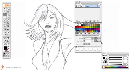
Watch the Bezier at Work (ZIP 16MB) Download QuickTime movie Mirror Server (if the first one is failing)
#p#
Ok! I know a lot of you have been waiting for this very moment. So here it is, part 2, all wrapped up in a (H.264 AKA MPEG-4 Part 10) movie for you to download and watch (14.9 MB). You have to excuse the fact that I often have to drag things back into the movie. I’m using just a small portion of my (big) screen, so the center is way out of the capture area (for example when I zoom in or name the layers).

Oh and again, I'm far from a perfect illustrator, so please ignore my little (bad clicking) mistakes. The idea that everything is been recorded made me a tidy bit nervous :-D
Here is a short overview of what we'll do: Organize the illustration
Drag paths (using the selection indicator in the Layer's Palette) to a separate layer, give the layer a name and lock it. We repeat these steps till the illustration is well organized in different layers. Make sure you respect the stacking order of things. The hair is separated in 2 layers: the hair in front of the face as a layer at the top and the part of the hair that resides behind the body. Start filling each layer
Fill parts of the illustration by selecting the path and selecting a color in the Swatches palette. Or go for the faster and smarter way and use the Live Paint Bucket tool.
Select a group of paths, select the
Live Paint Bucket and click in the paths to make it a Live Paint group (or Object > Live Paint Make). Then select a color and start clicking. You'll notice that you'll be able to give overlapping areas a different color. If you double click the Live Paint bucket, you can also check the 'Strokes' option, this way you'll be able to click on strokes as well and give each part a different stroke width or color.

Even paths with a small gap can be taken care of. Just go to
Object > Live Paint > Gap Options and
define the Gap Detection settings to make sure small gaps are ignored where needed. It is also possible to add new paths to a
Live Paint group.
I have only used the Live Paint for the face in my drawing here, but I have to admit that I'm still getting used to working with this new powerful feature.
You might think that now we've added colors to our illustration it's as good as finished, but look at it it's far from finished. It needs some touching up. We need to finalize it by adding some shadows and highlights etc. This is the most fun part in my opinion because the "before and after" effect can be huge and you get the feeling it is really "finished"... but that's all for part 3 of this tutorial. So look out for the final part soon, in the meantime I hope you find part 2 enjoyable to watch and (hopefully) learn something from it. Download QuickTime movie of part 2 Mirror server (if the first one is failing)
#p#
Some of you remember part 1 and part 2 and have been eager to view part 3. It took me a while to find some free time to work on part 3. Today I have been able to finish my drawing. This part covers the final touch of the illustration. We’ll be adding highlights and shadows and use the Gradient Tool a lot…

The final touch of an illustration improves the illustration a lot. It'll make the illustration more appealing if you spend some attention to details without overdoing it. An illustration style like this is clean but a little depth, light and shadow will make the difference. A bit of face lifting The eyes
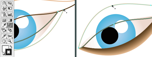
The part of the illustration that needs some extra attention and improving is the face, especially the eyes. First we'll add some smooth shadow effect which gives the impression as if she wears a bit of make up. This effect also adds a bit of depth to the face. First of all I removed the filling and used a stroke. I cut both into 2 parts and gave the outer lines the same color as the face. I made sure there is the same amount of points on both lines, otherwise this could result in some weird effect when using the Blend Tool. Choose the Blend Tool, click a point on the light line then click the equivalent point on the dark line. The neck and mouth
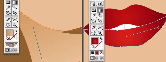
Adding some shadow on the neck will give the illustration extra depth. Make sure you always add shadows in a subtle way, too dark shadows will spoil it and make the illustration too hard. I use a gradient that has the same color of the skin and a bit of darker skin color. First I drew a shape that fits exactly on the neck. I copied the shape of the face and place it in front (command/control + f), then I used the Scissors Tool to cut off the part I don't need and drew the other parts of the path using the Pen Tool. For the lips a subtle red radial gradient is been used (instead of flat red). The hair
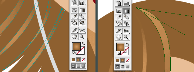
For the hair I added extra paths to give it more color. The color variation in the hair adds extra dimension, detail and it gives the girl also a more 'modern' look. Adding the right eye, adding shadow on her forehead
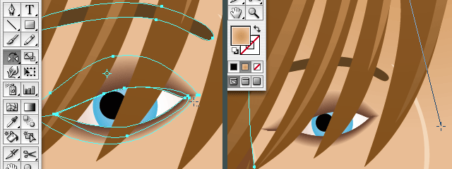
The left eye wasn't drawn yet in part 2, the hair covers her eye, so you could decide to leave it out. However it feels unfinished and a bit odd to me not to draw the left eye. It's also better to finish the right eye first since we will copy it to create the left one. You simply mirror (and if needed, rotate) the eye, except the eyeball of course. To finish her face I've added some shadow and highlights: an extra shape to highlight her nose, same for her left cheek and chin and a radial gradient on the shape of her face to add a bit of shadow on her forehead. Adding extra shadows and highlights
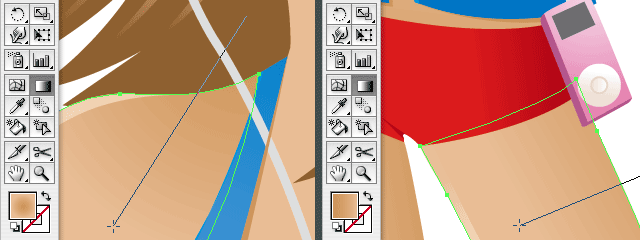
I've added subtle shadows and highlights on her skin and clothes by using subtle gradients or adding a highlight shape, a small line that follows the border. Adding a background
Last but not least I've added a background. Since she's wears a swimsuit (or kind of), I thought of adding the beach in the background. So I added sky, water, sand (with a tiny bit of structure), a beach chair and some boats to finish it off.

The before and after effect
In case you need me to refresh your memory, this is how the illustration looks without any finishing touch. Not bad but far from complete, just basic. Never forget the extra touch. Go the extra mile, but just remember to keep it well balanced.


 Oh and again, I'm far from a perfect illustrator, so please ignore my little (bad clicking) mistakes. The idea that everything is been recorded made me a tidy bit nervous :-D


 The before and after effect