一、横向条纹
如下代码:
CSS Code复制内容到剪贴板
- background: linear-gradient(#fb3 20%, #58a 80%)
上面代码表示整个图片的上部分20%和下部分20%是对应的纯色,只有中间的部分是渐变色。如果让中间的部分逐渐缩小,当中间部分变为0即上下两种颜色的七点和终点相同是,就没有了渐变而变成了两种颜色的色条:
CSS Code复制内容到剪贴板
- background: linear-gradient(#fb3 50%, #58a 50%);
接下来可以通过设置背景的大小,让背景高度变小并且背景默认为repeat,从而出现条纹状
CSS Code复制内容到剪贴板
- background: linear-gradient(#fb3 50%, #58a 50%);
- background-size: 100% 30px;
我们可以不设定第二个颜色的起始位置,设置为0,则浏览器默认为接着上一个颜色开始:
CSS Code复制内容到剪贴板
- background: linear-gradient(#fb3 30%, #58a 0);
- background-size:100% 30px;
这样就形成了一个黄色占30%蓝色占70%的条纹状背景
也可以设置多种颜色,下面设置了三种颜色的条纹:
CSS Code复制内容到剪贴板
- background: linear-gradient(#fb3 33.3%, #58a 0, #58a 66.6%,yellowgreen 0);
- background-size: 100% 45px;
二、竖向条纹
只需要在linear-gradient方法中加一个前缀即可。注意还需颠倒background-size长宽的设定
CSS Code复制内容到剪贴板
- background: linear-gradient(to rightright, #fb3 50%, #58a 0);
- background-size:30px 100%;
三、斜向条纹
可以通过修改background-size的值以及为linear-gradient添加角度来实现斜向的条纹:
background: linear-gradient(45deg, #fb3 50%, #58a 0); //让背景的渐变带有倾斜
background-size:30px 30px; //每一块小组成部分固定宽度和高度
但这样做的结果是只会形成一小块一小块的斜线,而不是整体div的斜线,我们需要以四个小div为一组绘制斜线,添加linear-gradient中的颜色分解:
CSS Code复制内容到剪贴板
- background: linear-gradient(45deg, #fb3 25%, #58a 0, #58a50%, #fb3 0, #fb3 75%, #58a 0);
- background-size:30px 30px;
四、使用repeat-linear-gradient
对于斜线的背景绘制,使用repeat-linear-gradient方法更有效。使用该方法的时候,设置的颜色变化会自动进行重复直到铺满整个div。实例代码如下:
CSS Code复制内容到剪贴板
- background: repeating-linear-gradient(45deg, #fb3, #58a 30px);
通过这种方式可以任意更改角度,而不会出现上中方法中的调节困难
background: repeating-linear-gradient(60deg, #fb3, #fb315px, #58a 0, #58a 30px);
(这种方法其实相当于将size的控制和gradient的控制合到了一起)
五、关于颜色的设定
有时我们希望条纹背景的颜色之间是相近的颜色,但是如果手动设定这个颜色的#很不方便,也很难发现要选择什么样的颜色。可以使用如下方法:
CSS Code复制内容到剪贴板
- background: #58a;
- background-image: repeating-linear-gradient(30deg,
- hsla(0,0%,100%,.1),
- hsla(0,0%,100%,.1)15px,
- transparent 0,transparent 30px);
这种方法的原理是:指定背景中最深的颜色,条文中其他相近色用透明度进行调整
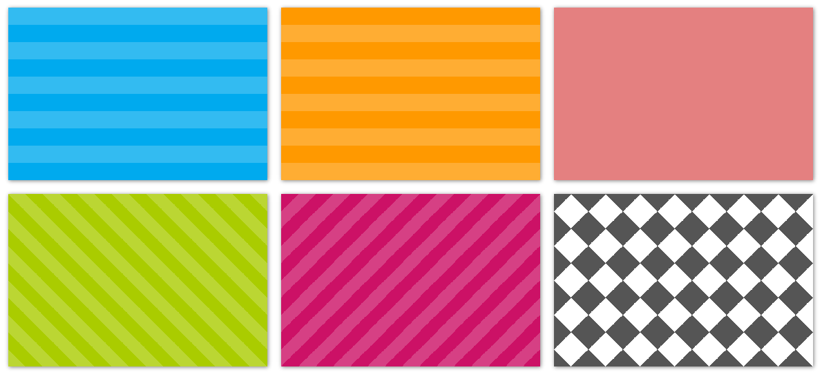
六、综合实例
这里效果图一起放上来了,与下面的样式一一对应:
CSS Code复制内容到剪贴板
- .stripes {
- height: 250px;
- width: 375px;
- float: left;
-
- margin: 10px;
-
- -webkit-background-size: 50px 50px;
- -moz-background-size: 50px 50px;
- background-size: 50px 50px;
-
- -moz-box-shadow: 1px 1px 8px gray;
- -webkit-box-shadow: 1px 1px 8px gray;
- box-shadow: 1px 1px 8px gray;
- }
CSS Code复制内容到剪贴板
- .horizontal {
- background-color: #0ae;
- background-image: -webkit-gradient(linear, 0 0, 0 100%, color-stop(.5, rgba(255, 255, 255, .2)), color-stop(.5, transparent), to(transparent));
- background-image: -moz-linear-gradient(rgba(255, 255, 255, .2) 50%, transparent 50%, transparent);
- background-image: -o-linear-gradient(rgba(255, 255, 255, .2) 50%, transparent 50%, transparent);
- background-image: linear-gradient(rgba(255, 255, 255, .2) 50%, transparent 50%, transparent);
- }
CSS Code复制内容到剪贴板
- .vertical {
- background-color: #f90;
- background-image: -webkit-gradient(linear, 0 0, 100% 0, color-stop(.5, rgba(255, 255, 255, .2)), color-stop(.5, transparent), to(transparent));
- background-image: -moz-linear-gradient(0deg, rgba(255, 255, 255, .2) 50%, transparent 50%, transparent);
- background-image: -o-linear-gradient(0deg, rgba(255, 255, 255, .2) 50%, transparent 50%, transparent);
- background-image: linear-gradient(0deg, rgba(255, 255, 255, .2) 50%, transparent 50%, transparent);
- }
CSS Code复制内容到剪贴板
- .picnic {
- background-color:white;
- background-image: -webkit-gradient(linear, 0 0, 0 100%, color-stop(.5, transparent), color-stop(.5, rgba(200, 0, 0, .5)), to(rgba(200, 0, 0, .5))),
- -webkit-gradient(linear, 0 0, 100% 0, color-stop(.5, transparent), color-stop(.5, rgba(200, 0, 0, .5)), to(rgba(200, 0, 0, .5)));
- background-image: -moz-linear-gradient(transparent 50%, rgba(200, 0, 0, .5) 50%, rgba(200, 0, 0, .5)),
- -moz-linear-gradient(0deg, transparent 50%, rgba(200, 0, 0, .5) 50%, rgba(200, 0, 0, .5));
- background-image: -o-linear-gradient(transparent 50%, rgba(200, 0, 0, .5) 50%, rgba(200, 0, 0, .5)),
- -o-linear-gradient(0deg, transparent 50%, rgba(200, 0, 0, .5) 50%, rgba(200, 0, 0, .5));
- background-image: linear-gradient(transparent 50%, rgba(200, 0, 0, .5) 50%, rgba(200, 0, 0, .5)),
- linear-gradient(0deg, transparent 50%, rgba(200, 0, 0, .5) 50%, rgba(200, 0, 0, .5));
- }
CSS Code复制内容到剪贴板
- .angled-135 {
- background-color: #c16;
- background-image: -webkit-gradient(linear, 0 0, 100% 100%,
- color-stop(.25, rgba(255, 255, 255, .2)), color-stop(.25, transparent),
- color-stop(.5, transparent), color-stop(.5, rgba(255, 255, 255, .2)),
- color-stop(.75, rgba(255, 255, 255, .2)), color-stop(.75, transparent),
- to(transparent));
- background-image: -moz-linear-gradient(-45deg, rgba(255, 255, 255, .2) 25%, transparent 25%,
- transparent 50%, rgba(255, 255, 255, .2) 50%, rgba(255, 255, 255, .2) 75%,
- transparent 75%, transparent);
- background-image: -o-linear-gradient(-45deg, rgba(255, 255, 255, .2) 25%, transparent 25%,
- transparent 50%, rgba(255, 255, 255, .2) 50%, rgba(255, 255, 255, .2) 75%,
- transparent 75%, transparent);
- background-image: linear-gradient(-45deg, rgba(255, 255, 255, .2) 25%, transparent 25%,
- transparent 50%, rgba(255, 255, 255, .2) 50%, rgba(255, 255, 255, .2) 75%,
- transparent 75%, transparent);
- }
CSS Code复制内容到剪贴板
- .checkered {
- background-image: -webkit-gradient(linear, 0 0, 100% 100%, color-stop(.25, #555), color-stop(.25, transparent), to(transparent)),
- -webkit-gradient(linear, 0 100%, 100% 0, color-stop(.25, #555), color-stop(.25, transparent), to(transparent)),
- -webkit-gradient(linear, 0 0, 100% 100%, color-stop(.75, transparent), color-stop(.75, #555)),
- -webkit-gradient(linear, 0 100%, 100% 0, color-stop(.75, transparent), color-stop(.75, #555));
- background-image: -moz-linear-gradient(45deg, #555 25%, transparent 25%, transparent),
- -moz-linear-gradient(-45deg, #555 25%, transparent 25%, transparent),
- -moz-linear-gradient(45deg, transparent 75%, #555 75%),
- -moz-linear-gradient(-45deg, transparent 75%, #555 75%);
- background-image: -o-linear-gradient(45deg, #555 25%, transparent 25%, transparent),
- -o-linear-gradient(-45deg, #555 25%, transparent 25%, transparent),
- -o-linear-gradient(45deg, transparent 75%, #555 75%),
- -o-linear-gradient(-45deg, transparent 75%, #555 75%);
- background-image: linear-gradient(45deg, #555 25%, transparent 25%, transparent),
- linear-gradient(-45deg, #555 25%, transparent 25%, transparent),
- linear-gradient(45deg, transparent 75%, #555 75%),
- linear-gradient(-45deg, transparent 75%, #555 75%);
- }
HTML代码:
XML/HTML Code复制内容到剪贴板
- <div class="horizontal stripes"></div>
- <div class="vertical stripes"></div>
- <div class="picnic stripes"></div>
- <div class="angled stripes"></div>
- <div class="angled-135 stripes"></div>
- <div class="checkered stripes"></div>


