纯HTML+CSS实现阿童木头像
先上最终效果图:
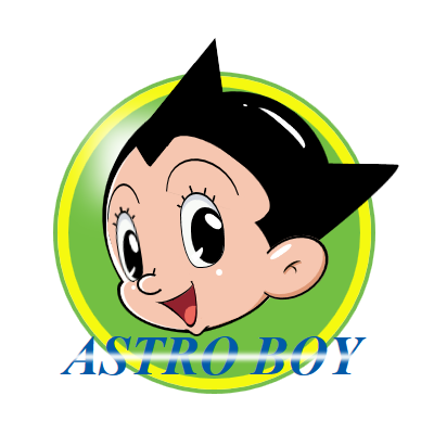
在里面主要用的了CSS中的几个属性:position—定位;border-radius—圆角;box-shadow—阴 影;background(linear-gradient)—渐变;transform—旋转和变换;animation —动画,技术点不是很多,主要是细心和耐心。还是直接上最终源码吧。由于考虑浏览器的CSS兼容性,代码比较多。
CSS Code复制内容到剪贴板
- <!DOCTYPE html>
- <html xmlns="http://www.w3.org/1999/xhtml">
- <head>
- <meta content="text/html; charset=utf-8" http-equiv="Content-Type" />
- <title>纯CSS漫画</title>
- <style type="text/css">
- * {
- margin: 0;
- padding: 0;
- }
-
- .outer-circle {
- position: absolute;
- top: 32px;
- left: 44px;
- width: 289px;
- height: 289px;
- border: 4px solid #75BD4F;
- -moz-border-radius: 50%;
- -webkit-border-radius: 50%;
- border-radius: 50%;
- }
-
- .inner-circle {
- position: relative;
- width: 269px;
- height: 269px;
- border: 10px solid #F5F910;
- -moz-border-radius: 50%;
- -webkit-border-radius: 50%;
- border-radius: 50%;
- background-color: #73BF43;
- }
-
- .inner-circle div {
- position: absolute;
- }
-
- .inner-circle-light {
- top: 41px;
- left: 35px;
- -moz-box-shadow: 26px 26px 29px 37px #fff;
- -webkit-box-shadow: 26px 26px 29px 37px #fff;
- box-shadow: 26px 26px 29px 37px #fff;
- }
-
- .header-top {
- top: 11px;
- rightright: 2px;
- z-index: 100;
- width: 180px;
- height: 90px;
- -moz-border-radius: 90px 90px 0 0;
- -webkit-border-radius: 90px 90px 0 0;
- border-radius: 90px 90px 0 0;
- background-color: #000;
- -moz-transform: rotate(32deg);
- -ms-transform: rotate(32deg);
- -o-transform: rotate(32deg);
- -webkit-transform: rotate(32deg);
- transform: rotate(32deg);
- }
-
- .header-left {
- top: -20px;
- left: 37px;
- width: 114px;
- height: 228px;
- -moz-border-radius: 228px 0 0 228px;
- -webkit-border-radius: 228px 0 0 228px;
- border-radius: 228px 0 0 228px;
- background-color: #000;
- -moz-transform: rotate(26deg);
- -ms-transform: rotate(26deg);
- -o-transform: rotate(26deg);
- -webkit-transform: rotate(26deg);
- transform: rotate(26deg);
- }
-
- .hair-left-1 {
- top: 15px;
- left: 53px;
- z-index: 55;
- width: 85px;
- height: 23px;
- -webkit-border-top-left-radius: 30px 180px;
- border-top-left-radius: 30px 180px;
- -webkit-border-bottom-left-radius: 30px 80px;
- border-bottom-left-radius: 30px 80px;
- background-color: #000;
- -moz-transform: rotate(-74deg) skew(-42deg, 23deg);
- -ms-transform: rotate(-74deg) skew(-42deg, 23deg);
- -o-transform: rotate(-74deg) skew(-42deg, 23deg);
- -webkit-transform: rotate(-74deg) skew(-42deg, 23deg);
- transform: rotate(-74deg) skew(-42deg, 23deg);
- }
-
- .hair-left-2 {
- top: -20px;
- left: 99px;
- z-index: 60;
- width: 49px;
- height: 37px;
- background-color: #000;
- -moz-transform: rotate(-51deg) skew(-43deg, 0deg);
- -ms-transform: rotate(-51deg) skew(-43deg, 0deg);
- -o-transform: rotate(-51deg) skew(-43deg, 0deg);
- -webkit-transform: rotate(-51deg) skew(-43deg, 0deg);
- transform: rotate(-51deg) skew(-43deg, 0deg);
- }
-
- .hair-rightright-1 {
- top: 70px;
- rightright: 1px;
- z-index: 60;
- width: 81px;
- height: 85px;
- -webkit-border-top-rightright-radius: 26px 120px;
- border-top-rightright-radius: 26px 120px;
- background-color: black;
- -moz-transform: rotate(1deg) skew(-51deg, 0deg);
- -ms-transform: rotate(1deg) skew(-51deg, 0deg);
- -o-transform: rotate(1deg) skew(-51deg, 0deg);
- -webkit-transform: rotate(1deg) skew(-51deg, 0deg);
- transform: rotate(1deg) skew(-51deg, 0deg);
- }
-
- .hair-rightright-2 {
- width: 60px;
- height: 10px;
- -webkit-border-bottom-left-radius: 100%;
- border-bottom-left-radius: 100%;
- background-color: rgba(0,0,0,0.2);
- }
-
- .hair-light-1 {
- top: 30px;
- rightright: 45px;
- z-index: 105;
- width: 57px;
- height: 17px;
- -moz-border-radius: 100%;
- -webkit-border-radius: 100%;
- border-radius: 100%;
- background-color: white;
- -moz-transform: rotate(39deg);
- -ms-transform: rotate(39deg);
- -o-transform: rotate(39deg);
- -webkit-transform: rotate(39deg);
- transform: rotate(39deg);
- }
-
- .hair-light-1-over {
- top: 32px;
- rightright: 38px;
- z-index: 105;
- width: 83px;
- height: 21px;
- -moz-border-radius: 100%;
- -webkit-border-radius: 100%;
- border-radius: 100%;
- background-color: black;
- -moz-transform: rotate(41deg);
- -ms-transform: rotate(41deg);
- -o-transform: rotate(41deg);
- -webkit-transform: rotate(41deg);
- transform: rotate(41deg);
- }
-
- .hair-light-2 {
- top: 16px;
- rightright: 104px;
- z-index: 105;
- width: 4px;
- height: 2px;
- -moz-border-radius: 2px;
- -webkit-border-radius: 2px;
- border-radius: 2px;
- background-color: white;
- -moz-transform: rotate(10deg);
- -ms-transform: rotate(10deg);
- -o-transform: rotate(10deg);
- -webkit-transform: rotate(10deg);
- transform: rotate(10deg);
- }
-
- .ear {
- top: 141px;
- rightright: 36px;
- z-index: 110;
- width: 49px;
- height: 48px;
- border: 2px solid #000;
- border-bottom-width: 1px;
- -moz-border-radius: 50%;
- -webkit-border-radius: 50%;
- border-radius: 50%;
- background-color: #F6C6B0;
- -moz-box-shadow: -4px 0 0 0 #de9876 inset;
- -webkit-box-shadow: -4px 0 0 0 #de9876 inset;
- box-shadow: -4px 0 0 0 #de9876 inset;
- -moz-transform: rotate(56deg) scaleY(1.4);
- -ms-transform: rotate(56deg) scaleY(1.4);
- -o-transform: rotate(56deg) scaleY(1.4);
- -webkit-transform: rotate(56deg) scaleY(1.4);
- transform: rotate(56deg) scaleY(1.4);
- }
-
- .ear-inner-1 {
- top: 22px;
- left: 22px;
- z-index: 70;
- width: 9px;
- height: 5px;
- border-top: 1px solid #110b00;
- -moz-border-radius: 50%;
- -webkit-border-radius: 50%;
- border-radius: 50%;
- -moz-transform: rotate(-6deg);
- -ms-transform: rotate(-6deg);
- -o-transform: rotate(-6deg);
- -webkit-transform: rotate(-6deg);
- transform: rotate(-6deg);
- }
-
- .ear-inner-2 {
- top: 19px;
- left: 18px;
- width: 14px;
- height: 7px;
- border-top: 2px solid #110b00;
- -moz-border-radius: 50%;
- -webkit-border-radius: 50%;
- border-radius: 50%;
- -moz-box-shadow: 0px 2px 0 0 #de9876 inset;
- -webkit-box-shadow: 0px 2px 0 0 #de9876 inset;
- box-shadow: 0px 2px 0 0 #de9876 inset;
- -moz-transform: rotate(-91deg);
- -ms-transform: rotate(-91deg);
- -o-transform: rotate(-91deg);
- -webkit-transform: rotate(-91deg);
- transform: rotate(-91deg);
- }
-
- .ear-light {
- top: 21px;
- rightright: 34px;
- z-index: 105;
- width: 17px;
- height: 6px;
- -moz-border-radius: 100%;
- -webkit-border-radius: 100%;
- border-radius: 100%;
- background-color: #FFF;
- -moz-transform: rotate(89deg);
- -ms-transform: rotate(89deg);
- -o-transform: rotate(89deg);
- -webkit-transform: rotate(89deg);
- transform: rotate(89deg);
- }
-
- .ear-over {
- bottombottom: -44px;
- left: -33px;
- z-index: 55;
- width: 69px;
- height: 59px;
- -moz-border-radius: 50%;
- -webkit-border-radius: 50%;
- border-radius: 50%;
- background-color: #f6c6b0;
- -moz-transform: rotate(26deg);
- -ms-transform: rotate(26deg);
- -o-transform: rotate(26deg);
- -webkit-transform: rotate(26deg);
- transform: rotate(26deg);
- }
-
- .face-main {
- top: 30px;
- left: 35px;
- z-index: 50;
- width: 180px;
- height: 188px;
- -moz-border-radius: 90px;
- -webkit-border-radius: 90px;
- border-radius: 90px;
- background-color: #F6C6B0;
- -moz-box-shadow: 3px -3px 0 0 #fff inset;
- -webkit-box-shadow: 3px -3px 0 0 #fff inset;
- box-shadow: 3px -3px 0 0 #fff inset;
- }
-
- .face-top {
- top: 61px;
- rightright: 75px;
- z-index: 105;
- width: 111px;
- height: 46px;
- -moz-border-radius: 50% 50% 26px 0;
- -webkit-border-radius: 50% 50% 26px 0;
- border-radius: 50% 50% 26px 0;
- background-color: #f6c6b0;
- -moz-transform: rotate(37deg);
- -ms-transform: rotate(37deg);
- -o-transform: rotate(37deg);
- -webkit-transform: rotate(37deg);
- transform: rotate(37deg);
- }
-
- .face-rightright-1 {
- top: 115px;
- rightright: 71px;
- z-index: 105;
- width: 68px;
- height: 62px;
- -moz-border-radius: 100% 0 0;
- -webkit-border-radius: 100% 0 0;
- border-radius: 100% 0 0;
- background-color: #f6c6b0;
- -moz-transform: rotate(99deg);
- -ms-transform: rotate(99deg);
- -o-transform: rotate(99deg);
- -webkit-transform: rotate(99deg);
- transform: rotate(99deg);
- }
-
- .face-bottombottom-1 {
- bottombottom: 42px;
- left: 45px;
- z-index: 40;
- width: 72px;
- height: 52px;
- -webkit-border-bottom-left-radius:
CSS配合JavaScript做酷的动态页面效果
利用CSS配合JavaScript的可以做很多更酷的动态页面效果,在本教程的最后给大家简单介绍一下CSS配合JS的应用。首先,要搞清楚事件和动作的概念。在客户端脚本中,JavaScript 通过对事件进行响应来获得与用户的交互。例如,当用户单击一个按钮或者在某段文字上移动鼠标
收藏 0赞 0分享
WEB标准,Web前端开发工程师必备技术列表
想要打造并拥有一流的Web产品开发团队,在团队成员基础能力上一定要下功夫。对于Web前端产品开发来说,仅仅掌握Web1.0时代简单的"网页套接"是完全不够的。我结合自己的团队配备,特此罗列了Web前端产品工程师所涉及的技能列表如下:
通过许多实际项目,
收藏 0赞 0分享
用CSS制作Alpha滤镜测试板
alpha滤镜给制作网页特效提供了较大的创作空间,但由于它控制参数较多,在实际应用时,为了确定一组合适的参数值,不得不反复调整修改,在编辑窗口和预览窗口来回倒腾,甚是麻烦,本文介绍了一种简单的方法。制作一个“Alpha滤镜参数测试板”,在测试板上输入参数
收藏 0赞 0分享
非常流行的所谓的气泡窗口
普通的Alt无法自定义风格,而Sweet Titles通过JS脚本与CSS的集合.自定义了这种伪Alt风格.
前一段时间非常流行的,就所谓的气泡窗口(鼠标移到链接处出现的).
我们这里实现的用的是Sweet Titles的插件.显示效果完全由CSS控制..
先下载Sweet Ti
收藏 0赞 0分享
CSS教程:li和ul标签用法举例
LI代码的格式化:
A).运用CSS格式化列表符: ul li{
list-style-type:none;
}
B).如果你想将列表符换成图像,则: ul li{
list-style-type:none;
list-style-image: url(/blog/images/
收藏 0赞 0分享
CSS教程:CSS中的定位(position)
使用CSS来定位页面内层的位置,一直是比较难以掌握的事情,很多时候,往往被绝对定位的元素,总是以浏览器的左上角为坐标原点,此时,如果浏览器的大小改变,被定义的层就会偏离设计想要的位置,让人很挠头。
其实,要想控制好层的绝对定位,只要理解CSS中关于定位
收藏 0赞 0分享
CSS教程:盒模型(BOX Model)
如果想熟练掌握DIV和CSS的布局方法,首先要对盒模型有足够的了解。每个HTML元素都可以看作一个装了东西的盒子,盒子里面的内容到盒子的边框之间的距离即填充(padding),盒子本身有边框(border),而盒子边框外和其他盒子之间,还有边界(margin),如图1所示。
收藏 0赞 0分享
无延迟翻滚的图形与CSS混合风格按钮
在一个具有图形背景的按钮中添加CSS风格的文本,这种建立按钮的方法结合了具有CSS翻滚(CSS rollover)标记的开发速度和效率,从而有效地提高按钮外表图像的三维效果。
相比于常规的图形按钮,这些图形/CSS混合按钮可易于建立和载入,因为你只需要为空白按钮外面
收藏 0赞 0分享
css里expression实现界面对象的批量控制
用过css样式我们就知道, 可以定义一批对象的class属性来指定同一个样式来统一界面. 但如何统一同类型的对象的事件? 比如:界面有无数个 <img src="**.jpg"> 如何实现鼠标经过此图片, 图片的src变成是**_over.jpg?
收藏 0赞 0分享
CSS教程:水平对齐(text-align)
水平对齐(text-align),用以设定元素内文本的水平对齐方式。
1.语法
text-align具体参数如下:
语法:text-align:left|right|center|justify
说明:设定元素内文本的水平对齐方式。
参数:left:左
收藏 0赞 0分享


