本文实例讲述了纯CSS3实现飘逸洒脱带有飞行效果的三级下拉菜单。分享给大家供大家参考。具体如下:
这是一款纯CSS3实现的飘逸洒脱的飞行菜单,三级下拉菜单,多级菜单,可支持三级,会飞行的子菜单,因为使用CSS3技术,所以您在IE下将看不到效果,测试请用Chrome或火狐等浏览器。
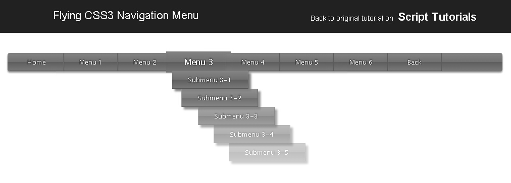
效果描述:把鼠标放在主菜单的任意菜单上,所属的二级菜单就会按次序的飞过来,然后现移上二级菜单任意项,三级菜单会滑开,很棒的菜单效果。
运行效果截图如下:
在线演示地址如下:
http://demo.jb51.net/js/2015/css3-fly-style-3lelvel-down-show-menu-codes/
具体代码如下:
<!DOCTYPE html>
<html lang="en" >
<head>
<meta charset="utf-8" />
<title>飘逸洒脱的纯CSS3飞行菜单,三级下拉菜单</title>
<style>
#nav,#nav ul {
list-style: none outside none;
margin: 0;
padding: 0;
}
#nav {
font-family: "Lucida Sans Unicode",Verdana,Arial,sans-serif;
font-size: 13px;
height: 36px;
list-style: none outside none;
margin: 40px auto;
text-shadow: 0 -1px 3px #202020;
width: 980px;
/* border radius */
-moz-border-radius:4px;
-webkit-border-radius:4px;
border-radius:4px;
/* box shadow */
-moz-box-shadow: 0px 3px 3px #cecece;
-webkit-box-shadow: 0px 3px 3px #cecece;
box-shadow: 0 3px 4px #8b8b8b;
/* gradient */
background-image: -webkit-gradient(linear, left bottom, left top, color-stop(0, #787878), color-stop(0.5, #5E5E5E), color-stop(0.51, #707070), color-stop(1, #838383));
background-image: -moz-linear-gradient(center bottom, #787878 0%, #5E5E5E 50%, #707070 51%, #838383 100%);
background-color:#5f5f5f;
}
#nav ul {
left: -9999px;
position: absolute;
top: -9999px;
z-index: 2;
}
#nav li {
border-bottom: 1px solid #575757;
border-left: 1px solid #929292;
border-right: 1px solid #5d5d5d;
border-top: 1px solid #797979;
display: block;
float: left;
height: 34px;
position: relative;
width: 105px;
}
#nav li:first-child {
border-left: 0 none;
margin-left: 5px;
}
#nav li a {
color: #FFFFFF;
display: block;
line-height: 34px;
outline: medium none;
text-align: center;
text-decoration: none;
/* gradient */
background-image: -webkit-gradient(linear, left bottom, left top, color-stop(0, #787878), color-stop(0.5, #5E5E5E), color-stop(0.51, #707070), color-stop(1, #838383));
background-image: -moz-linear-gradient(center bottom, #787878 0%, #5E5E5E 50%, #707070 51%, #838383 100%);
background-color:#5f5f5f;
}
/* keyframes #animation1 */
@-webkit-keyframes animation1 {
0% {
-webkit-transform: scale(1);
}
30% {
-webkit-transform: scale(1.3);
}
100% {
-webkit-transform: scale(1);
}
}
@-moz-keyframes animation1 {
0% {
-moz-transform: scale(1);
}
30% {
-moz-transform: scale(1.3);
}
100% {
-moz-transform: scale(1);
}
}
#nav li > a:hover {
/* css3 animation */
-moz-animation-name: animation1;
-moz-animation-duration: 0.7s;
-moz-animation-timing-function: linear;
-moz-animation-iteration-count: infinite;
-moz-animation-direction: normal;
-moz-animation-delay: 0;
-moz-animation-play-state: running;
-moz-animation-fill-mode: forwards;
-webkit-animation-name: animation1;
-webkit-animation-duration: 0.7s;
-webkit-animation-timing-function: linear;
-webkit-animation-iteration-count: infinite;
-webkit-animation-direction: normal;
-webkit-animation-delay: 0;
-webkit-animation-play-state: running;
-webkit-animation-fill-mode: forwards;
}
#nav li:hover > a {
z-index: 4;
}
#nav li:hover ul.subs {
left: 0;
top: 34px;
width: 150px;
}
#nav ul li {
background: none repeat scroll 0 0 #838383;
box-shadow: 5px 5px 5px rgba(0, 0, 0, 0.5);
opacity: 0;
width: 100%;
/*-webkit-transition:all 0.3s ease-in-out;
-moz-transition:all 0.3s ease-in-out;
-o-transition:all 0.3s ease-in-out;
-ms-transition:all 0.3s ease-in-out;
transition:all 0.3s ease-in-out;*/
}
/* keyframes #animation2 */
@-webkit-keyframes animation2 {
0% {
margin-left:185px;
}
100% {
margin-left:0px;
opacity:1;
}
}
@-moz-keyframes animation2 {
0% {
margin-left:185px;
}
100% {
margin-left:0px;
opacity:1;
}
}
#nav li:hover ul li {
/* css3 animation */
-moz-animation-name: animation2;
-moz-animation-duration: 0.3s;
-moz-animation-timing-function: linear;
-moz-animation-iteration-count: 1;
-moz-animation-direction: normal;
-moz-animation-delay: 0;
-moz-animation-play-state: running;
-moz-animation-fill-mode: forwards;
-webkit-animation-name: animation2;
-webkit-animation-duration: 0.3s;
-webkit-animation-timing-function: linear;
-webkit-animation-iteration-count: 1;
-webkit-animation-direction: normal;
-webkit-animation-delay: 0;
-webkit-animation-play-state: running;
-webkit-animation-fill-mode: forwards;
/*-webkit-transition:all 0.3s ease-in-out;
-moz-transition:all 0.3s ease-in-out;
-o-transition:all 0.3s ease-in-out;
-ms-transition:all 0.3s ease-in-out;
transition:all 0.3s ease-in-out;*/
}
/* animation delays */
#nav li:hover ul li:nth-child(1) {
-moz-animation-delay: 0;
-webkit-animation-delay: 0;
}
#nav li:hover ul li:nth-child(2) {
-moz-animation-delay: 0.05s;
-webkit-animation-delay: 0.05s;
}
#nav li:hover ul li:nth-child(3) {
-moz-animation-delay: 0.1s;
-webkit-animation-delay: 0.1s;
}
#nav li:hover ul li:nth-child(4) {
-moz-animation-delay: 0.15s;
-webkit-animation-delay: 0.15s;
}
#nav li:hover ul li:nth-child(5) {
-moz-animation-delay: 0.2s;
-webkit-animation-delay: 0.2s;
}
#nav li:hover ul li:nth-child(6) {
-moz-animation-delay: 0.25s;
-webkit-animation-delay: 0.25s;
}
#nav li:hover ul li:nth-child(7) {
-moz-animation-delay: 0.3s;
-webkit-animation-delay: 0.3s;
}
#nav li:hover ul li:nth-child(8) {
-moz-animation-delay: 0.35s;
-webkit-animation-delay: 0.35s;
}
*{
margin:0;
padding:0;
}
body {
font:14px/1.3 Arial,sans-serif;
background-color:#fff;
}
header {
background-color:#212121;
box-shadow: 0 -1px 2px #111111;
color:#fff;
display:block;
height:70px;
position:relative;
width:100%;
z-index:100;
}
header h2{
font-size:22px;
font-weight:normal;
left:50%;
margin-left:-400px;
padding:22px 0;
position:absolute;
width:540px;
}
header a.stuts,a.stuts:visited{
border:none;
text-decoration:none;
color:#fcfcfc;
font-size:14px;
left:50%;
line-height:31px;
margin:23px 0 0 110px;
position:absolute;
top:0;
}
header .stuts span {
font-size:22px;
font-weight:bold;
margin-left:5px;
}
</style>
</head>
<body>
<header>
<h2>Flying CSS3 Navigation Menu</h2>
<a href="/" class="stuts">Back to original tutorial on <span>Script Tutorials</span></a>
</header>
<ul id="nav">
<li><a href="/">Home</a></li>
<li><a class="hsubs" href="#">Menu 1</a>
<ul class="subs">
<li><a href="#">Submenu 1</a></li>
<li><a href="#">Submenu 2</a></li>
<li><a href="#">Submenu 3</a></li>
<li><a href="#">Submenu 4</a></li>
<li><a href="#">Submenu 5</a></li>
</ul>
</li>
<li><a class="hsubs" href="#">Menu 2</a>
<ul class="subs">
<li><a href="#">Submenu 2-1</a></li>
<li><a href="#">Submenu 2-2</a></li>
<li><a href="#">Submenu 2-3</a></li>
<li><a href="#">Submenu 2-4</a></li>
<li><a href="#">Submenu 2-5</a></li>
<li><a href="#">Submenu 2-6</a></li>
<li><a href="#">Submenu 2-7</a></li>
<li><a href="#">Submenu 2-8</a></li>
</ul>
</li>
<li><a class="hsubs" href="#">Menu 3</a>
<ul class="subs">
<li><a href="#">Submenu 3-1</a></li>
<li><a href="#">Submenu 3-2</a></li>
<li><a href="#">Submenu 3-3</a></li>
<li><a href="#">Submenu 3-4</a></li>
<li><a href="#">Submenu 3-5</a></li>
</ul>
</li>
<li><a href="#">Menu 4</a></li>
<li><a href="#">Menu 5</a></li>
<li><a href="#">Menu 6</a></li>
<li><a href="#">Back</a></li>
</ul>
</body>
</html>
希望本文所述对大家的div+css程序设计有所帮助。


