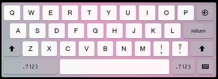
效果预览:
html标签:
<!DOCTYPE html>
<html>
<head>
<meta charset="utf-8" />
<title>CSS3 KeyBoard</title>
<link rel="stylesheet" href="font.css" type="text/css" >
<link rel="stylesheet" href="style.css" type="text/css" >
</head>
<body>
<ul>
<li>Q</li>
<li>W</li>
<li>E</li>
<li>R</li>
<li>T</li>
<li>Y</li>
<li>U</li>
<li>I</li>
<li>O</li>
<li>P</li>
<li class="icon">?</li>
<li>A</li>
<li>S</li>
<li>D</li>
<li>F</li>
<li>G</li>
<li>H</li>
<li>J</li>
<li>K</li>
<li>L</li>
<li>return</li>
<li class="icon">?</li>
<li>Z</li>
<li>X</li>
<li>C</li>
<li>V</li>
<li>B</li>
<li>N</li>
<li>M</li>
<li><span>!</span><span>,</span></li>
<li><span>?</span><span>.</span></li>
<li class="icon">?</li>
<li>.?123</li>
<li></li>
<li>.?123</li>
<li class="icon">?</li>
</ul>
</body>
</html>
CSS代码:
@font-face {
font-family: 'icomoon';
src:url('http://upimage-img.stor.sinaapp.com/icomoon.eot');
src:url('http://upimage-img.stor.sinaapp.com/icomoon.eot?#iefix') format('embedded-opentype'),
url('http://upimage-img.stor.sinaapp.com/icomoon.woff') format('woff'),
url('http://upimage-img.stor.sinaapp.com/icomoon.ttf') format('truetype'),
url('http://upimage-img.stor.sinaapp.com/icomoon.svg#icomoon') format('svg');
font-weight: normal;
font-style: normal;
}
body {
background-color: #000;
}
ul, li {
list-style: none;
margin: 0;
padding: 0;
-webkit-user-select: none;
-moz-user-select: none;
-ms-user-select: none;
user-select: none;
}
ul {
width: 704px;
background: linear-gradient(60deg, rgba(158,180,185,1), rgba(222,157,193,1) 50%, rgba(169,156,173,1) 100%);
padding-left: 8px;
border-radius: 5px;
padding-top: 10px;
}
ul::after {
content: "";
display: table;
clear: both;
}
li {
font-family: "Vrinda";
width: 54px;
height: 50px;
line-height: 50px;
background-color: rgba(255,255,255,.9);
border-radius: 5px;
float: left;
text-align: center;
font-size: 24px;
vertical-align: text-top;
margin-right: 10px;
margin-bottom: 10px;
box-shadow: 0 1px 0 rgba(0,0,0,.5);
cursor: pointer;
position: relative;
}
li:active {
box-shadow: inset 0 1px 0 rgba(0,0,0,.5);
top:1px;
}
.icon {
font-family: "icomoon";
}
li:nth-child(11), li:nth-child(21), li:nth-child(22),
li:nth-child(32), li:nth-child(33), li:nth-child(35), li:nth-child(36) {
background: rgba(188,188,188,.5);
font-size: 20px;
}
li:nth-child(12) {
margin-left: 20px;
}
li:nth-child(21) {
width: 98px;
}
li:nth-child(n+22) {
width: 52px;
}
li:nth-child(32) {
width: 74px;
}
li:nth-child(33) {
width: 176px;
}
li:nth-child(34) {
width: 362px;
}
li:nth-child(35) {
width: 74px;
}
li:nth-child(31), li:nth-child(30) {
box-sizing: border-box;
padding-top: 14px;
}
li:nth-child(31) span, li:nth-child(30) span {
display: block;
line-height: 0.5;
}


