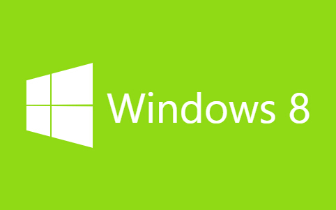
今天给大家分享一款纯css3实现的win8加载动画。在这款实例中动画效果完全由css3实现。一起看下效果图:
实现的代码。
html代码:
<div class="wrapp">
<div class="text">
<h1>
Windows 8</h1>
</div>
<div class="logo">
<span class="top-left"></span><span class="bottom-right"></span>
</div>
</div>
css3代码:
body{
margin: 0;
padding: 0;
background-color: #90da15;
}
.wrapp{
position: absolute;
top: 50%;
left: 50%;
width: 600px;
height: 300px;
margin: -150px 0 0 -300px;
-webkit-perspective: 30px;
-webkit-transform: translateX(0px);
-webkit-animation: wrapp 400ms 800ms ease-in forwards;</p>
<p> -moz-perspective: 30px;
-moz-transform: translateX(0px);
-moz-animation: wrapp 400ms 800ms ease-in forwards;</p>
<p> -ms-perspective: 30px;
-ms-transform: translateX(0px);
-ms-animation: wrapp 400ms 800ms ease-in forwards;</p>
<p> perspective: 30px;
transform: translateX(0px);
animation: wrapp 400ms 800ms ease-in forwards;
}
.text{
position: absolute;
top: 50%;
left: 50%;
width: 0px;
height: 60px;
margin: -30px 0 0 -160px;
overflow: hidden;
-webkit-transform: translateX(0px);
-webkit-animation: text 400ms 800ms linear forwards;</p>
<p> -moz-transform: translateX(0px);
-moz-animation: text 400ms 800ms linear forwards;</p>
<p> -ms-transform: translateX(0px);
-ms-animation: text 400ms 800ms linear forwards;</p>
<p> transform: translateX(0px);
animation: text 400ms 800ms linear forwards;
}
h1{
float: right;
font-family: "Segoe UI", Frutiger, "Frutiger Linotype", "Dejavu Sans", "Helvetica Neue", Arial, sans-serif;
font-weight: normal;
color: #fff;
padding: 0;
margin: 0;
width: 320px;
height: 60px;
font-size: 60px;
line-height: 60px;
}
.logo{
position: absolute;
top: 50%;
left: 50%;
width: 90px;
height: 90px;
margin: -45px 0 0 -45px;
background-color: #fff;
-webkit-transform: translateX(0px) rotateY(10deg);
-webkit-animation: logo 500ms 300ms ease-out forwards;</p>
<p> -moz-transform: translateX(0px) rotateY(10deg);
-moz-animation: logo 500ms 300ms ease-out forwards;</p>
<p> -ms-transform: translateX(0px) rotateY(10deg);
-ms-animation: logo 500ms 300ms ease-out forwards;</p>
<p> transform: translateX(0px) rotateY(10deg);
animation: logo 500ms 300ms ease-out forwards;
}
.logo .top-left{
position: absolute;
top: 0;
left: 0;
width: 44px;
height: 44px;
border-right: solid 2px #90da15;
border-bottom: solid 2px #90da15;
}
.logo .bottom-right{
position: absolute;
bottom: 0;
right: 0;
width: 44px;
height: 44px;
border-left: solid 2px #90da15;
border-top: solid 2px #90da15;
}</p>
<p>@-webkit-keyframes logo {
from {
-webkit-transform: translateX(0px) rotateY(10deg);
}
to {
-webkit-transform: translateX(0px) rotateY(-10deg);
}
}
@-webkit-keyframes text {
from {
width: 0px;
-webkit-transform: translateX(0px);
}
60%{
width: 0px;
}
to {
width: 320px;
-webkit-transform: translateX(240px);
}
}
@-webkit-keyframes wrapp {
from {
-webkit-transform: translateX(0px);
}
to {
-webkit-transform: translateX(-200px);
}
}
@-moz-keyframes logo {
from {
-moz-transform: translateX(0px) rotateY(10deg);
}
to {
-moz-transform: translateX(0px) rotateY(-10deg);
}
}
@-moz-keyframes text {
from {
width: 0px;
-moz-transform: translateX(0px);
}
60%{
width: 0px;
}
to {
width: 320px;
-moz-transform: translateX(240px);
}
}
@-moz-keyframes wrapp {
from {
-moz-transform: translateX(0px);
}
to {
-moz-transform: translateX(-200px);
}
}</p>
<p>@-ms-keyframes logo {
from {
-ms-transform: translateX(0px) rotateY(10deg);
}
to {
-ms-transform: translateX(0px) rotateY(-10deg);
}
}
@-ms-keyframes text {
from {
width: 0px;
-ms-transform: translateX(0px);
}
60%{
width: 0px;
}
to {
width: 320px;
-ms-transform: translateX(240px);
}
}
@-ms-keyframes wrapp {
from {
-ms-transform: translateX(0px);
}
to {
-ms-transform: translateX(-200px);
}
}
@keyframes logo {
from {
transform: translateX(0px) rotateY(10deg);
}
to {
transform: translateX(0px) rotateY(-10deg);
}
}
@keyframes text {
from {
width: 0px;
transform: translateX(0px);
}
60%{
width: 0px;
}
to {
width: 320px;
transform: translateX(240px);
}
}
@keyframes wrapp {
from {
transform: translateX(0px);
}
to {
transform: translateX(-200px);
}
}
是不是很炫酷呢,小伙伴们自己动手制作一个试试手吧。


