这是一个响应式设计的菜单。单击列表图标,当你显示屏大小可以完全水平放下所有菜单项时,菜单水平显示(如图1)。当你的显示屏不能水平放置所有菜单项时,菜单垂直显示(如图2)。 而且显示的时候是以动画的型式显示。效果相当的好。
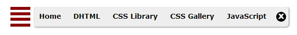
图1
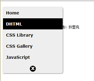
图2
下面是实现的代码。
html代码:
XML/HTML Code复制内容到剪贴板
- <div class="container">
- <!--[if lte IE 8]>
- <style>
-
- .iconicmenu > label{
- border-width: 7px;
- background: #eee;
- }
-
- .iconicmenu:hover ul{
- left: 8px; /* show menu onmouseover in IE8 and below */
- }
-
- </style>
- <![endif]-->
- <div class="iconicmenu">
- <input type="checkbox" id="togglebox" />
- <ul>
- <li><a targe="_blank" href="https://www.jb51.net/Shili/css3%E8%8F%9C%E5%8D%95">Home</a></li>
- <li><a targe="_blank" href="https://www.jb51.net/Shili/css3%E8%8F%9C%E5%8D%95">DHTML</a></li>
- <li><a targe="_blank" href="https://www.jb51.net/Shili/css3%E8%8F%9C%E5%8D%95">CSS Library</a></li>
- <li><a targe="_blank" href="https://www.jb51.net/Shili/css3%E8%8F%9C%E5%8D%95">CSS Gallery</a></li>
- <li><a targe="_blank" href="https://www.jb51.net/Shili/css3%E8%8F%9C%E5%8D%95">JavaScript</a></li>
- <li>
- <label for="togglebox">
- </label>
- </li>
- </ul>
- <label class="toggler" for="togglebox">
- Menu</label>
- </div>
- </div>
这里加入了兼容ie8的hack 。
css代码:
以上就是一个纯用css3实现的菜单,是不是很简单呢,谢谢阅读,希望能帮到大家,请继续关注脚本之家,我们会努力分享更多优秀的文章。


