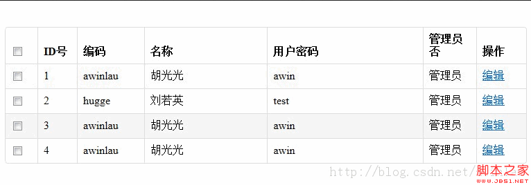
先看效果图:
CSS:
<style type="text/css">
table {
max-width: 100%;
background-color: transparent;
border-collapse: collapse;
border-spacing: 0;
}
.table {
width: 100%;
margin-bottom: 18px;
}
.table th, .table td {
padding: 8px;
line-height: 18px;
text-align: left;
vertical-align: top;
border-top: 1px solid #dddddd;
}
.table th {
font-weight: bold;
}
.table thead th {
vertical-align: bottom;
}
.table caption + thead tr:first-child th, .table caption + thead tr:first-child td, .table colgroup + thead tr:first-child th, .table colgroup + thead tr:first-child td, .table thead:first-child tr:first-child th, .table thead:first-child tr:first-child td {
border-top: 0;
}
.table tbody + tbody {
border-top: 2px solid #dddddd;
}
.table-condensed th, .table-condensed td {
padding: 4px 5px;
}
.table-bordered {
border: 1px solid #dddddd;
border-collapse: separate;
*border-collapse: collapsed;
border-left: 0;
-webkit-border-radius: 4px;
-moz-border-radius: 4px;
border-radius: 4px;
}
.table-bordered th, .table-bordered td {
border-left: 1px solid #dddddd;
}
.table-bordered caption + thead tr:first-child th, .table-bordered caption + tbody tr:first-child th, .table-bordered caption + tbody tr:first-child td, .table-bordered colgroup + thead tr:first-child th, .table-bordered colgroup + tbody tr:first-child th, .table-bordered colgroup + tbody tr:first-child td, .table-bordered thead:first-child tr:first-child th, .table-bordered tbody:first-child tr:first-child th, .table-bordered tbody:first-child tr:first-child td {
border-top: 0;
}
.table-bordered thead:first-child tr:first-child th:first-child, .table-bordered tbody:first-child tr:first-child td:first-child {
-webkit-border-top-left-radius: 4px;
border-top-left-radius: 4px;
-moz-border-radius-topleft: 4px;
}
.table-bordered thead:first-child tr:first-child th:last-child, .table-bordered tbody:first-child tr:first-child td:last-child {
-webkit-border-top-right-radius: 4px;
border-top-right-radius: 4px;
-moz-border-radius-topright: 4px;
}
.table-bordered thead:last-child tr:last-child th:first-child, .table-bordered tbody:last-child tr:last-child td:first-child {
-webkit-border-radius: 0 0 0 4px;
-moz-border-radius: 0 0 0 4px;
border-radius: 0 0 0 4px;
-webkit-border-bottom-left-radius: 4px;
border-bottom-left-radius: 4px;
-moz-border-radius-bottomleft: 4px;
}
.table-bordered thead:last-child tr:last-child th:last-child, .table-bordered tbody:last-child tr:last-child td:last-child {
-webkit-border-bottom-right-radius: 4px;
border-bottom-right-radius: 4px;
-moz-border-radius-bottomright: 4px;
}
.table-striped tbody tr:nth-child(odd) td, .table-striped tbody tr:nth-child(odd) th {
background-color: #f9f9f9;
}
.table tbody tr:hover td, .table tbody tr:hover th {
background-color: #f5f5f5;
}
</style>
再看表格引用:
<table class="table table-bordered table-striped ">
<thead>
<tr>
<th width="30"> <input type="checkbox" name="ckall" id="ckall" />
</th>
<th width="40"> ID号 </th>
<th width="80"> 编码 </th>
<th> 名称 </th>
<th> 用户密码 </th>
<th width="60"> 管理员否 </th>
<th width="55"> 操作 </th>
</tr>
</thead>
<tr>
<td><input type="checkbox" name="c_id" value="a" /></td>
<td>1</td>
<td>awinlau</td>
<td> 胡光光</td>
<td> awin</td>
<td> 管理员 </td>
<td><a href="#" class="btn btn-mini"><i class="icon-edit"> </i>编辑</a></td>
</tr>
<tr>
<td><input type="checkbox" name="c_id" value="a" /></td>
<td>2</td>
<td>hugge</td>
<td> 刘若英</td>
<td> test</td>
<td> 管理员 </td>
<td><a href="#" class="btn btn-mini"><i class="icon-edit"> </i>编辑</a></td>
</tr>
<tr>
<td><input type="checkbox" name="c_id" value="a" /></td>
<td>3</td>
<td>awinlau</td>
<td> 胡光光</td>
<td> awin</td>
<td> 管理员 </td>
<td><a href="#" class="btn btn-mini"><i class="icon-edit"> </i>编辑</a></td>
</tr>
<tr>
<td><input type="checkbox" name="c_id" value="a" /></td>
<td>4</td>
<td>awinlau</td>
<td> 胡光光</td>
<td> awin</td>
<td> 管理员 </td>
<td><a href="#" class="btn btn-mini"><i class="icon-edit"> </i>编辑</a></td>
</tr>
</table>


