效果图如下:
源码如下:
<!doctype html>
<html>
<head>
<meta content="text/html;charset=utf-8" http-equiv="content-type" />
<link rel="stylesheet" href="bubble.css" />
<link rel="stylesheet" href="css.css" />
</head>
<body>
<div id="wraper1">
<div style="height:20px;" ></div>
<div style="text-align: left;padding-left:20px">
<div class="bubble">
<div class="content">
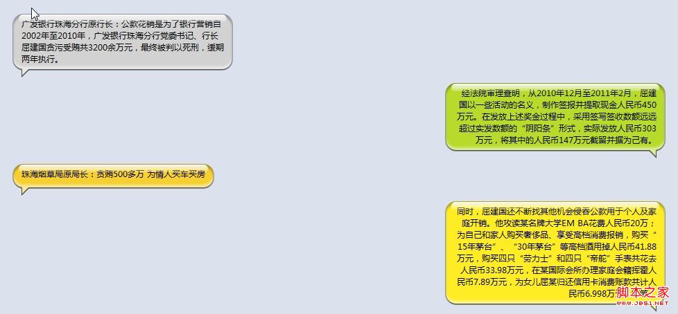
广发银行珠海分行原行长:公款花销是为了银行营销自2002年至2010年,广发银行珠海分行党委书记、行长屈建国贪污受贿共3200余万元,最终被判以死刑,缓期两年执行。
</div>
</div>
</div>
</div>
<div id="wraper2">
<div style="text-align: right;padding-right:20px;">
<div class="bubble">
<div class="content"> 经法院审理查明,从2010年12月至2011年2月,屈建国以一些活动的名义,制作签报并提取现金人民币450万元。在发放上述奖金过程中,采用签写签收数额远远超过实发数额的“阴阳条”形式,实际发放人民币303万元,将其中的人民币147万元截留并据为己有。
</div>
</div>
</div>
</div>
<div id="wraper3">
<div style="text-align: left;padding-left:20px">
<div class="bubble">
<div class="content">
珠海烟草局原局长:贪贿500多万 为情人买车买房
</div>
</div>
</div>
</div>
<div id="wraper4">
<div style="text-align: right;padding-right:20px;">
<div class="bubble">
<div class="content">
同时,屈建国还不断找其他机会侵吞公款用于个人及家庭开销。他攻读某名牌大学EM BA花费人民币20万;为自己和家人购买奢侈品、享受高档消费报销,购买“15年茅台”、“30年茅台”等高档酒用掉人民币41.88万元,购买四只“劳力士”和四只“帝舵”手表共花去人民币33.98万元,在某国际会所办理家庭会籍挥霍人民币7.89万元,为女儿屈某归还信用卡消费账款共计人民币6.998万元;等等。
</div>
</div>
</div>
</div>
</body>
</html>
bubble.css:
#wraper1,
#wraper2,
#wraper3,
#wraper4 {
color: #000;
position: relative;
width: 100%;
background: #dbe2ed;
}
.bubble {
position: relative;
display: inline-block;
min-width: 30px;
max-width: 300px;
word-break: break-all;
word-wrap: break-word;
min-height: 22px;
background: #d2d2d2;
border-radius: 15px;
margin-bottom: 20px;
padding: 6px 8px;
-webkit-box-shadow: 0px 1px 2px #000, inset 0px 4px 4px rgba(0,0,0,.3), inset 0px -4px 4px rgba(255,255,255,.5);
-moz-shadow: 0px 1px 2px #000, inset 0px 4px 4px rgba(0,0,0,.3), inset 0px -4px 4px rgba(255,255,255,.5);
box-shadow: 0px 1px 2px #000, inset 0px 4px 4px rgba(0,0,0,.3), inset 0px -4px 4px rgba(255,255,255,.5);
}
.bubble:before {
content: '';
display: block;
font-size: 0;
width: 0;
height: 0;
border-width: 6px;
position: absolute;
bottom: -12px;
left: 12px;
border-color: #4a4c50 transparent transparent #4a4c50;
border-style: solid dashed dashed solid;
}
.bubble:after {
content: '';
display: block;
font-size: 0;
position: absolute;
bottom: -9px;
left: 13px;
width: 0;
height: 0;
border-width: 5px;
border-color: #e8e8e8 transparent transparent #e8e8e8;
border-style: solid dashed dashed solid;
}
.bubble .content {
position: relative;
padding: 0 4px;
}
.bubble .content:before {
content: '';
position: absolute;
margin: auto;
top: -5px;
left: 0;
width: 100%;
height: 12px;
background-image: -webkit-linear-gradient(top, rgba(255,255,255,1) 0%, rgba(255,255,255,0.2) 90%, rgba(255,255,255,0) 90% );
background-image: -moz-linear-gradient(top, rgba(255,255,255,1) 0%, rgba(255,255,255,0.2) 90%, rgba(255,255,255,0) 90% );
border-radius: 10px
}
/**
* 绿色气泡
*/
#wraper2 .bubble {
background: #b7da2b;
}
#wraper2 .bubble:before {
left: auto;
right: 12px;
border-color: #4a4c50 #4a4c50 transparent transparent;
border-style: solid solid dashed dashed;
}
#wraper2 .bubble:after {
left: auto;
right: 13px;
border-color: #daec93 #daec93 transparent transparent;
border-style: solid solid dashed dashed;
}
/**
* 橙色气泡
*/
#wraper3 .bubble {
background: #f6d031;
}
#wraper3 .bubble:after {
border-color: #fae796 transparent transparent #fae796;
border-style: solid dashed dashed solid;
}
/**
* 黄色气泡
*/
#wraper4 .bubble {
background: #feed24;
}
#wraper4 .bubble:before {
left: auto;
right: 12px;
border-color: #4a4c50 #4a4c50 transparent transparent;
border-style: solid solid dashed dashed;
}
#wraper4 .bubble:after {
left: auto;
right: 13px;
border-color: #fef690 #fef690 transparent transparent;
border-style: solid solid dashed dashed;
}
css.css:
body {
width: 980px;
margin: 0 auto;
font-family: "微软雅黑";
color: #7d7d7d;
}
img {
border: 0;
}
h1, h2 {
text-align: center;
position: relative;
}
h1 {
color: #0092d3;
}
h2 {
color: #53bde8;
}
h3, h4, h5, h6 {
margin: 0;
}
ul, ol, li {
margin: 0;
padding: 0;
text-align: left;
vertical-align: top;
}
li * {
vertical-align: middle;
}
a {
color: #7d7d7d;
}
a:hover {
color: #000;
}
.indent {
margin-left: 2em;
}
.footer {
text-align: right;
font-size: 12px;
}
h1 img {
vertical-align: middle;
}
.code {
margin-left: 2em;
background-color: #aaa;
border-radius: 5px;
padding: 5px;
font-size: 14px;
color: #fff;
}


