
前几天看到一篇文章是写用css3绘制腾讯企鹅的。趁着今天有空,就用css3来写一个百度的小度熊。话不多说,开始上码。
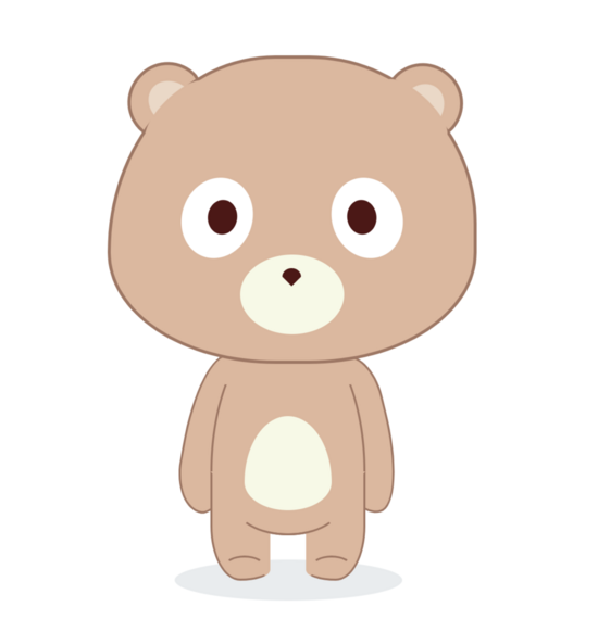
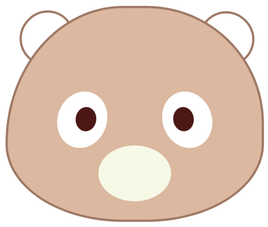
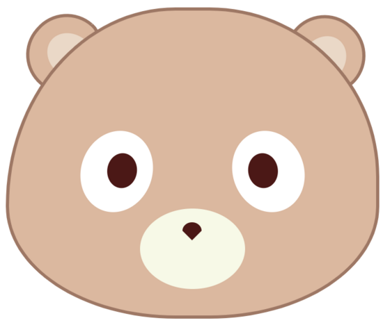
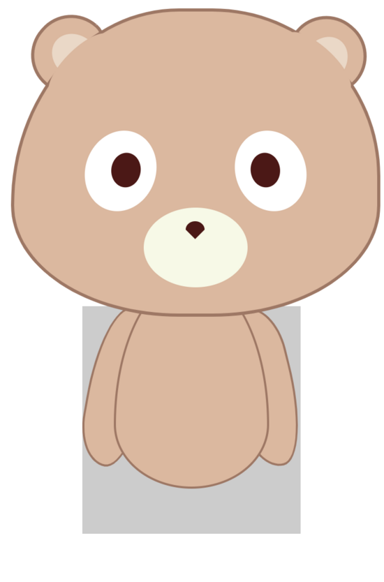
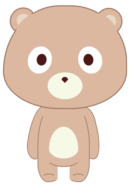
爆照
先来一张呆萌小度熊的成果照。
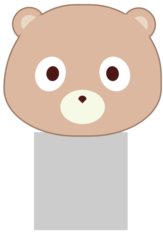
在绘制小度熊之前,首先要对小度熊布局上进行一个分解,便于我们组织代码结构。 从整体结构上主要分成耳朵,头部和身体。我们统一对将胳膊,肚子和腿都放到了身体的部分里。
<!-- 页面框架 -->
<!Doctype html>
<html>
<head>
    <meta name="viewport" content="width=device-width, initial-scale=1.0,maximum-scale=1.0, user-scalable=no"/>
    <title>纯css度熊</title>
    <link rel="stylesheet" href="./bear.css"/>
</head>
<body>
    <!-- 背景 -->
    <div class="bac">
        <!-- 头部 -->
            <!-- 耳朵 -->
            <div class="earLeft"></div>
            <div class="earRight"></div>
            <!-- 脸 -->
            <div class="head"></div>
        <!-- 身体 -->
        <div class="body">
            <!-- 胳膊 -->
            <div class="armLeft"></div>
            <div class="armRight"></div>
            <!-- 肚子 -->
            <div class="tummy"></div>
            <!-- 腿 -->
            <div class="legLeft"></div>
            <div class="legRight"></div>
        </div>
        <!-- 阴影 -->
        <div class="shaodw"></div>
    </div>
</body>
结构调整好之后,我们先把背景容器的位置和大小设置一下。在开发的时候,可以先给背景设置一个深色背景,便于我们看各部分的位置,最后的时候注释掉就可以了。
/*背景容器*/
.bac {
    width: 345px;
    height: 500px;
    top: 50%;
    position: relative;
    left: 50%;
    transform: translate(-50%,-50%);
    /* background-color: #333333; */
 }
头部
然后我们就可以在容器中,放置各个部分了,我是按从上到下的顺序写的,所以最开始放置的是头部。
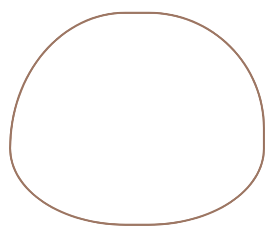
/*头部*/
.bac .head {
    width: 346px;
    height: 288px;
    /* background-color: #e1b79b; */
    border: 3px solid #a57662;
    border-radius: 50% 50% 50% 50% / 70% 60% 40% 40%;
    position: relative;
    z-index: 88;
  }
知识点来了,怎么样可以画出这种不规则的形状呢?绘制这种带有弧线的形状,可以使用border-radius属性,具体使用方法这里不深入讨论,简单来说通过设置元素的border-radius值,可以轻松给元素设置圆角边框,甚至实现绘制圆、半圆、四分之一的圆等各种圆角图形。因为我没有准确的尺寸图,所以就用百分比来实现了。
“/”前的四个数值表示圆角的水平半径,后面四个值表示圆角的垂直半径。这个方法我们在后面还会很频繁的使用到。
耳朵
绘制完头部轮廓之后,我们可以把耳朵的轮廓也加上,本来计划是将耳朵写在头部
内部的,但是因为要考虑层级压盖的情况,还是把耳朵要素单独的放在了外面。这里有一个关键属性就是transform: rotate(Xdeg)用来对要素做旋转,我们可以将耳朵旋转成对应的角度。
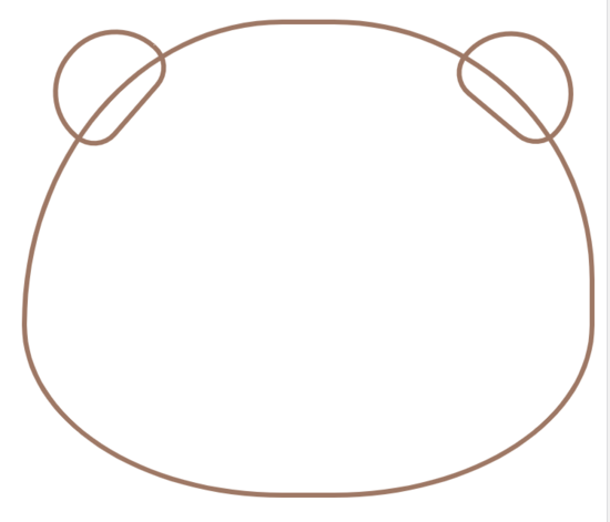
/*左耳朵*/
.earLeft {
    height: 50px;
    width: 70px;
    /* background-color: #e1b79b; */
    border-radius: 200px 200px 100px 100px;
    border: 3px solid #a57662;
    transform: rotate(-49deg);
    position: absolute;
    top: 10px;
    left: 12px;
}

/*右耳朵*/
.earRight {
    height: 50px;
    width: 70px;
    /* background-color: #e1b79b; */
    border-radius: 200px 200px 100px 100px;
    border: 3px solid #a57662;
    transform: rotate(40deg);
    position: absolute;
    top: 10px;
    right: 0;
}
眼睛
接下来就开始填充绘制头部里面的内容,头部里面主要是眼睛,鼻子和嘴巴,我们先来画眼睛,为了看的清楚,我们就把头部填充上颜色了。
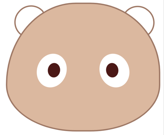
/*左眼白*/
.head .eyeLeft {
    height: 78px;
    width: 67px;
    background-color: #ffffff;
    border-radius: 50% / 50%;
    transform: rotate(20deg);
    position: absolute;
    top: 113px;
    left: 68px;
 }

 /*左眼珠*/
 .head .eyeConLeft {
    width: 28px;
    height: 33px;
    background-color: #511313;
    position: absolute;
    border-radius: 50%/50%;
    transform: rotate(-13deg);
    top: 20px;
    right: 15px;
 }

 /*右眼白*/
 .head .eyeRight {
    height: 78px;
    width: 67px;
    background-color: #ffffff;
    border-radius: 50% / 50%;
    transform: rotate(-20deg);
    position: absolute;
    top: 113px;
    right: 68px;
 }

 /*右眼珠*/
 .head .eyeConRight {
    width: 28px;
    height: 33px;
    background-color: #511313;
    position: absolute;
    border-radius: 50%/50%;
    transform: rotate(13deg);
    top: 20px;
    left: 15px;
}
嘴巴
绘制了眼睛之后,我们来绘制嘴巴,嘴巴没有太特殊的地方,我们用正常椭圆就可以。
/*嘴巴*/
.head .mouse {
    width: 99px;
    height: 76px;
    background-color: #f7f9e5;
    position: absolute;
    left: 50%;
    transform: translate(-50%,0);
    border-radius: 50% / 50%;
    top: 187px;
 }
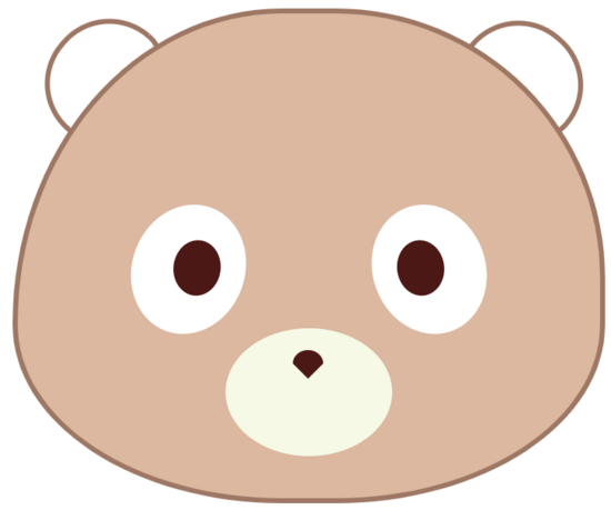
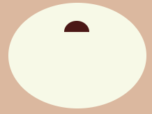
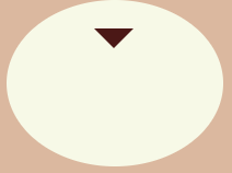
鼻子
虽然嘴巴就是一个普通的椭圆,但是鼻子比较特殊,鼻子我们可以看作是一个半椭圆+三角形组成。
知识点又来了,怎么样用css画半椭圆和三角形呢?
我们可以利用 border-radius: 50%/100% 100% 0 0; 来实现半椭圆的绘制。
我们利用将width和height设置为0,通过border属性来实现三角形的绘制。
我为了操作方便,在给鼻子设置来一个容器,使其居中,便于调整。
/*鼻子容器*/
.head .nose {
    width: 18px;
    height: 14px;
    position: absolute;
    left: 50%;
    margin-left: -9px;
    top: 13px;
}

/* 鼻子上部分-半椭圆*/
.nose .noseTop {
    width: 18px;
    height: 8px;
    background-color: #511313;
    border-radius: 50%/100% 100% 0 0;
 }

 /* 鼻子下部分-三角形*/
 .nose .noseBottom {
    width: 0;
    height: 0;
    border-width: 9px 9px 0;
    border-style: solid;
    border-color: #511313 transparent transparent;
    position: relative;
 }
耳朵内部
终于完成了头部的操作,结果发现耳朵少了点什么,原来耳朵少了内部的要素,我们就分别给耳朵内部加点东西。
/* 左耳朵内部*/
.earLeft .earCon {
    width: 40px;
    height: 60px;
    background-color: #eed8c5;
    border-radius: 50%/ 40% 40% 30% 30%;
    margin-left: 17px;
    margin-top: 15px;
    transform: rotate(-3deg);
 }

 /*右耳朵内部*/
 .earRight .earCon {
    width: 40px;
    height: 60px;
    background-color: #eed8c5;
    border-radius: 50%/ 40% 40% 30% 30%;
    margin-left: 17px;
    margin-top: 15px;
    transform: rotate(-3deg);
 }
辅助要素
小度熊的头部绘制完了,但是耳朵的地方还不够完美,因为头部的轮廓线把耳朵遮住了,我们想让头部和耳朵连在一起,这就用到了我们的辅助要素。我们可以把辅助要素设置成和头部一样的颜色,将头部与耳朵间的轮廓线盖住,这样就看起来好多了。
/*左侧辅助要素*/
.head .arcLeft {
    position: absolute;
    top: 36px;
    left: 23px;
    width: 80px;
    height: 30px;
    background-color: #e1b79b;
    border-radius: 50%/ 50%;
    transform: rotate(-45deg);
}

/*右侧辅助要素*/
.head .arcRight {
    position: absolute;
    top: 34px;
    right: 16px;
    width: 80px;
    height: 30px;
    background-color: #e1b79b;
    border-radius: 50%/ 50%;
    transform: rotate(43deg);
}
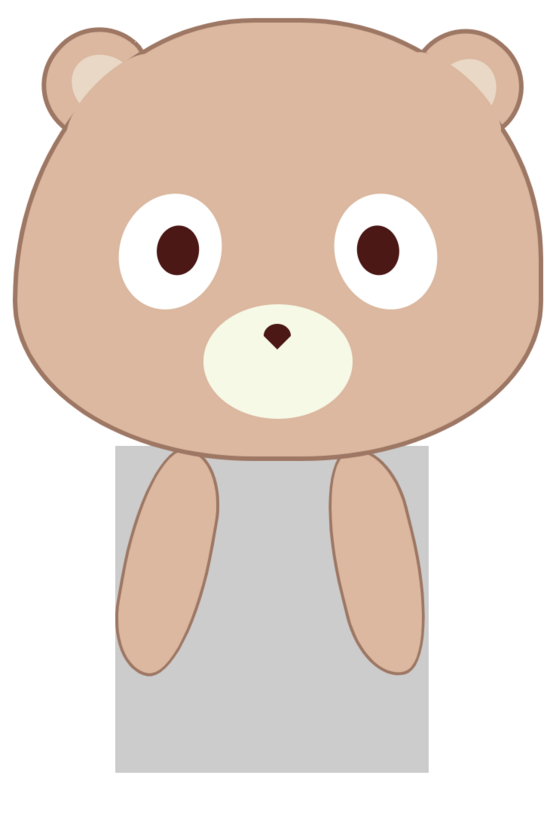
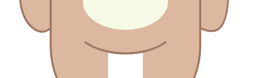
身体
终于完成了头部的绘制,接下来就开始身体的绘制,同样需要先分析一下身体里包括那些部分,我们可以看到身体里主要包括胳膊,肚子和腿。
我们为了看清楚各部分位置,可以先给身体容器加上背景颜色,最后再去掉。
/*度熊身体*/
.body {
    width: 208px;
    height: 217px;
    margin: -10px auto;
    position: relative;
}
胳膊
我们先来添加小度熊的胳膊,最后位置可以再微调。
/*左侧胳膊*/
.body .armLeft {
    width: 53px;
    height: 150px;
    background-color: #e1b79b;
    border: 2px solid #a57662;
    border-radius: 50% 50%/60% 30%;
    transform: rotate(10deg);
    left: 6px;
    position: absolute;
}

/*右侧胳膊*/
.body .armRight {
    width: 53px;
    height: 150px;
    background-color: #e1b79b;
    border: 2px solid #a57662;
    border-radius: 50% 50%/60% 30%;
    transform: rotate(-14deg);
    position: absolute;
    right: 6px;
}
肚子
绘制好胳膊我们就可以绘制小度熊,肉嘟嘟的肚子了。
知识点来了,这里绘制的肚子有一点想鸡蛋形,其实还是利用border-radius: 50% 50% 50% 50% / 70% 70% 30% 30%;这个属性来设置的,通过改变半径大小,实现这种鸡蛋形的图案绘制。
之前说的可能漏了一句,我们的要素大部分是基于position: absolute来定位的,因为这个属性可以设置层级,便于我们图案的压盖。这里的肚子就要设置高一点的层级,压盖住之前绘制的胳膊图案。
/*肚子*/
.body .tummy {
    width: 144px;
    height: 200px;
    background-color: #e1b79b;
    position: absolute;
    left: 50%;
    transform: translate(-50%,0);
    border-radius: 50% 50% 50% 50% / 70% 70% 30% 30%;
    margin-top: -30px;
    border: 2px solid #a57662;
 }
肚子图案
在小度熊的肚子上还有一个小图案,我们直接添加覆盖上去就可以了。
/*肚子图案*/
.body .tummyCon {
    width: 83px;
    height: 90px;
    background-color: #f7f9e5;
    -webkit-border-radius: 63px 63px 63px 63px / 108px 108px 72px 72px;
    border-radius: 50% 50% 50% 50% / 70% 70% 30% 30%;
    position: absolute;
    top: 60px;
    left: 50%;
    transform: translate(-50%, 0);
}
腿
绘制好肚子之后,我们来绘制腿,腿上面没有什么太多难点,就是注意边框和脚的弧度就行。
/*左腿*/
.body .legLeft {
    width: 53px;
    height: 100px;
    background-color: #e1b79b;
    position: absolute;
    bottom: 0px;
    left: 30px;
    border: 2px solid #a57662;
    border-color: transparent transparent #a57662 #a57662;
    border-radius: 50% 50% 50% 50%/0 0 10% 50%;
 }

 /*右腿*/
 .body .legRight {
    width: 53px;
    height: 100px;
    background-color: #e1b79b;
    position: absolute;
    bottom: 0px;
    right: 30px;
    border: 2px solid #a57662;
    border-color: transparent #a57662 #a57662 transparent;
    border-radius: 50% 50% 50% 50%/0 0 50% 10%;
 }
辅助要素
到这里我们基本的要素就绘制齐了,身体容器的背景颜色就可以去掉了,然后同样要绘制一些辅助元素,来让我们的小度熊看起来更好看。
我们要给小度熊添加一个脖子,盖住身体的线条。
给肚子添加一个曲线,让肚子和腿更立体。
最后就是要用辅助线条把脚展示出来。
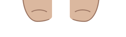
把这几个步骤完成,我们的小度熊整体就全部完成了。
/*脖子遮盖*/
.body .neck {
    width: 120px;
    height: 30px;
    background-color: #e1b79b;
    position: absolute;
    left: 50%;
    transform: translate(-50%,0);
 }

 /*肚子辅助线*/
 .body .arc {
    border-bottom: 2px solid #511313;
    position: absolute;
    top: 70px;
    left: 50%;
    transform: translate(-50%, 0);
    width: 100px;
    height: 100px;
    border: solid 2px #a57662;
    border-color: transparent transparent #a57662 transparent;
    border-radius: 50%/ 0 0 30% 30%;
 }

 /*左脚辅助线*/
 .body .arcLeft {
    border-bottom: 2px solid #511313;
    position: absolute;
    bottom: -30px;
    left: 43px;
    width: 35px;
    height: 50px;
    border: solid 2px #a57662;
    border-color: #a57662 transparent transparent transparent;
    border-radius: 50%/ 20% 20% 0 0;
 }

 /*右脚辅助线*/
 .body .arcRight {
    border-bottom: 2px solid #511313;
    position: absolute;
    bottom: -30px;
    right: 43px;
    width: 35px;
    height: 50px;
    border: solid 2px #a57662;
    border-color: #a57662 transparent transparent transparent;
    border-radius: 50%/ 20% 20% 0 0;
 }
阴影
最后一步,给小度熊的脚底加一个阴影,我们就大功告成了。
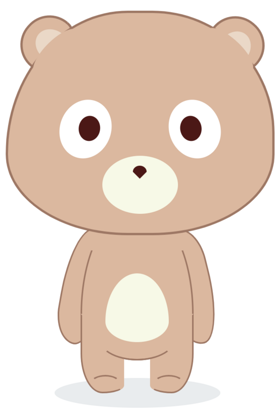
/*阴影*/
.shaodw {
    width: 217px;
    height: 39px;
    background-color: #e9ecee;
    margin: -20px auto;
    border-radius: 50%/50%;
}
总结
绘制小度熊的关键是一个是对于布局的分析,一个是css的border-radius和transform: rotate属性的使用。


