
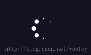
效果图
下载地址:http://xiazai.jb51.net/201709/yuanma/css_loading_jb51.rar
<style>
    #loading {
        position:absolute;
        left:0;
        top:0;
        width:100%;
        height:100%;
        background: #121220;
        overflow:hidden;
        z-index:9999;
    }
    /*加载圈*/
    .spinner {
        margin:0 auto;
        width:60px;
        height:60px;
        position:relative;
        top:40%;
    }
    .container1 > div,.container2 > div,.container3 > div {
        width:15px;
        height:15px;
        background-color:#fff;
        border-radius:100%;
        position:absolute;
        -webkit-animation:bouncedelay 1.2s infinite ease-in-out;
        animation:bouncedelay 1.2s infinite ease-in-out;
        -webkit-animation-fill-mode:both;
        animation-fill-mode:both;
    }
    .spinner .spinner-container {
        position:absolute;
        width:100%;
        height:100%;
    }
    .container2 {
        -webkit-transform:rotateZ(45deg);
        transform:rotateZ(45deg);
    }
    .container3 {
        -webkit-transform:rotateZ(90deg);
        transform:rotateZ(90deg);
    }
    .circle1 {
        top:0;
        left:0;
    }
    .circle2 {
        top:0;
        right:0;
    }
    .circle3 {
        right:0;
        bottom:0;
    }
    .circle4 {
        left:0;
        bottom:0;
    }
    .container2 .circle1 {
        -webkit-animation-delay:-1.1s;
        animation-delay:-1.1s;
    }
    .container3 .circle1 {
        -webkit-animation-delay:-1.0s;
        animation-delay:-1.0s;
    }
    .container1 .circle2 {
        -webkit-animation-delay:-0.9s;
        animation-delay:-0.9s;
    }
    .container2 .circle2 {
        -webkit-animation-delay:-0.8s;
        animation-delay:-0.8s;
    }
    .container3 .circle2 {
        -webkit-animation-delay:-0.7s;
        animation-delay:-0.7s;
    }
    .container1 .circle3 {
        -webkit-animation-delay:-0.6s;
        animation-delay:-0.6s;
    }
    .container2 .circle3 {
        -webkit-animation-delay:-0.5s;
        animation-delay:-0.5s;
    }
    .container3 .circle3 {
        -webkit-animation-delay:-0.4s;
        animation-delay:-0.4s;
    }
    .container1 .circle4 {
        -webkit-animation-delay:-0.3s;
        animation-delay:-0.3s;
    }
    .container2 .circle4 {
        -webkit-animation-delay:-0.2s;
        animation-delay:-0.2s;
    }
    .container3 .circle4 {
        -webkit-animation-delay:-0.1s;
        animation-delay:-0.1s;
    }
    @-webkit-keyframes bouncedelay {
        0%,80%,100% {
            -webkit-transform:scale(0.0)
        }
        40% {
            -webkit-transform:scale(1.0)
        }
    }
    @keyframes bouncedelay {
        0%,80%,100% {
            transform:scale(0.0);
            -webkit-transform:scale(0.0);
    }
        40% {
            transform:scale(1.0);
            -webkit-transform:scale(1.0);
        }
    }
</style>
<body>
    <div id="loading" >
        <div class="spinner">
          <div class="spinner-container container1">
            <div class="circle1"></div>
            <div class="circle2"></div>
            <div class="circle3"></div>
            <div class="circle4"></div>
          </div>
          <div class="spinner-container container2">
            <div class="circle1"></div>
            <div class="circle2"></div>
            <div class="circle3"></div>
            <div class="circle4"></div>
          </div>
          <div class="spinner-container container3">
            <div class="circle1"></div>
            <div class="circle2"></div>
            <div class="circle3"></div>
            <div class="circle4"></div>
          </div>
        </div>
    </div>
</body>
以上所述是小编给大家介绍的纯CSS实现预加载动画效果,希望对大家有所帮助,如果大家有任何疑问请给我留言,小编会及时回复大家的。在此也非常感谢大家对脚本之家网站的支持!


