
开头先说说大家都知道的Material Design。
Material Design:
Material Design是Google推出的一个全新的设计语言,它的特点就是拟物扁平化。
Material Design包含了很多内容,我大致把它分为四部分:
Material Theme
使用Material主题:
Material主题只能应用在Android L版本。
应用Material主题很简单,只需要修改res/values/styles.xml文件,使其继承android:Theme.Material。如下:
<!-- res/values/styles.xml -->
<resources>
 <!-- your app's theme inherits from the Material theme -->
 <style name="AppTheme" parent="android:Theme.Material">
  <!-- theme customizations -->
 </style>
</resources>
或者在AndroidManifest.xml中直接设置主题:
android:theme="@android:style/Theme.Material.Light"
在最新的5.0中,google似乎不推荐使用Material Design主题了,而是由AppCompat代替。
<resources>

  <!-- Base application theme. -->
  <style name="AppTheme" parent="Theme.AppCompat.Light.DarkActionBar">
    <!-- Customize your theme here. -->
    <item name="colorPrimary">@color/colorPrimary</item>
    <item name="colorPrimaryDark">@color/colorPrimaryDark</item>
    <item name="colorAccent">@color/colorAccent</item>
  </style>

</resources>
自定义状态条和导航条:
material还允许你轻松的自定义状态条和导航条的颜色。
可以使用如下属性(参考下方图片):
android:statusBarColor,Window.setStatusBarColor
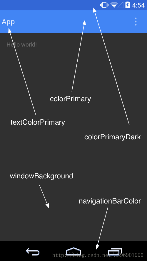
兼容性:
由于Material Theme只可以在Android L Developer Preview中使用。
所以在低版本使用的话就需要为其另设一套主题:
在老版本使用一套主题 res/values/styles.xml,在新版本使用Material主题res/values-v21/styles.xml.
系统自带点击事件的控件一般都具有默认的波纹效果,直接使用即可:
<RelativeLayout
        android:layout_width="match_parent"
        android:layout_height="wrap_content"
        >

        <Button
          android:id="@+id/myBtn"
          android:layout_width="match_parent"
          android:layout_height="wrap_content"
          android:drawablePadding="10dp"
          android:gravity="center_vertical"
          android:paddingBottom="15dip"
          android:paddingLeft="15dip"
          android:paddingRight="25dip"
          android:paddingTop="15dip"
          android:text="Click"
          android:textColor="@color/common_black_text"
          android:textSize="16sp" />
      </RelativeLayout>
怎么为view添加点击波纹效果呢,先了解下面的东西。
触摸反馈:
在Android L5.0中加入了触摸反馈动画。
其中最明显,最具代表性的就是波纹动画,比如当点击按钮时会从点击的位置产生类似于波纹的扩散效果。
波纹效果(Ripple):
当你使用了Material主题后,波纹动画会自动应用在所有的控件上,我们当然可以来设置其属性来调整到我们需要的效果。
可以通过如下代码设置波纹的背景:
android:background="?android:attr/selectableItemBackground"波纹有边界
android:background="?android:attr/selectableItemBackgroundBorderless"波纹超出边界
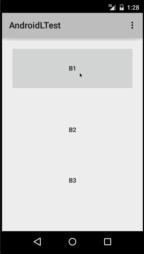
使用效果如下:
B1是不设任何背景的按钮
B2设置了?android:attr/selectableItemBackground
B3设置了?android:attr/selectableItemBackgroundBorderless
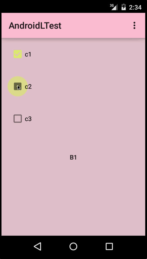
设置颜色
我们也可以通过设置xml属性来调节动画颜色,从而可以适应不同的主题:
android:colorControlHighlight:设置波纹颜色
android:colorAccent:设置checkbox等控件的选中颜色
比如下面这个比较粉嫩的主题,就需要修改动画颜色来匹配(上面已经有介绍):
为view添加波纹效果:
<RelativeLayout
        android:id="@+id/user_info_layout"
        android:layout_width="match_parent"
        android:layout_height="wrap_content"
        android:clickable="true"
        android:background="?android:attr/selectableItemBackground"
        android:layout_marginTop="10dp"
        android:paddingBottom="15dip"
        android:paddingTop="15dip">

        <TextView
          android:id="@+id/user_info_text"
          android:layout_width="wrap_content"
          android:layout_height="wrap_content"
          android:drawablePadding="10dp"
          android:gravity="center_vertical"
          android:paddingLeft="15dip"
          android:paddingRight="25dip"
          android:text="我的资料"
          android:textSize="16sp" />

        <ImageView
          android:layout_width="wrap_content"
          android:layout_height="wrap_content"
          android:layout_alignParentRight="true"
          android:layout_centerInParent="true"
          android:contentDescription="@null"
          android:paddingRight="15dip"
           />
      </RelativeLayout>
为Textview添加波纹效果:
<LinearLayout
        android:layout_width="match_parent"
        android:layout_height="68dp"
        android:weightSum="4"
        android:gravity="center_vertical">

        <TextView
          android:id="@+id/user_unpaid"
          android:layout_width="0dp"
          android:layout_height="wrap_content"
          android:background="?android:attr/selectableItemBackgroundBorderless"
          android:drawableTop="@mipmap/ic_user_paid"
          android:drawablePadding="5dp"
          android:gravity="center"
          android:layout_weight="1"
          android:text="待付款"
          android:textSize="12sp"
          android:clickable="true"/>
        <TextView
          android:id="@+id/user_paid"
          android:layout_width="0dp"
          android:layout_height="wrap_content"
          android:background="?android:attr/selectableItemBackgroundBorderless"
          android:drawableTop="@mipmap/ic_user_paid"
          android:drawablePadding="5dp"
          android:layout_weight="1"
          android:gravity="center"
          android:text="待发货"
          android:textColor="@color/common_black_text"
          android:textSize="12sp"
          android:clickable="true"/>
        <TextView
          android:id="@+id/user_unreceived"
          android:layout_width="0dp"
          android:layout_height="wrap_content"
          android:background="?android:attr/selectableItemBackgroundBorderless"
          android:drawableTop="@mipmap/ic_user_paid"
          android:drawablePadding="5dp"
          android:gravity="center"
          android:layout_weight="1"
          android:text="待收货"
          android:textColor="@color/common_black_text"
          android:textSize="12sp"
          android:clickable="true"/>
        <TextView
          android:id="@+id/user_completed"
          android:layout_width="0dp"
          android:layout_height="wrap_content"
          android:background="?android:attr/selectableItemBackgroundBorderless"
          android:drawableTop="@mipmap/ic_user_paid"
          android:drawablePadding="5dp"
          android:gravity="center"
          android:layout_weight="1"
          android:text="已完成"
          android:textSize="12sp"
          android:clickable="true"/>

      </LinearLayout>
这样就可以实现波纹效果啦!
以上就是本文的全部内容,希望对大家的学习有所帮助,也希望大家多多支持脚本之家。


