
这篇教程是向脚本之家的朋友介绍用AI制作逼真的扬声器方法,教程制作出来的扬声器很漂亮,难度也不是很大,很值得大家学习,推荐过来,大家快快来学习吧!
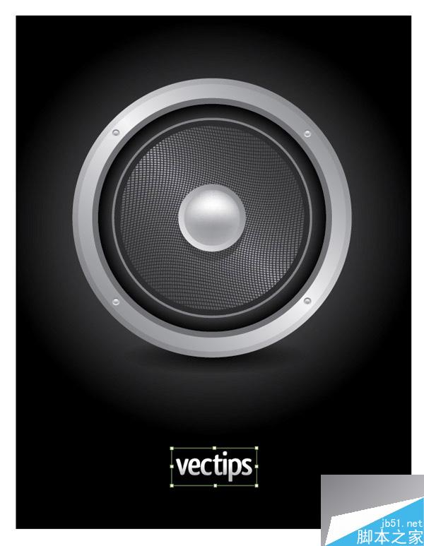
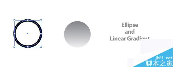
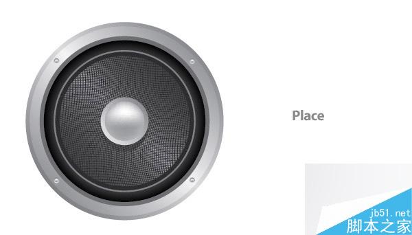
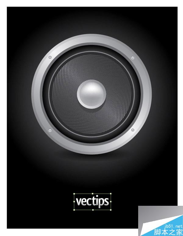
Final Image PreviewLet's take a look at the final icon design below.
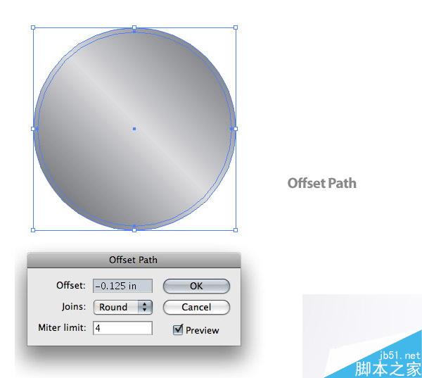
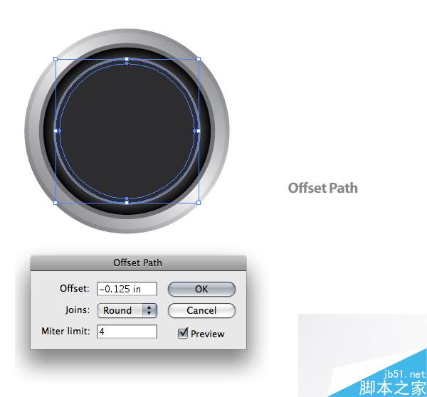
Step 4
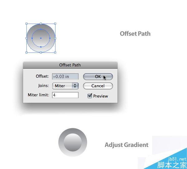
With the ellipse selected, go to Object > Path > Offset Path to bring up the offset dialog. Change the Offset to -.125 inches.
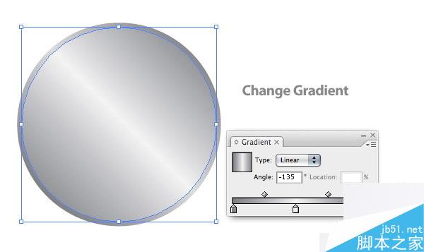
Step 5
Change the first swatch on the offset ellipse to a 50% black, the second swatch to a 4% black, and the last swatch to a 50% black.
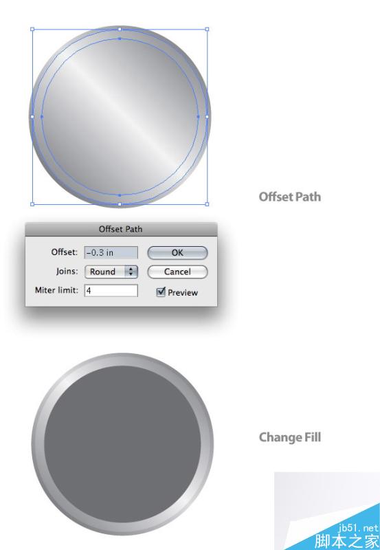
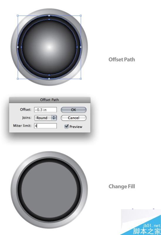
Step 6
With the smallest ellipse selected, Offset the path again. This time set the Offset to -.3 inches and change the fill to a 60% black.
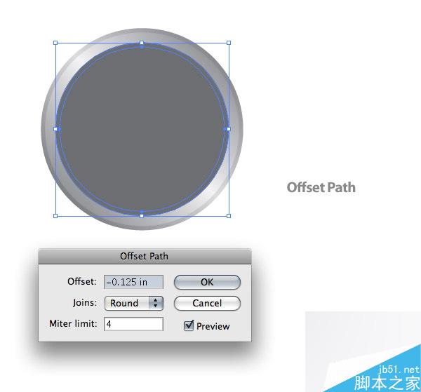
Step 7
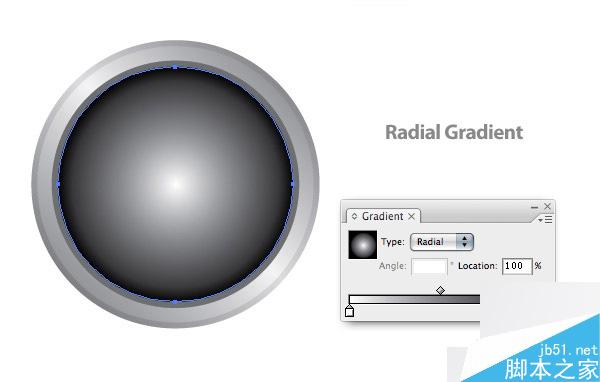
With the smallest ellipse selected, Offset the path yet again. This time change the Offset to -.125 inches.
Step 8
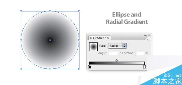
With the new ellipse, create a Radial Gradient from the Gradient Panel and change the first swatch to white and the second swatch to a 100% black.
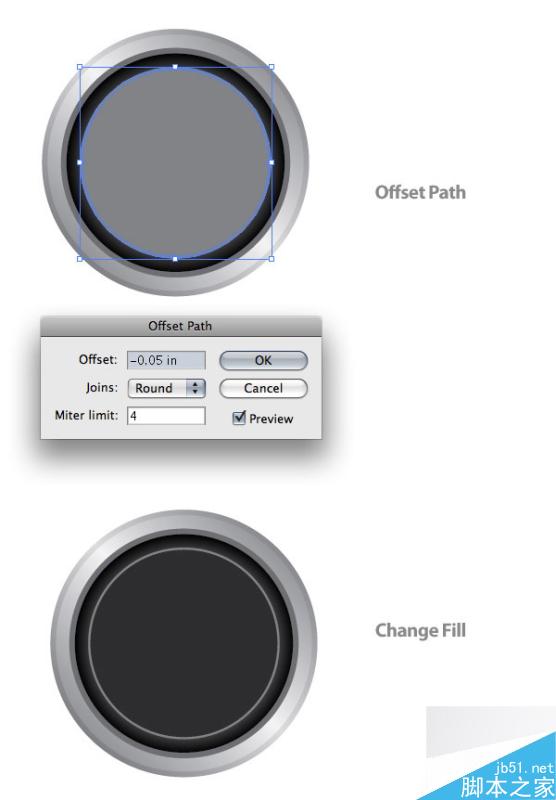
With the radial gradient ellipse selected, Offset the path at -.3 inches and change the fill color to a 50% black.
Step 10
Offset the latest ellipse again, but this time change the Offset to -.05 inches and change the fill color to a 90 % black.
Step 11
Again, Offset the latest ellipse, but change the Offset to -.125.
Step 12
Create a three swatch Linear Gradient like the first few ellipses. Change the first swatch to a 82% black, the second swatch to a 34% black, and the last swatch to a 82% black. Like the first couple of Linear Gradients, adjust the gradient to a 45 degree angle.
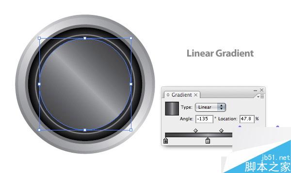
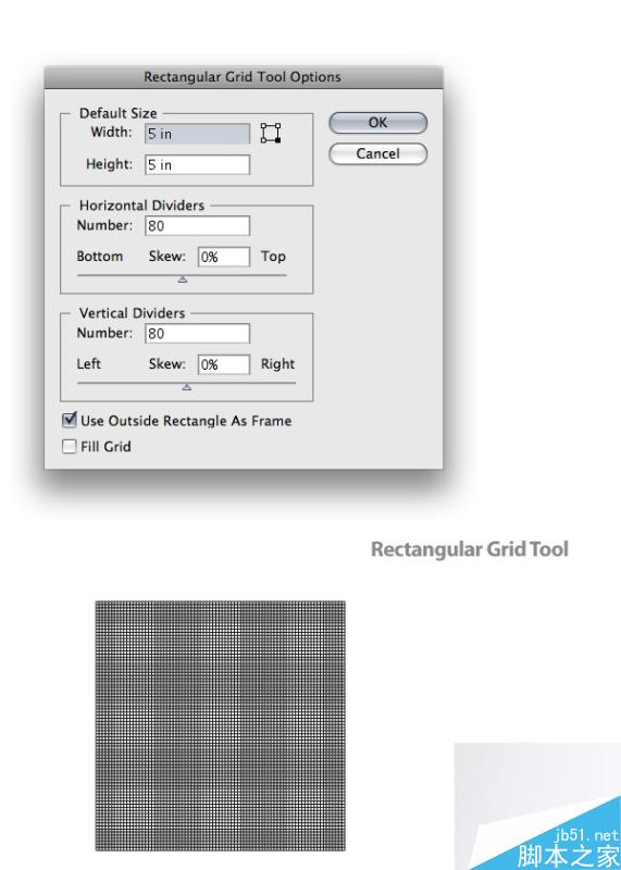
Step 13
With the Rectangular Grid Tool (located under the Line Segment Tool in the Tools Panel) click on the artboard to bring up the Rectangular Grid Tool Options dialog. In the dialog change the Width and Height to 5 inches and change the Horizontal and Vertical dividers to 80.
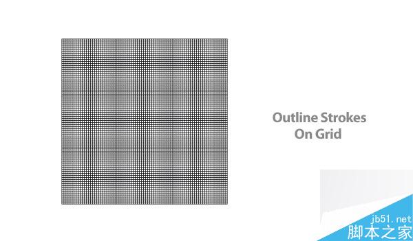
Step 14
Make sure the grid has a 1 point black stroke with no fill. Then expand the strokes of the grid by going to Object > Path > Outline Stroke. If you don't outline the strokes of the grid, you'll get some unexpected results when you proceed to the next step.
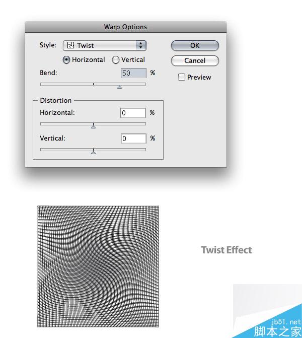
Step 15
With your grid selected, go to Effects > Warp > Twist to bring up the Warp Option dialog. Change the Bend for the Twist effect to 50. Next, expand the appearance of the effect by going to Object > Expand.
Step 16
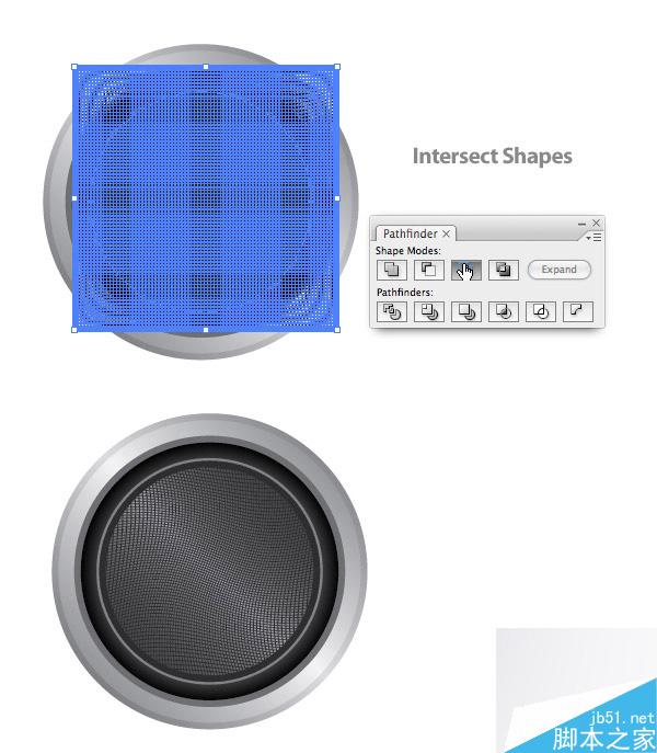
Place the grid so it is centered over the ellipses. Copy (Command + C) the second to last ellipse (the 90% black filled one) and Paste it in Front (Command + F). Select the copied ellipse and the grid, and press the Intersect Shape Areas in the Pathfinder Panel. Finish it up by pressing the Expand button in panel.
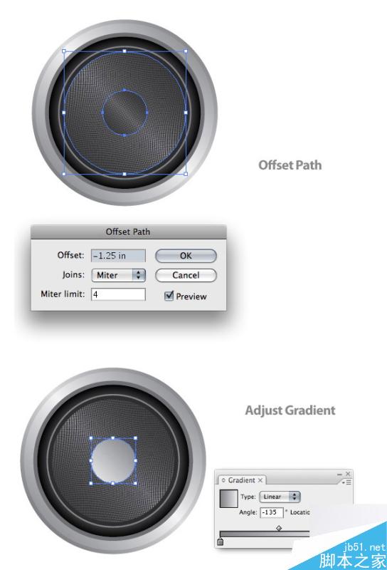
Select the ellipse right below the grid (it might be easier to select the ellipse by locking (Command + 2) the grid object. Then Offset the path -1.25 inches. Bring the ellipse to the front and change the gradient so it only has two swatches. Change the first swatch to a 50% black and the second swatch to a 4 % black. Adjust the gradient so the darker color is at the top of the gradient.
Step 18
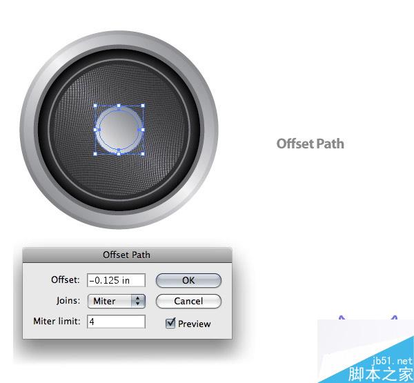
With the ellipse still selected, Offset the path -.125 inches and change its fill to a 30% black.
Step 19
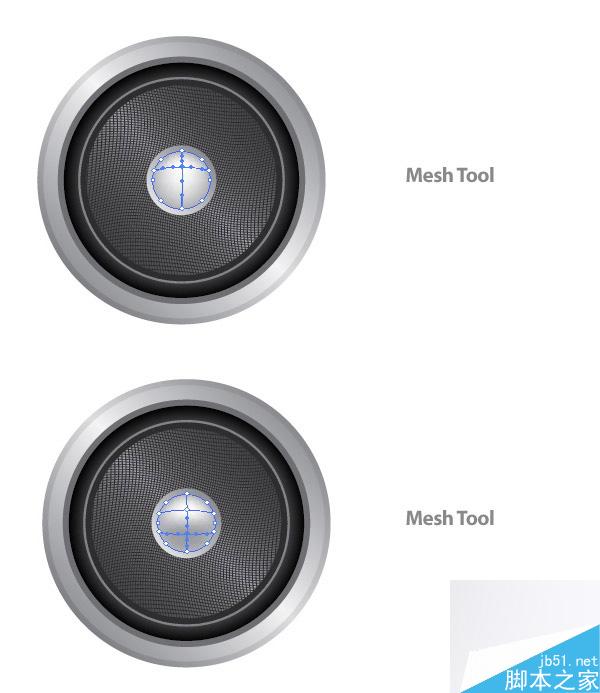
Withe the Mesh Tool (U), click halfway between the top and center of the ellipse in the middle, which creates a Mesh Point. With the Mesh Point still selected, change the color in the Color Panel to white. Next, use the Mesh Tool again to make a Mesh Point by clicking on the vertical line from the first Mesh Point towards the bottom of the ellipse. Change this Mesh Point to a 40% black.
Step 20
Select the ellipse under the mesh ellipse and Copy (Command + C) and Paste it in Front (Command + F). With the Selection Tool (V), stretch the copied ellipse down from the bottom-middle anchor point. Change the color to a 70% black and send the object behind the grid.
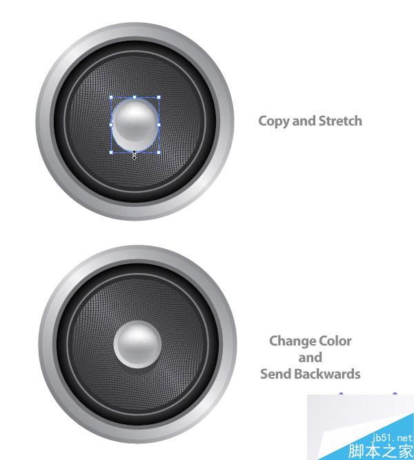
Step 21
The next couple of steps deal with the screws on the edge of the speaker. Create an ellipse that is .16 inches by .16 inches. Then create a Linear Gradient with the same swatches as the ellipse in the middle of the speaker (not the mesh ellipse). Adjust the gradient so the darker color is at the top of the ellipse.
Step 22
Offset the ellipse by .03 inches, and adjust the gradient so the lighter color is at the top of the ellipse.
Step 23
Copy (Command + C) and Paste (Command + V) these two ellipse so you have a total of four screws. Place the screws around the rim of the speaker.
Step 24
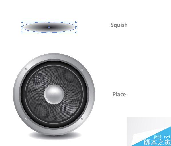
Draw a 4 inch by 4 inch ellipse and create a Radial Blend. Change the gradient so the first swatch is black and the second is white.
Step 25
Squish the Radial Gradient ellipse with the Direct Select Tool (V). Place the ellipse behind all the other artwork. Also, line up the center of the ellipse with the bottom of the speaker.
Step 26
That's pretty much it! If you want to add a background color, make sure the drop shadow shape is set to multiply in in the Transparency Panel. For my background, I created a rectangle the size of my document, and used a Radial Gradient with a 75% black as my first swatch and a 100% black as my second swatch.
教程结束,以上就是用AI制作逼真的扬声器方法介绍,操作很简单的,大家学会了吗?希望能对大家有所帮助!


