

今天小编为大家介绍illustrator绘制超漂亮的卡通风格的插画海报方法,教程绘制出来的效果真的很棒,本教程主要是向大家介绍了设计思路,希望能对大家有所帮助!
本文原作者是Sasha Barr;是一位西雅图的插画家,擅长用粗糙的纹理、来源于自然的手绘花纹及事物、奇妙的颜色搭配。下面是他的一张海报的设计过程!这个海报是为宣传“Band of Horses”这个曲子而做。翻译的不好,有错误的地方可参看英文部分。
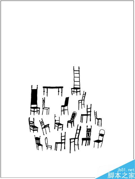
I saw an image in an old design annual of some chairs, so my spark sort of started with that. I started with these, thinking I could make something cool with them. I work almost exclusively in Illustrator, so I always turn everything in to vectors.
我在一个旧的椅子设计年鉴上看到一张图,所以我的灵感从这里开始了。我想我能够用这些作一些很cool的东西,我做任何东西基本都在 Illustrator里,所以习惯把所有的东西全部转换成矢量图形。
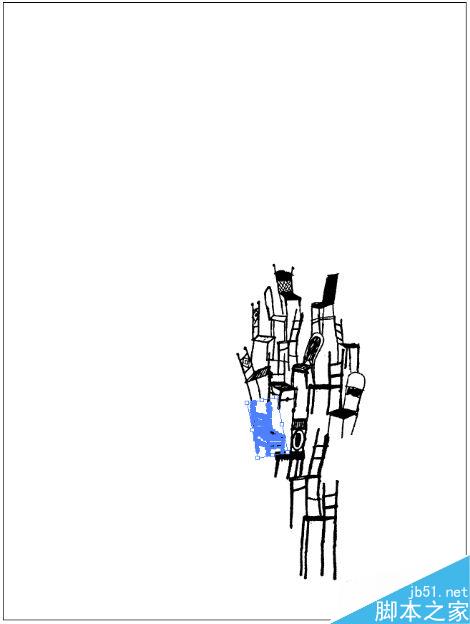
Here I’ve started to pile up the chairs, not really knowing where it’s going, but it seems like a good idea. My last couple of posters have been particularly busy with line work (Album Leaf & Sub Pop CMJ Showcase), so this time around I wanted to keep it open and simple (and quick).
这里我开始把椅子堆起来,虽然并不知道该摆在哪里,但是感觉应该是个好想法。我最近的一组海报里面的元素都是复杂的线条,所以这次我想要简单一点。
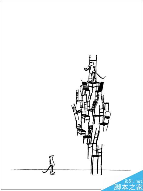
I put in a little sketch of a this mouse guy here (the one on the bottom, also now in vectors), multiplied/ rearranged him, and put the second one on the top of the chair pile. I also added the straight line at the bottom to create some ground. I think this is cool image, but it’s not really doing it for me at this point.
我手绘了一个小老鼠,一个在上面,一个在下面,我又加了一条线想要制作一个地面,我觉得这是一个很cool的画面,但是这跟我想要表达的主题没什么关系。
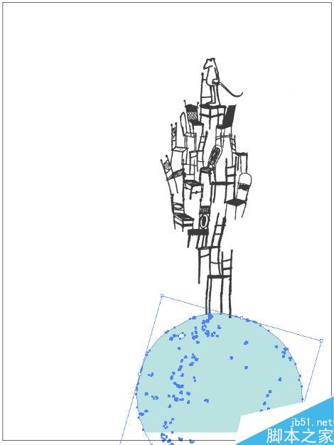
I have a bank of all kinds of vectors I pull from when working on projects; here I’ve added a circle shape to the bottom of the chair pile, while removing the lower mouse character. At this point I’m creating a better idea of what’s happening with the poster, I’m imagining the stacked chairs & mouse on top of a large head, almost as if it’s coming out of the head.
我的矢量元素多得像个银行,我就从里面拿出一个圆形放在了椅子的下面,去掉了下面的小老鼠。这次,我想到了一个切合主题的好想法,我想像堆积的椅子和上面的老鼠都是来自大脑的想像。
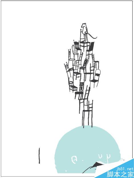
Here’s a good example of how I typically create images and characters. It’s actually pretty rare that I’ll draw something and scan it in, more often than not I’ll build things in illustrator from other vectors. The facial features I’ve added here were made using the line work from the chair on the left and the Pathfinder tools.
这是我自己动手创作图形的好例子。我一般都是在illustrator里借助其他已有的矢量图形创作出自己需要的图形。我用左边的线条给圆形加眼睛鼻子耳朵。
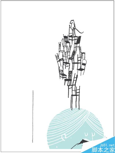
Now this is where my image actually starts to make some sense to me. I’ve added in this book, so my big blue head is reading a story to go along with the lyrics/ Band of Horses theme. In my mind the character is reading a story, and the chair stack/ mouse are what he’s imagining as he’s reading. You can see I built the book and hands from the line on the left.
现在这个图像已经有点意思了。我加了一本书,所以我的这个大脑袋正在读一个故事伴随着“Band of Horses”的旋律。我想像这个人物正在读一个故事,椅子和老鼠正是他的想像。我的书和手是用左边的线条绘制的。
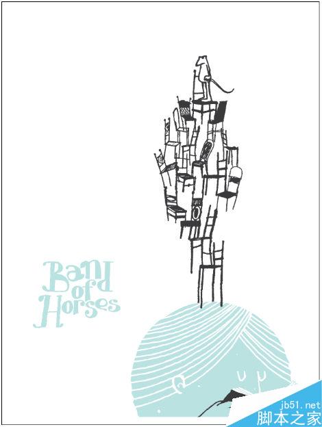
My first attempt at adding type, my initial thought was to do something hand drawn/ childlike, but I’m not so into it after seeing it.
我首先尝试加一个字体,手写或者卡通风格,但是加上后发现不是很好
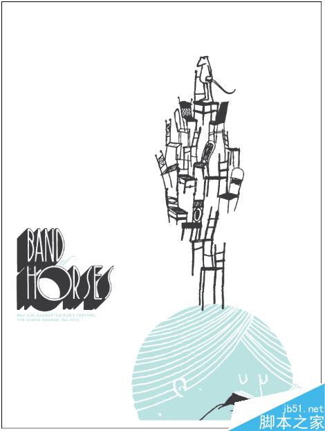
My second attempt at type is a little more successful to me, I’ve scanned this retro 3d type from a font book, and I like the way it looks with the image. I’ve added the secondary text and “OF” in a script font, but I’m not feeling the script or the Gotham (I’m guilty of using it too much).
第二次尝试我比较满意。我从一本书上扫描了一款3D字体,我很喜欢字体和图形组成的风格。我又加了第二款字体,“OF”用script字体,但是我不想用这种字体,因为我用得太多了。
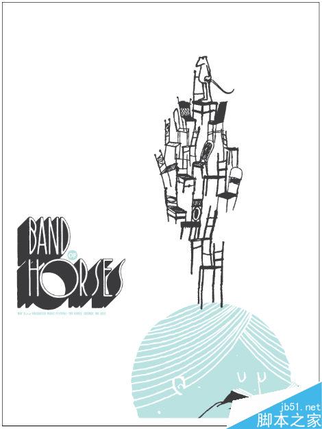
My third attempt at the type is a little more satisfying, the “OF” is now in a small blue circle, and I’ve changed the secondary type to Franklin Gothic Extra Condensed. Because I don’t want to spend too much time messing around with little details on this piece, I call it a day for the type. But, I’m not super happy with the image just on white.
我对字体的第三次尝试比较满意,"OF"在一个小的蓝色圆形中,而且我把字体换成了“Franklin Gothic Extra Condensed”。因为我不想在这么小的细节上花费太多时间,我斟酌这个字体用了1天的时间。但是,我对这个海报的白色背景很不满意。
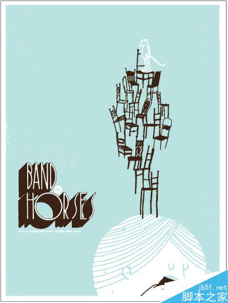
The final poster. I inverted the colors a bit, changed the grey to dark brown, and added some texture. I’m guilty of using blue and brown a little too much, but I think I’m ok with it. I think the poster is pretty cool, and it’s time to move on!
最后的定稿。我转换了一下颜色,把灰色换成了深棕色,加了一些纹理。我用蓝色和棕色有点太多,但是我觉得我用得还可以,我觉得海报很COOL,现在是时候了。
以上就是illustrator绘制超漂亮的卡通风格的插画海报方法介绍,操作很简单的,大家学会了吗?希望这篇教程能对大家有所帮助!


