响应式布局的简单案例

所属分类: 网页制作 / CSS 阅读数: 1226
收藏 0 赞 0 分享

响应式布局

响应式布局在面对不同分辨率设备灵活性强,在平时的网页设计中基本上都要用到响应式布局设计,它给我们提供了良好的用户浏览页面,能带给我们更好的客户体验,下面给大家分享下我做的一个简单的响应式的布局:

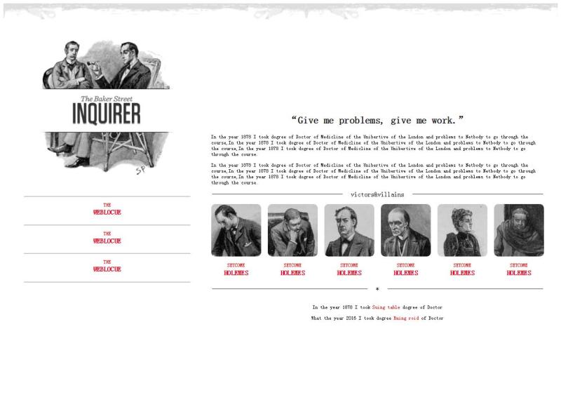
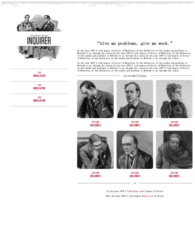
不同的页面会适用不同大小浏览器页面,它会随着分辨率的变化而变化。代码展示如下:

XML/HTML Code复制内容到剪贴板
  1. <!DOCTYPE html>    
  2. <html>    
  3. <head>    
  4. <meta charset="utf-8" />    
  5. <title></title>    
  6. <style>    
  7.   p{    
  8.     font-size: 12px;    
  9.   }    
  10.   header{    
  11.     width: 100%;    
  12.   }    
  13.   header img{    
  14.     width: 100%;    
  15.   }    
  16.   @media (min-width: 1300px) and (max-width:1400px) {    
  17.     #left{    
  18.       float: left;    
  19.       width: 30%;    
  20.       margin: 0px 50px;    
  21.     }    
  22.     #left #logo-bg{    
  23.       margin: 10% 10%;    
  24.       width: 80%;    
  25.       position: relative;    
  26.     }    
  27.     #left #logo{    
  28.       float: left;    
  29.       width: 12%;    
  30.       position: absolute;    
  31.       left: 13%;    
  32.       top: 230px;    
  33.     }    
  34.     #left p{    
  35.       margin-bottom: -20px;    
  36.     }    
  37.     #left p,h4{    
  38.       text-align: center;    
  39.       color: red;    
  40.     }    
  41.     #right{    
  42.       float: left;    
  43.       width: 60%;    
  44.       margin: 15% 0px;    
  45.     }    
  46.     #right h2{    
  47.       text-align: center;    
  48.     }    
  49.     #right fieldset{    
  50.       text-align: center;    
  51.       border-left: none;    
  52.       border-right: none;    
  53.       border-bottom: none;    
  54.     }    
  55.     #right fieldset legend{    
  56.       padding: 0px 20px;    
  57.     }    
  58.     #fen{    
  59.       width: 100%;    
  60.       -webkit-column-count: 6;    
  61.       -moz-column-count: 6;    
  62.       -o-column-count: 6;    
  63.       -ms-column-count: 6;    
  64.       column-count: 6;    
  65.       -webkit-column-gap: 1em;    
  66.       -moz-column-gap: 1em;    
  67.       -o-column-gap: 1em;    
  68.       -ms-column-gap: 1em;    
  69.       column-gap: 1em;    
  70.     }    
  71.     #fen img{    
  72.       width: 100%;    
  73.       border-radius: 10px 10px 10px 10px;    
  74.     }    
  75.     #fen p,h4{    
  76.       text-align: center;    
  77.       color: red;    
  78.     }    
  79.     #fen p{    
  80.       margin-bottom: -20px;    
  81.     }    
  82.     #di p{    
  83.       text-align: center;    
  84.     }    
  85.     #di p span{    
  86.        color: red;    
  87.     }    
  88.   }    
  89.   @media (min-width: 1000px) and (max-width:1300px){    
  90.     #left{    
  91.       float: left;    
  92.       width: 30%;    
  93.       margin: 0px 50px;    
  94.     }    
  95.     #left #logo-bg{    
  96.       margin: 10% 10%;    
  97.       width: 80%;    
  98.       position: relative;    
  99.     }    
  100.     #left #logo{    
  101.       width: 12%;    
  102.       position: absolute;    
  103.       left: 14%;    
  104.       top: 190px;    
  105.     }    
  106.     #left p{    
  107.       margin-bottom: -20px;    
  108.     }    
  109.     #left p,h4{    
  110.       text-align: center;    
  111.       color: red;    
  112.     }    
  113.     #right{    
  114.       float: left;    
  115.       width: 60%;    
  116.       margin: 15% 0px;    
  117.     }    
  118.     #right h2{    
  119.       text-align: center;    
  120.     }    
  121.     #right fieldset{    
  122.       text-align: center;    
  123.       border-left: none;    
  124.       border-right: none;    
  125.       border-bottom: none;    
  126.     }    
  127.     #right fieldset legend{    
  128.       padding: 0px 20px;    
  129.     }    
  130.     #fen{    
  131.       width: 100%;    
  132.       -webkit-column-count: 3;    
  133.       -moz-column-count: 3;    
  134.       -o-column-count: 3;    
  135.       -ms-column-count: 3;    
  136.       column-count: 3;    
  137.       -webkit-column-gap: 1em;    
  138.       -moz-column-gap: 1em;    
  139.       -o-column-gap: 1em;    
  140.       -ms-column-gap: 1em;    
  141.       column-gap: 1em;    
  142.     }    
  143.     #fen img{    
  144.         width: 100%;    
  145.         border-radius: 10px 10px 10px 10px;    
  146.     }    
  147.     #fen p,h4{    
  148.         text-align: center;    
  149.         color: red;    
  150.       }    
  151.     #fen p{    
  152.         margin-bottom: -20px;    
  153.     }    
  154.     #di p{    
  155.       text-align: center;    
  156.     }    
  157.     #di p span{    
  158.       color: red;    
  159.     }    
  160.   }    
  161. </style>    
  162. </head>    
  163. <body>    
  164.   <header>    
  165.     <img src="img/rag.png" />    
  166.   </header>    
  167.   <aside id="left">    
  168.     <img src="img/logo-bg.png" id="logo-bg"/>    
  169.     <img src="img/logo.png" id="logo" />    
  170.     <hr />    
  171.     <p>THE</p>    
  172.     <h4>WEBLOCUE</h4>    
  173.     <hr />    
  174.     <p>THE</p>    
  175.     <h4>WEBLOCUE</h4>    
  176.     <hr />    
  177.     <p>THE</p>    
  178.     <h4>WEBLOCUE</h4>    
  179.     <hr />    
  180.   </aside>    
  181.   <article id="right">    
  182.     <h2>“Give me problems, give me work.”</h2>    
  183.     <p>In the year 1878 I took dogree of Doctor of Medicline of the Unibertive of the London and problems to Netbody to go through the course,In the year 1878 I took dogree of Doctor of Medicline of the Unibertive of the London and problems to Netbody to go through the course,In the year 1878 I took dogree of Doctor of Medicline of the Unibertive of the London and problems to Netbody to go through the course.</p>    
  184.     <p>In the year 1878 I took dogree of Doctor of Medicline of the Unibertive of the London and problems to Netbody to go through the course,In the year 1878 I took dogree of Doctor of Medicline of the Unibertive of the London and problems to Netbody to go through the course,In the year 1878 I took dogree of Doctor of Medicline of the Unibertive of the London and problems to Netbody to go through the course.</p>    
  185.     <fieldset><legend>victors</legend></fieldset>    
  186.     <div id="fen">    
  187.       <img src="img/1.jpg" />    
  188.       <p>SETCOME</p>    
  189.       <h4>HOLEMES</h4>    
  190.       <img src="img/2.jpg" />    
  191.       <p>SETCOME</p>    
  192.       <h4>HOLEMES</h4>    
  193.       <img src="img/3.jpg" />    
  194.       <p>SETCOME</p>    
  195.       <h4>HOLEMES</h4>    
  196.       <img src="img/4.jpg" />    
  197.       <p>SETCOME</p>    
  198.       <h4>HOLEMES</h4>    
  199.       <img src="img/5.jpg" />    
  200.       <p>SETCOME</p>    
  201.       <h4>HOLEMES</h4>    
  202.       <img src="img/6.jpg" />    
  203.       <p>SETCOME</p>    
  204.       <h4>HOLEMES</h4>    
  205.     </div>    
  206.     <fieldset><legend>*</legend></fieldset>    
  207.     <div id="di">    
  208.       <p>In the year 1878 I took <span>Suing table</span> dogree of Doctor</p>    
  209.       <p>What the year 2016 I took dogree <span>Ruing roid</span> of Doctor</p>    
  210.     </div>    
  211.   </article>    
  212. </body>    
  213. </html>  

做的不够严谨,因为时间问题,请见谅。

以上这篇响应式布局的简单案例就是小编分享给大家的全部内容了,希望能给大家一个参考,也希望大家多多支持脚本之家。

原文地址:http://www.cnblogs.com/duzheqiang/p/5666465.html

更多精彩内容其他人还在看

Opera中国的WEB标准课程

网页制作Webjx文章简介:在这篇文章里,我要向大家介绍我和其他很多人花费数月时间开发的一个课程——Web标准课程,该课程旨在向大家提供Web设计和开发的坚实基础,无论读者是谁,此教程完全免费、可访问,并且不需要预备知识。当然,我主要还
收藏 0 赞 0 分享

CSS样式表渐进增强的基本概念

网页制作Webjx文章简介:如果你挠着头想弄清楚优雅降级和渐进增强的区别,我告诉你,这是视角问题。优雅降级和渐进增强都考虑网站在各种设备的各种浏览器上如何良好运转。两者区别的关键在于它们各自关注的焦点,以及这种关注对工作流程的影响
收藏 0 赞 0 分享

简单介绍Web Developer插件制作网页

网页制作Webjx文章简介:Firefox浏览器是一个良好支持W3C标准的开放源代码的浏览器,拥有Linux/Windows/Mac版本。因为Firefox浏览器良好支持W3C标准,所以使用Firefox来调试网页是非常好的。 Firefox浏览器是
收藏 0 赞 0 分享

CSS布局带来的巨大影响:CSS display属性值

网页制作Webjx文章简介:网页元素应用上那些与表格相关的display属性值后,能够模仿出与表格相同的特性。我将会在该文中给大家演示这种方法给CSS布局带来的巨大影响。 应原书编辑要求,先在文章顶部给出链接:《Everything You
收藏 0 赞 0 分享

用div css模拟表格对角线

这只是探讨一种CSS模拟表格对角线的用法,实际在工作中可能觉得这样做有点小题大作,这不是本主题讨论的重点。如果对此深以为然的朋友,请一笑过之 首先声明: 这只是探讨一种CSS模拟表格对角线的
收藏 0 赞 0 分享

IE Firefox在css中的差别 (部分)

1、单位问题 问题:任何距离的数值ie可以不加单位,ff必须要求写单位(0除外) 解决:写全单位如padding:0px; 2、水平居中 问题:div里的内容,ie默认为center,而ff默认left 解决:mairgin:0px auto; 3、高度问题
收藏 0 赞 0 分享

不用js可以实现信息提示效果

[code] <style> body { font:verdena; font-size:14px; color:#000 } h1{ font:verdena; font-size:22px; color:#000 } h2{ font:verdena;
收藏 0 赞 0 分享

CSS解决未知高度的垂直水平居中自适应问题

今天有人问起,晚上试着写出来,供参考; 以下代码兼容主流浏览器IE6、IE7、Firefox、Opera。 从最简单的开始………… 一、如何让一个DIV水平居中? 这个简单不作过多说明! [code] <st
收藏 0 赞 0 分享

CSS cursor 属性 -- 鼠标指针样式效果

取值: [ [<uri> ,]* [ auto | crosshair | default | pointer | move | e-resize | ne-resize | nw-resize | n-resize | se-resize | sw-resize |
收藏 0 赞 0 分享

css 简单区别ie6,ie7,firefox的写法

同一样式里可以这样 [code] margin:17px; FF +margin:17px; IE6 IE7 _margin:17px; IE6 [/code] 按这个顺序,刚好区分开三个浏览器
收藏 0 赞 0 分享
查看更多