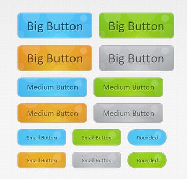
这是一款非常有特点的CSS3按钮,按钮的背景不是北京图片,也不是单纯的颜色,而是一组魔幻般的冒泡背景动画。当我们将鼠标滑过按钮时,按钮的冒泡背景动画就可以展示出来。可以说这款CSS3按钮的设计风格相当有创意,而且令人惊叹的是,这些动画都是用CSS3实现的,并没有使用JavaScript,非常强大。
HTML代码:
XML/HTML Code复制内容到剪贴板
- <div id="buttonContainer">
-
- <a href="#" class="button big blue">Big Button</a>
- <a href="#" class="button big green">Big Button</a>
- <a href="#" class="button big orange">Big Button</a>
- <a href="#" class="button big gray">Big Button</a>
-
- <a href="#" class="button blue medium">Medium Button</a>
- <a href="#" class="button green medium">Medium Button</a>
- <a href="#" class="button orange medium">Medium Button</a>
- <a href="#" class="button gray medium">Medium Button</a>
-
- <a href="#" class="button small blue">Small Button</a>
- <a href="#" class="button small green">Small Button</a>
- <a href="#" class="button small blue rounded">Rounded</a>
-
- <a href="#" class="button small orange">Small Button</a>
- <a href="#" class="button small gray">Small Button</a>
-
- <a href="#" class="button small green rounded">Rounded</a>
-
- </div>
CSS代码:
CSS Code复制内容到剪贴板
- .button{
- font:15px Calibri, Arial, sans-serif;
-
-
- text-shadow:1px 1px 0 rgba(255,255,255,0.4);
-
-
- text-decoration:none !important;
- whitewhite-space:nowrap;
-
- display:inline-block;
- vertical-align:baselinebaseline;
- position:relative;
- cursor:pointer;
- padding:10px 20px;
-
- background-repeat:no-repeat;
-
-
-
-
- background-position:bottombottom left;
- background-image:url('button_bg.png');
-
-
-
-
- background-position:bottombottom left, top rightright, 0 0, 0 0;
- background-clip:border-box;
-
-
-
- -moz-border-radius:8px;
- -webkit-border-radius:8px;
- border-radius:8px;
-
-
-
- -moz-box-shadow:0 0 1px #fff inset;
- -webkit-box-shadow:0 0 1px #fff inset;
- box-shadow:0 0 1px #fff inset;
-
-
-
-
- -webkit-transition:background-position 1s;
- -moz-transition:background-position 1s;
- transition:background-position 1s;
- }
-
- .button:hover{
-
-
-
-
-
- background-position:top left;
- background-position:top left, bottombottom rightright, 0 0, 0 0;
- }
-
- .button:active{
-
- bottombottom:-1px;
- }
-
-
-
- .button.big { font-size:30px;}
- .button.medium { font-size:18px;}
- .button.small { font-size:13px;}
-
-
-
- .button.rounded{
- -moz-border-radius:4em;
- -webkit-border-radius:4em;
- border-radius:4em;
- }
-
-
-
-
-
- .blue.button{
- color:#0f4b6d !important;
-
- border:1px solid #84acc3 !important;
-
-
- background-color: #48b5f2;
-
-
-
- background-image: url('button_bg.png'), url('button_bg.png'),
- -moz-radial-gradient( center bottombottom, circle,
- rgba(89,208,244,1) 0,rgba(89,208,244,0) 100px),
- -moz-linear-gradient(#4fbbf7, #3faeeb);
-
- background-image: url('button_bg.png'), url('button_bg.png'),
- -webkit-gradient( radial, 50% 100%, 0, 50% 100%, 100,
- from(rgba(89,208,244,1)), to(rgba(89,208,244,0))),
- -webkit-gradient(linear, 0% 0%, 0% 100%, from(#4fbbf7), to(#3faeeb));
- }
-
- .blue.button:hover{
- background-color:#63c7fe;
-
- background-image: url('button_bg.png'), url('button_bg.png'),
- -moz-radial-gradient( center bottombottom, circle,
- rgba(109,217,250,1) 0,rgba(109,217,250,0) 100px),
- -moz-linear-gradient(#63c7fe, #58bef7);
-
- background-image: url('button_bg.png'), url('button_bg.png'),
- -webkit-gradient( radial, 50% 100%, 0, 50% 100%, 100,
- from(rgba(109,217,250,1)), to(rgba(109,217,250,0))),
- -webkit-gradient(linear, 0% 0%, 0% 100%, from(#63c7fe), to(#58bef7));
- }
-
-
-
- .green.button{
- color:#345903 !important;
- border:1px solid #96a37b !important;
- background-color: #79be1e;
-
- background-image:url('button_bg.png'), url('button_bg.png'), -moz-radial-gradient(center bottombottom, circle, rgba(162,211,30,1) 0,rgba(162,211,30,0) 100px),-moz-linear-gradient(#82cc27, #74b317);
- background-image:url('button_bg.png'), url('button_bg.png'), -webkit-gradient(radial, 50% 100%, 0, 50% 100%, 100, from(rgba(162,211,30,1)), to(rgba(162,211,30,0))),-webkit-gradient(linear, 0% 0%, 0% 100%, from(#82cc27), to(#74b317));
- }
-
- .green.button:hover{
- background-color:#89d228;
-
- background-image:url('button_bg.png'), url('button_bg.png'), -moz-radial-gradient(center bottombottom, circle, rgba(183,229,45,1) 0,rgba(183,229,45,0) 100px),-moz-linear-gradient(#90de31, #7fc01e);
- background-image:url('button_bg.png'), url('button_bg.png'), -webkit-gradient(radial, 50% 100%, 0, 50% 100%, 100, from(rgba(183,229,45,1)), to(rgba(183,229,45,0))),-webkit-gradient(linear, 0% 0%, 0% 100%, from(#90de31), to(#7fc01e));
- }
-
-
-
- .orange.button{
- color:#693e0a !important;
- border:1px solid #bea280 !important;
- background-color: #e38d27;
-
- background-image:url('button_bg.png'), url('button_bg.png'), -moz-radial-gradient(center bottombottom, circle, rgba(232,189,45,1) 0,rgba(232,189,45,0) 100px),-moz-linear-gradient(#f1982f, #d4821f);
- background-image:url('button_bg.png'), url('button_bg.png'), -webkit-gradient(radial, 50% 100%, 0, 50% 100%, 100, from(rgba(232,189,45,1)), to(rgba(232,189,45,0))),-webkit-gradient(linear, 0% 0%, 0% 100%, from(#f1982f), to(#d4821f));
- }
-
- .orange.button:hover{
- background-color:#ec9732;
-
- background-image:url('button_bg.png'), url('button_bg.png'), -moz-radial-gradient(center bottombottom, circle, rgba(241,192,52,1) 0,rgba(241,192,52,0) 100px),-moz-linear-gradient(#f9a746, #e18f2b);
- background-image:url('button_bg.png'), url('button_bg.png'), -webkit-gradient(radial, 50% 100%, 0, 50% 100%, 100, from(rgba(241,192,52,1)), to(rgba(241,192,52,0))),-webkit-gradient(linear, 0% 0%, 0% 100%, from(#f9a746), to(#e18f2b));
- }
-
- .gray.button{
- color:#525252 !important;
- border:1px solid #a5a5a5 !important;
- background-color: #a9adb1;
-
- background-image:url('button_bg.png'), url('button_bg.png'), -moz-radial-gradient(center bottombottom, circle, rgba(197,199,202,1) 0,rgba(197,199,202,0) 100px),-moz-linear-gradient(#c5c7ca, #92989c);
- background-image:url('button_bg.png'), url('button_bg.png'), -webkit-gradient(radial, 50% 100%, 0, 50% 100%, 100, from(rgba(197,199,202,1)), to(rgba(197,199,202,0))),-webkit-gradient(linear, 0% 0%, 0% 100%, from(#c5c7ca), to(#92989c));
- }
-
- .gray.button:hover{
- background-color:#b6bbc0;
-
- background-image:url('button_bg.png'), url('button_bg.png'), -moz-radial-gradient(center bottombottom, circle, rgba(202,205,208,1) 0,rgba(202,205,208,0) 100px),-moz-linear-gradient(#d1d3d6, #9fa5a9);
- background-image:url('button_bg.png'), url('button_bg.png'), -webkit-gradient(radial, 50% 100%, 0, 50% 100%, 100, from(rgba(202,205,208,1)), to(rgba(202,205,208,0))),-webkit-gradient(linear, 0% 0%, 0% 100%, from(#d1d3d6), to(#9fa5a9));
- }
以上就是本文的全部内容,希望对大家的学习有所帮助。


