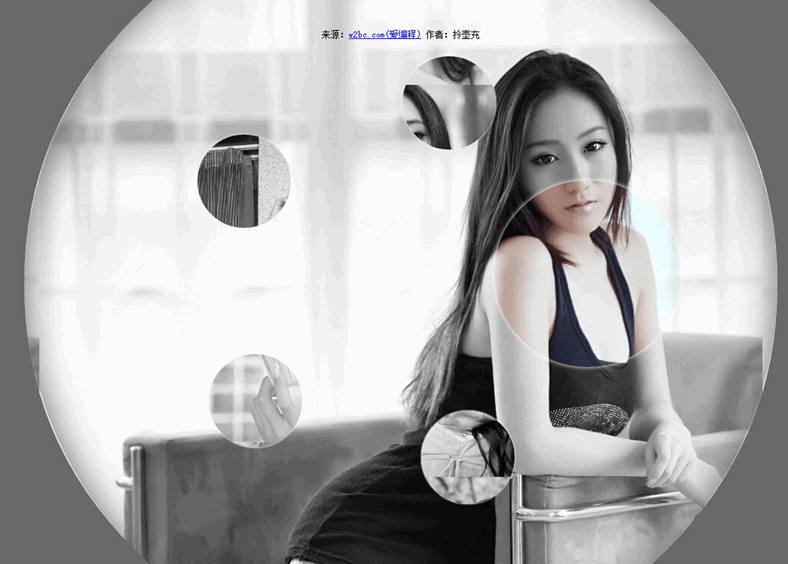
今天要给大家分享的的一款用纯css3实现的图片放大镜特效。页面打开五个小图显示于页面。当鼠标经过图片时,当前图片以灰色背景图的形式展示。效果非常不错。
 源码下载
源码下载 实现的代码:
html代码:
<ul class="gallery">
<li class="gallery__item"></li>
<li class="gallery__item"></li>
<li class="gallery__item"></li>
<li class="gallery__item"></li>
<li class="gallery__item"></li>
<li class="gallery__item"></li>
</ul>
css代码:
.gallery
{
list-style: none;
}
.gallery:before, .gallery__item:last-child
{
position: fixed;
top: 50%;
left: 50%;
margin: -31.25em;
width: 62.5em;
height: 62.5em;
}
.gallery:before
{
z-index: -1;
border-radius: 50%;
content: '';
box-shadow: inset 0 0 5em dimgrey, 0 0 0 50vw dimgrey;
}
.gallery__item
{
background-blend-mode: luminosity;
transition: -webkit-transform 0.5s cubic-bezier(0.175, 0.885, 0.32, 1.275), background-image 0.5s;
}
.gallery__item:not(:last-child)
{
position: absolute;
top: 50%;
left: 50%;
width: 32vmin;
height: 32vmin;
border-radius: 50%;
box-shadow: 0 0 .5em white;
}
.gallery__item:nth-child(1)
{
margin: 13.87457vmin -4.53223vmin;
-webkit-transform: scale(0.5);
background: url("imgs/1.jpg") 50% 50% fixed whitesmoke;
}
.gallery__item:nth-child(1):hover
{
-webkit-transform: scale(1);
background-blend-mode: normal;
cursor: pointer;
}
.gallery__item:nth-child(1):hover ~ :last-child
{
background: url("imgs/1.jpg") 50% 50% fixed dimgray;
}
.gallery__item:nth-child(1):hover ~ :last-child:after
{
opacity: .001;
}
.gallery__item:nth-child(2)
{
margin: 4.13825vmin -40.86867vmin;
-webkit-transform: scale(0.5);
background: url("imgs/2.jpg") 50% 50% fixed whitesmoke;
}
.gallery__item:nth-child(2):hover
{
-webkit-transform: scale(1);
background-blend-mode: normal;
cursor: pointer;
}
.gallery__item:nth-child(2):hover ~ :last-child
{
background: url("imgs/2.jpg") 50% 50% fixed dimgray;
}
.gallery__item:nth-child(2):hover ~ :last-child:after
{
opacity: .001;
}
.gallery__item:nth-child(3)
{
margin: -33.42845vmin -42.83746vmin;
-webkit-transform: scale(0.5);
background: url("imgs/3.jpg") 50% 50% fixed whitesmoke;
}
.gallery__item:nth-child(3):hover
{
-webkit-transform: scale(1);
background-blend-mode: normal;
cursor: pointer;
}
.gallery__item:nth-child(3):hover ~ :last-child
{
background: url("imgs/3.jpg") 50% 50% fixed dimgray;
}
.gallery__item:nth-child(3):hover ~ :last-child:after
{
opacity: .001;
}
.gallery__item:nth-child(4)
{
margin: -46.90963vmin -7.71779vmin;
-webkit-transform: scale(0.5);
background: url("imgs/4.jpg") 50% 50% fixed whitesmoke;
}
.gallery__item:nth-child(4):hover
{
-webkit-transform: scale(1);
background-blend-mode: normal;
cursor: pointer;
}
.gallery__item:nth-child(4):hover ~ :last-child
{
background: url("imgs/4.jpg") 50% 50% fixed dimgray;
}
.gallery__item:nth-child(4):hover ~ :last-child:after
{
opacity: .001;
}
.gallery__item:nth-child(5)
{
margin: -17.67475vmin 15.95615vmin;
-webkit-transform: scale(0.5);
background: url("imgs/5.jpg") 50% 50% fixed whitesmoke;
}
.gallery__item:nth-child(5):hover
{
-webkit-transform: scale(1);
background-blend-mode: normal;
cursor: pointer;
}
.gallery__item:nth-child(5):hover ~ :last-child
{
background: url("imgs/5.jpg") 50% 50% fixed dimgray;
}
.gallery__item:nth-child(5):hover ~ :last-child:after
{
opacity: .001;
}
.gallery__item:last-child
{
z-index: -2;
}
.gallery__item:last-child:after
{
position: absolute;
top: 0;
right: 0;
bottom: 0;
left: 0;
opacity: .999;
background: dimgrey;
transition: opacity 2s;
content: '';
}


