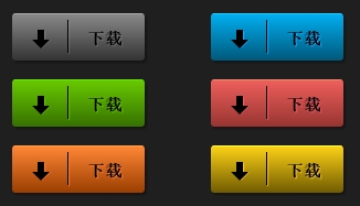
效果图如下:
代码如下:
<!doctype html>
<html>
<head>
<meta charset="utf-8">
<title>Live Preview</title>
<style>
body {
padding: 20px;
background: black;
}
div.container {
position: relative;
background: #1f1f1f;
margin: 0 auto;
width: 500px;
height: 100px;
padding: 120px 0px;
/* border-radius */
-webkit-border-radius: 5px;
-moz-border-radius: 5px;
border-radius: 5px;
/* box-shadow */
-webkit-box-shadow: rgba(0,0,0,0.2) 0px 1px 3px;
-moz-box-shadow: rgba(0,0,0,0.2) 0px 1px 3px;
box-shadow: rgba(0,0,0,0.2) 0px 1px 3px;
text-align: center;
}
a.button {
position: relative;
height: 15px;
padding: 12px 20px 15px 68px;
cursor: pointer;
text-align: Right;
font-weight: bold;
font-size: 18px;
-webkit-border-radius: 3px;
-moz-border-radius: 3px;
border-radius: 3px;
-webkit-box-shadow: 2px 2px 2px 0 rgba(0,0,0,.3);
-moz-box-shadow: 2px 2px 2px 0 rgba(0,0,0,.3);
box-shadow: 2px 2px 2px 0 rgba(0,0,0,.3);
display: inline-block !important;
font: 700 15px 'Arial', Helvetica, Clean, sans-serif;
margin: 0px 0px 20px 10px;
position: relative;
text-decoration: none;
transition: background-position .2s ease, margin .1s ease;
-webkit-transition: background-position .2s ease, margin .1s ease;
-moz-transition: background-position .2s ease, margin .1s ease;
background-repeat: repeat-x;
}
a.button:hover { background-position: 0 10px }
a.button:active {
-webkit-box-shadow: -1px -1px 2px 0 rgba(0,0,0,.3);
-moz-box-shadow: -1px -1px 2px 0 rgba(0,0,0,.3);
box-shadow: -1px -1px 2px 0 rgba(0,0,0,.3);
margin: 2px 0 20px 10px;
}
a.button span.bar {
width: 1px;
height: 30px;
position: absolute;
background: black;
top: 5px;
left: 50px;
}
a.button div.arrow {
position: absolute;
left: 20px;
top: 14px;
}
a.button div.arrow span.top {
position: absolute;
width: 6px;
height: 9px;
background: #000;
top: 0;
left: 3px;
}
a.button div.arrow span.bottom,
div.arrow span.bottomShadow {
position: absolute;
width: 0px;
height: 0px;
border-left: 8px solid transparent;
border-right: 8px solid transparent;
border-top: 8px solid black;
top: 9px;
left: -2px;
z-index: 2;
}
a.button div.arrow span.bottomShadow {
z-index: 1;
left: -1px;
}
/* GRAY
================================================== */
a.grey {
background-color: #888;
background-image: -webkit-linear-gradient(top, #888, #333);
background-image: -moz-linear-gradient(top, #888, #333);
background-image: -ms-linear-gradient(top, #888, #333);
background-image: -o-linear-gradient(top, #888, #333);
background-image: linear-gradient(top, #888, #333);
text-shadow: 1px 1px 1px rgba(255,255,255,.2);
border-top: 1px solid #aaa;
}
a.grey span.bar {
-webkit-box-shadow: 1px 1px 1px rgba(255,255,255,.2);
-moz-box-shadow: 1px 1px 1px rgba(255,255,255,.2);
box-shadow: 1px 1px 1px rgba(255,255,255,.2);
}
a.grey div.arrow span.top {
-webkit-box-shadow: 1px 1px 1px rgba(255,255,255,.2);
-moz-box-shadow: 1px 1px 1px rgba(255,255,255,.2);
box-shadow: 1px 1px 1px rgba(255,255,255,.2);
}
a.grey div.arrow span.bottomShadow { border-top: 8px solid rgba(255, 255, 255, 0.2) }
/* BLUE
================================================== */
a.blue {
background-color: #00aeef;
background-image: -webkit-linear-gradient(top, #00aeef, #00587a);
background-image: -moz-linear-gradient(top, #00aeef, #00587a);
background-image: -ms-linear-gradient(top, #00aeef, #00587a);
background-image: -o-linear-gradient(top, #00aeef, #00587a);
background-image: linear-gradient(top, #00aeef, #00587a);
text-shadow: 1px 1px 1px #23aaff;
border-top: 1px solid #23ccff;
}
a.blue span.bar {
-webkit-box-shadow: 1px 1px 1px #23aaff;
-moz-box-shadow: 1px 1px 1px #23aaff;
box-shadow: 1px 1px 1px #23aaff;
}
a.blue div.arrow span.top {
-webkit-box-shadow: 1px 1px 1px #23aaff;
-moz-box-shadow: 1px 1px 1px #23aaff;
box-shadow: 1px 1px 1px #23aaff;
}
a.blue div.arrow span.bottomShadow { border-top: 8px solid #23aaff }
/* GREEN
================================================== */
a.green {
background-color: #68c800;
background-image: -webkit-linear-gradient(top, #68c800, #367100);
background-image: -moz-linear-gradient(top, #68c800, #367100);
background-image: -ms-linear-gradient(top, #68c800, #367100);
background-image: -o-linear-gradient(top, #68c800, #367100);
background-image: linear-gradient(top, #68c800, #367100);
text-shadow: 1px 1px 1px #67c800;
border-top: 1px solid #67e800;
}
a.green span.bar {
-webkit-box-shadow: 1px 1px 1px #67c800;
-moz-box-shadow: 1px 1px 1px #67c800;
box-shadow: 1px 1px 1px #67c800;
}
a.green div.arrow span.top {
-webkit-box-shadow: 1px 1px 1px #67c800;
-moz-box-shadow: 1px 1px 1px #67c800;
box-shadow: 1px 1px 1px #67c800;
}
a.green div.arrow span.bottomShadow { border-top: 8px solid #67c800 }
/* RED
================================================== */
a.red {
background-color: #ee5f5b;
background-image: -webkit-linear-gradient(top, #ee5f5b, #973431);
background-image: -moz-linear-gradient(top, #ee5f5b, #973431);
background-image: -ms-linear-gradient(top, #ee5f5b, #973431);
background-image: -o-linear-gradient(top, #ee5f5b, #973431);
background-image: linear-gradient(top, #ee5f5b, #973431);
text-shadow: 1px 1px 1px #ed5d69;
border-top: 1px solid #ed8d69;
}
a.red span.bar {
-webkit-box-shadow: 1px 1px 1px #ed5d69;
-moz-box-shadow: 1px 1px 1px #ed5d69;
box-shadow: 1px 1px 1px #ed5d69;
}
a.red div.arrow span.top {
-webkit-box-shadow: 1px 1px 1px #ed5d69;
-moz-box-shadow: 1px 1px 1px #ed5d69;
box-shadow: 1px 1px 1px #ed5d69;
}
a.red div.arrow span.bottomShadow { border-top: 8px solid #ed5d69 }
/* ORANGE
================================================== */
a.orange {
background-color: #ff8636;
background-image: -webkit-linear-gradient(top, #ff8636, #9a3e00);
background-image: -moz-linear-gradient(top, #ff8636, #9a3e00);
background-image: -ms-linear-gradient(top, #ff8636, #9a3e00);
background-image: -o-linear-gradient(top, #ff8636, #9a3e00);
background-image: linear-gradient(top, #ff8636, #9a3e00);
text-shadow: 1px 1px 1px #ff7f42;
border-top: 1px solid #ffa542;
}
a.orange span.bar {
-webkit-box-shadow: 1px 1px 1px #ff7f42;
-moz-box-shadow: 1px 1px 1px #ff7f42;
box-shadow: 1px 1px 1px #ff7f42;
}
a.orange div.arrow span.top {
-webkit-box-shadow: 1px 1px 1px #ff7f42;
-moz-box-shadow: 1px 1px 1px #ff7f42;
box-shadow: 1px 1px 1px #ff7f42;
}
a.orange div.arrow span.bottomShadow { border-top: 8px solid #ff7f42 }
/* YELLOW
================================================== */
a.yellow {
background-color: #fcd116;
background-image: -webkit-linear-gradient(top, #fcd116, #705b00);
background-image: -moz-linear-gradient(top, #fcd116, #705b00);
background-image: -ms-linear-gradient(top, #fcd116, #705b00);
background-image: -o-linear-gradient(top, #fcd116, #705b00);
background-image: linear-gradient(top, #fcd116, #705b00);
text-shadow: 1px 1px 1px #ffc33d;
border-top: 1px solid #ffff3d;
}
a.yellow span.bar {
-webkit-box-shadow: 1px 1px 1px #ffc33d;
-moz-box-shadow: 1px 1px 1px #ffc33d;
box-shadow: 1px 1px 1px #ffc33d;
}
a.yellow div.arrow span.top {
-webkit-box-shadow: 1px 1px 1px #ffc33d;
-moz-box-shadow: 1px 1px 1px #ffc33d;
box-shadow: 1px 1px 1px #ffc33d;
}
a.yellow div.arrow span.bottomShadow { border-top: 8px solid #ffc33d }
/* FOR DEMO PURPOSE ONLY
================================================== */
a.grey {
position: absolute;
top: 80px;
left: 80px;
}
a.blue {
position: absolute;
top: 80px;
left: 260px;
}
a.green {
position: absolute;
top: 140px;
left: 80px;
}
a.red {
position: absolute;
top: 140px;
left: 260px;
}
a.orange {
position: absolute;
top: 200px;
left: 80px;
}
a.yellow {
position: absolute;
top: 200px;
left: 260px;
}
</style>
</head>
<body>
<a href="http://cssdeck.com/item/20/download-button-set-no-images" style="position: absolute; top: -1px; right: -1px; z-index: 1000; overflow: hidden; background: #ccc; color: #333; text-shadow: 0px 1px 1px #fff; text-decoration: none; padding: 5px 10px; display: inline-block; border: 0; font-size: 12px; font-family: 'HelveticaNeue-Light', 'Helvetica Neue Light', 'Helvetica Neue', Helvetica, Arial, 'Lucida Grande', sans-serif; font-weight: bold;">Back To Item</a>
<div class="container">
<a class="button grey">
<div class="arrow">
<span class="top"></span>
<span class="bottom"></span>
<span class="bottomShadow"></span>
</div>
<span class="bar"></span>
下载
</a>
<a class="button blue">
<div class="arrow">
<span class="top"></span>
<span class="bottom"></span>
<span class="bottomShadow"></span>
</div>
<span class="bar"></span>
下载
</a>
<a class="button green">
<div class="arrow">
<span class="top"></span>
<span class="bottom"></span>
<span class="bottomShadow"></span>
</div>
<span class="bar"></span>
下载
</a>
<a class="button red">
<div class="arrow">
<span class="top"></span>
<span class="bottom"></span>
<span class="bottomShadow"></span>
</div>
<span class="bar"></span>
下载
</a>
<a class="button orange">
<div class="arrow">
<span class="top"></span>
<span class="bottom"></span>
<span class="bottomShadow"></span>
</div>
<span class="bar"></span>
下载
</a>
<a class="button yellow">
<div class="arrow">
<span class="top"></span>
<span class="bottom"></span>
<span class="bottomShadow"></span>
</div>
<span class="bar"></span>
下载
</a>
</div>
</body>
</html>


