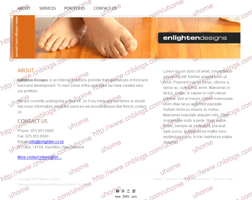
首先需要规划网站,本教程将以下图为例构建网站。
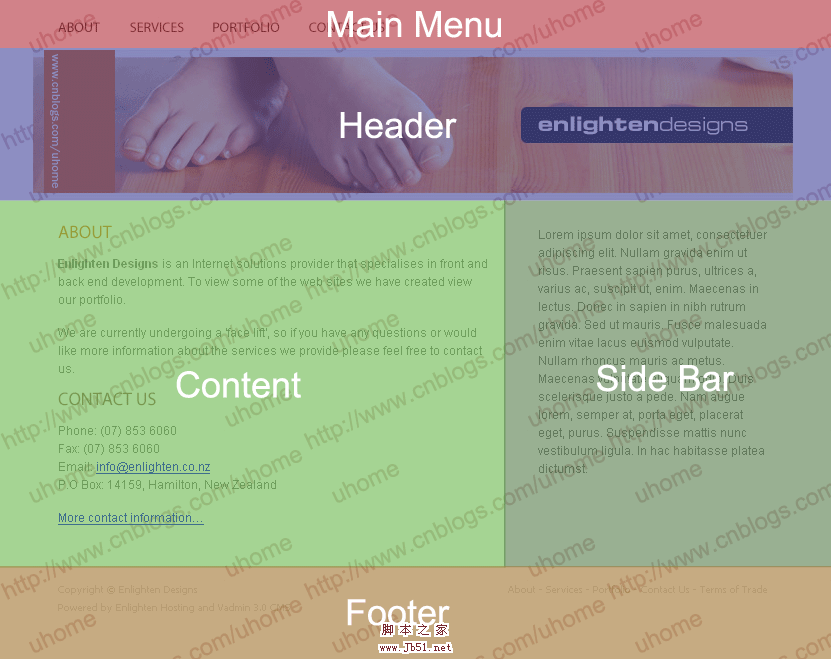
其基本布局见下图:
主要由五个部分构成:
1.Main Navigation 导航条,具有按钮特效。 Width: 760px Height: 50px
2.Header 网站头部图标,包含网站的logo和站名。 Width: 760px Height: 150px
3.Content 网站的主要内容。 Width: 480px Height: Changes depending on content
4.Sidebar 边框,一些附加信息。 Width: 280px Height: Changes depending on
5.Footer 网站底栏,包含版权信息等。 Width: 760px Height: 66px
第二步:创建html模板及文件目录等
1.创建html模板。代码如下:
<!--Example Source Code-->
<!DOCTYPE html PUBLIC "-//W3C//DTD XHTML 1.0 Transitional//EN" "http://www.w3.org/TR/xhtml1/DTD/xhtml1-transitional.dtd">
<html xmlns="http://www.w3.org/1999/xhtml">
<head>
<meta http-equiv="Content-type" content="text/html; charset=UTF-8" />
<title>Div+Css</title>
<meta http-equiv="Content-Language" content="en-us" />
<meta http-equiv="imagetoolbar" content="no" />
<meta name="MSSmartTagsPreventParsing" content="true" />
<meta name="description" content="Description" />
<meta name="keywords" content="Keywords" />
<meta name="author" content="Enlighten Designs" />
<style type="text/css" media="all">@import "css/master.css";</style>
</head>
<body>
</body>
</html>
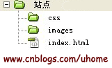
将其保存为index.html,并创建文件夹css,images,网站结构如下:
2.创建网站的大框:
建立一个宽760px的盒子,它将包含网站的所有元素。
在html文件的和之间写入
<!--Example Source Code-->
<div id="page-container">
Hello world.
</div>
创建css文件,命名为master.css,保存在/css/文件夹下。写入:
/*Example Source Code*/
#page-container {
width: 760px;
background: red;
}
控制html的id为page-container的盒子的宽为760px,背景为红色。
现在为了让盒子居中,写入margin: auto;,使css文件为:
/*Example Source Code*/
#page-container {
width: 760px;
margin: auto;
background: red;
}
现在你可以看到盒子和浏览器的顶端有8px宽的空隙。这是由于浏览器的默认的填充和边界造成的。消除这个空隙,就需要在css文件中写入:
/*Example Source Code*/
* {
margin: 0;
padding: 0;
}
第三步:将网站分为五个div,网页基本布局的基础:
1.将“第一步”提到的五个部分都放入盒子中,在html文件中写入:
<!--Example Source Code-->
<div id="page-container">
<div id="main-nav">Main Nav</div>
<div id="header">Header</div>
<div id="sidebar-a">Sidebar A</div>
<div id="content">Content</div>
<div id="footer">Footer</div>
</div>
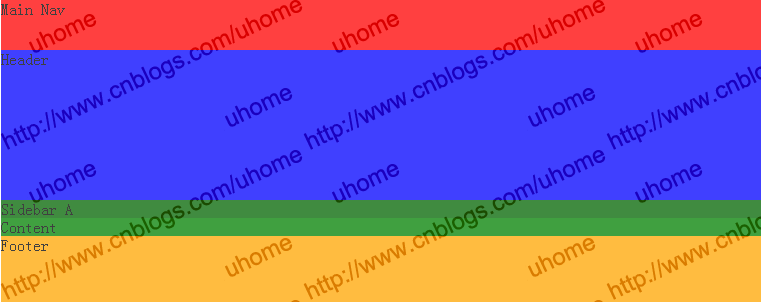
2.为了将五个部分区分开来,我们将这五个部分用不同的背景颜色标示出来,在css文件写入:
/*Example Source Code*/
#main-nav {
background: red;
height: 50px;
}
#header {
background: blue;
height: 150px;
}
#sidebar-a {
background: darkgreen;
}
#content {
background: green;
}
#footer {
background: orange;
height: 66px;
}
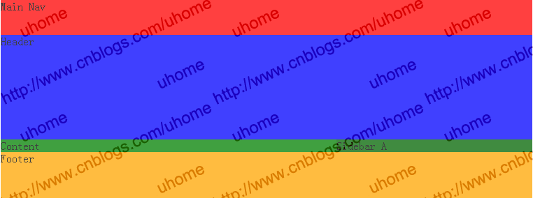
表现如下:
第四步:网页布局与div浮动等1.浮动:首先让边框浮动到主要内容的右边。用css控制浮动。
/*Example Source Code*/
#sidebar-a {
float: right;
width: 280px;
background: darkgreen;
}
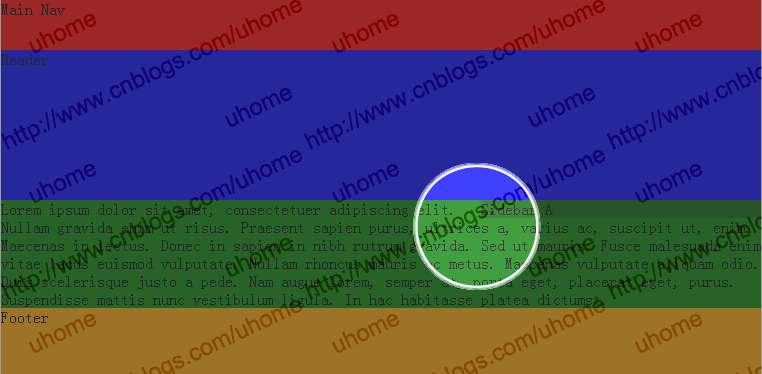
表现如下:
2.往主要内容的盒子中写入一些文字。在html文件中写入:
<!--Example Source Code-->
<div id="content">
Lorem ipsum dolor sit amet, consectetuer adipiscing elit. Nullam gravida enim ut risus.
Praesent sapien purus, ultrices a, varius ac, suscipit ut, enim. Maecenas in lectus.
Donec in sapien in nibh rutrum gravida. Sed ut mauris. Fusce malesuada enim vitae lacus
euismod vulputate. Nullam rhoncus mauris ac metus. Maecenas vulputate aliquam odio.
Duis scelerisque justo a pede. Nam augue lorem, semper at, porta eget, placerat eget,
purus. Suspendisse mattis nunc vestibulum ligula. In hac habitasse platea dictumst.
</div>
但是你可以看到主要内容的盒子占据了整个page-container的宽度,我们需要将#content的右边界设为280px。以使其不和边框发生冲突。css代码如下:
/*Example Source Code*/
#content {
margin-right: 280px;
background: green;
}
同时往边框里写入一些文字。在html文件中写入:
<!--Example Source Code-->
<div id="sidebar-a">
Lorem ipsum dolor sit amet, consectetuer adipiscing elit. Nullam gravida enim ut risus.
Praesent sapien purus, ultrices a, varius ac, suscipit ut, enim. Maecenas in lectus.
Donec in sapien in nibh rutrum gravida. Sed ut mauris. Fusce malesuada enim vitae lacus
euismod vulputate. Nullam rhoncus mauris ac metus. Maecenas vulputate aliquam odio.
Duis scelerisque justo a pede. Nam augue lorem, semper at, porta eget, placerat eget,
purus. Suspendisse mattis nunc vestibulum ligula. In hac habitasse platea dictumst.
</div>
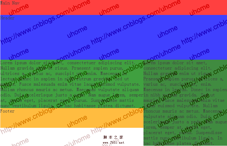
表现如下:
这也不是我们想要的,网站的底框跑到边框的下边去了。这是由于我们将边框向右浮动,由于是浮动,所以可以理解为它位于整个盒子之上的另一层。因此,底框和内容盒子对齐了。
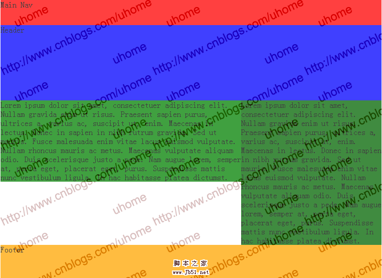
因此我们往css中写入:
/*Example Source Code*/
#footer {
clear: both;
background: orange;
height: 66px;
}
表现如下: