基于CSS的网站导航菜单.
Loodo
A colorful menu that adds to the feel of the website.
Acko.net
Steven Wittens takes a look at the navigation menu from a quite unusual perspective.

Web Design Ledger
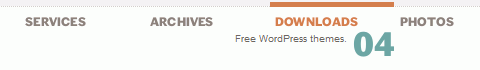
Web Design Ledger has an excellent menu; its large size is convenient but doesn’t intrude on the content.

UX Booth
UX Booth uses a a stylish text box under the navigation as a sort of subtext for each menu item.

Nopokographics
Vertical navigation menus are used very rarely, for the simple reason: they are harder to use. However, some designers risk unusual approaches. Nopoko Graphics uses an arrow and a hover-effect for its vertical navigation menu.

Icon Designer
This website uses a large image-based menu on the home page. The user’s attention is drawn directly to this large menu, making it convenient for users.
Cosmicsoda
This large and colorful menu is very noticeable and uses a slight hover effect to further define the menu items.

Designsensory
An intuitive drop-down navigation that uses 2 colors effectively to communicate the active navigation item and the passive ones.

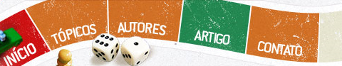
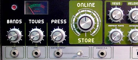
Smallstone
Smallstone, a U.S. record label, presents its navigation menu in the form of a the so-called
Space Echo Roland SE-201.
TNVacation
It’s pretty hard to find a nice-looking drop-down menu. This one is a beautiful exception.

Clearleft
Clearleft uses a couple of paper pieces for its navigation.
#p#
基于CSS的网站导航菜单.
45royale
A simple, clean and beautiful navigation with a nice hover effect.

Design Intellection
An excellent example of block navigation that shows how effectively “speaking” hover effects can be used with a clean and simple navigation menu.
Ronnypries.de
A navigation menu doesn’t have to look like a traditional navigation menu. Ronny Pries uses a floor plan to lead site visitors through the pages of the site.

Jiri Tvrdek
Jiri Tvrdek presents the navigation options of his site as leaves on a tree. Creative, unusual and memorable.

Water’s Edge Media
Patricia Abbott uses clothespins for the navigation options.

Matt Dempsey
Matt Dempsey highlights his navigation options with a brush stroke.

Cognigen
The current navigation option is pressed — clear and intuitive.

District Solutions
Vertical tabs are used very rarely. But they can look good!

Jayme Blackmon
Jayme Blackmon seems to like setting “done”-marks…

Jeff Sarmiento
Why not try a sloping navigation options once in a while?

#p#
基于CSS的网站导航菜单.
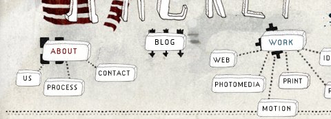
Studioracket
A really unusual navigation menu that uses some kind of a mindmap to illustrate the navigation. And, apart from that, the navigation menu is hand-drawn!
Cultured Code
A subtle yet distinct menu that is out of the way of content. Excellent colors and a nice hover effect also add to the menu.

Nando Designer
This Portuguese designers uses handwriting and a piece of paper for its main navigation.
Bonfiremedia
Sometimes typography is just enough…

Artgeex
Vivid typography in use.

Gloobs
Some designers integrate a stamp in the contact navigation option.

South Creative
This website uses large navigation buttons and has a good hover effect.

Mac Rabbit
One more example of a large and clean menu. This one uses icons to aid the reader in recognizing each item’s function.

RapidWeaver
This menu has a clean and smooth layout, and it has a great sub-menu that uses transparency to separate it from the main menu.

DFW UPA
Icons reinforce the menu items on this website and add emphasis to each option.

Revolution Driving Tuition
This website has a great grunge style, and the menu fits right into the layout.

Duarte Pires
This menu is located close to the content, where it is easy to use. It uses large icons, which adds a visual element to the navigation. Also, the menu on other pages uses the same icons in a vertical layout, bringing consistency to the website. The icons may not fit perfectly, but it’s a nice idea.

Valetin Agachi
This navigation has a rather unique style that emphasizes selected items. Also, the menu layout stays consistent throughout the whole website.

Tutorial9
Tutorial9 recently got a nice redesign, which came with a very usable and well-organized menu.


