在以前我们的工作中,以传统切图思想进行操作,讲究精细,图片规格越小越好,重量越小越好,其实规格大小无所谓,计算机统一都按Byte计算。
客户端每显示一张图片都会向服务器发送请求,所以,图片越多请求次数越多,造成延迟的可能性也就越大。因为一张图片的传输时间,通常远小于请求等待的时间。
典型如文本编辑器,小图标特别多,打开时一张张跑出来,给用户的感觉很不好。如果能用一张图解决,则不会有这个问题,比如百度空间、163博客、Gmail都是这么做的,jb51.net也提倡这样的操作方法。
 CSS Sprites: Image Slicing’s Kiss of Death
Back when video games were still fun (we’re talking about the 8-bit glory days here), graphics were a much simpler matter by necessity. Bitmapped 2-dimensional character data and background scenery was individually drawn, much like today’s resurgent pixel art. Hundreds and later thousands of small graphics called sprites were the building blocks for all things visual in a game.
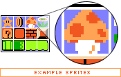
As game complexity increased, techniques developed to manage the multitude of sprites while keeping game play flowing. One variation saw sprites being plugged into a master grid, then later pulled out as needed by code that mapped positions of each individual graphic, and selectively painted them on the screen.
And what does this have to do with the web?
Everything old is new again, and though the rise of 3D games has made sprite maps obsolete, the concurrent rise of mobile devices with 2D gaming capabilities have brought them back into vogue. And now, with a bit of math and a lot of CSS, we’re going to take the basic concept and apply it to the world of web design.
Specifically, we’re going to replace old-school image slicing and dicing (and the necessary JavaScript) with a CSS solution. And because of the way CSS works, we’re going to take it further: by building a grid of images and devising a way to get each individual cell out of the grid, we can store all buttons/navigation items/whatever we wish in a single master image file, along with the associated “before” and “after” link states.
How do CSS Sprites work?
As it turns out, the basic tools to do this are built into CSS, given a bit of creative thinking.
Let’s start with the master image itself. Dividing a rectangle into four items, you’ll observe in this master image that our intended “before" link images are on the top row, with “after" :hover states immediately below. There’s no clear division between the four links at the moment, so imagine that each piece of text is a link for now. (For the sake of simplicity, we’ll continue to refer to link images as “before” images and the :hover state as “after” for the rest of this article. It’s possible to extend this method to :active, :focus, and :visited links states as well, but we won’t go into that here.)
Those familiar with Petr Stanicek’s (Pixy) Fast Rollovers may already see where we’re going with this. This article owes a debt of gratitude to Pixy’s example for the basic function we’ll be relying on. But let’s not get ahead of ourselves.
On to the HTML. Every good CSS trick strives to add a layer of visuals on top of a clean block of code, and this technique is no exception:
<ul id="skyline">
<li id="panel1b"><a href="#1"></a></li>
<li id="panel2b"><a href="#2"></a></li>
<li id="panel3b"><a href="#3"></a></li>
<li id="panel4b"><a href="#4"></a></li>
</ul>
This code will serve as a base for our example. Light-weight, simple markup that degrades well in older and CSS-disabled browsers is all the rage, and it’s a trend that’s good for the industry. It’s a great ideal to shoot for. (We’ll ignore any text inside the links for the time being. Apply your favorite image replacement technique later to hide the text you’ll end up adding.)
Applying the CSS
With those basic building blocks, it’s time to build the CSS. A quick note before we start — because of an IE glitch, we’ll be tiling the after image on top of the before image when we need it, instead of replacing one with the other. The result makes no real visual difference if we line them up precisely, but this method avoids what otherwise would be an obvious “flicker” effect that we don’t want.
#skyline {
width: 400px; height: 200px;
background: url(test-3.jpg);
margin: 10px auto; padding: 0;
position: relative;}
#skyline li {
margin: 0; padding: 0; list-style: none;
position: absolute; top: 0;}
#skyline li, #skyline a {
height: 200px; display: block;}
Counter-intuitively, we’re not assigning the before image to the links at all, it’s applied to the <ul> instead. You’ll see why in a moment.
The rest of the CSS in the above example sets things like the dimensions of the #skyline block and the list items, starting positions for the list items, and it turns off the unwanted list bullets.
We’ll be leaving the links themselves as empty, transparent blocks (though with specific dimensions) to trigger the link activity, and position them using the containing <li>s. If we were to position the links themselves and effectively ignore the <li>s, we’d start seeing errors in older browsers, so let’s avoid this.
Positioning the links
The <li>s are absolutely positioned, so why aren’t they at the top of the browser window? A quirky but useful property of positioned elements is that all descendent elements contained within them base their absolute position not off the corners of the browser window, but off the corners of the nearest positioned ancestor element.The upshot of this is that since we applied position: relative; to #skyline, we’re able to absolutely position the <li>s from the top left corner of #skyline itself.
#panel1b {left: 0; width: 95px;}
#panel2b {left: 96px; width: 75px;}
#panel3b {left: 172px; width: 110px;}
#panel4b {left: 283px; width: 117px;}
So #panel1 isn’t horizontally positioned at all, #panel2b is positioned 96px to the left of #skyline’s left edge, and so on. We assigned the links a display: block; value and the same height as the <li>s in the past listing, so they’ll end up filling their containing <li>s, which is exactly what we want.
At this point we have a basic image map with links, but no :hover states. See the example. It’s probably easier to see what’s happening with borders turned on.
Hovers
In the past we would have applied some JavaScript to swap in a new image for the after state. Instead our after states are in one image, so all we need is a way to selectively pull each state out for the appropriate link.
If we apply the master image to the :hover state without additional values, we make only the top left corner visible — not what we want, though clipped by the link area, which is what we want. We need to move the position of the image somehow.
We’re dealing with known pixel values; a little bit of math should enable us to offset that background image enough both vertically and horizontally so that only the piece containing the after state shows.
That’s exactly what we’ll do:
#panel1b a:hover {
background: transparent url(test-3.jpg)
0 -200px no-repeat;}
#panel2b a:hover {
background: transparent url(test-3.jpg)
-96px -200px no-repeat;}
#panel3b a:hover {
background: transparent url(test-3.jpg)
-172px -200px no-repeat;}
#panel4b a:hover {
background: transparent url(test-3.jpg)
-283px -200px no-repeat;}
Where did we get those pixel values? Let’s break it down: the first value is of course the horizontal offset (from the left edge), and the second is the vertical.
Each vertical value is equal; since the master image is 400 pixels high and the after states sit in the bottom half, we’ve simply divided the height. Shifting the whole background image up by 200px requires us to apply the value as a negative number. Think of the top edge of the link as the starting point, or 0. To position the background image 200 pixels above this point, it makes sense to move the starting point -200px.
Likewise, if the left edge of each link is effectively 0, we’ll need to offset the background image horizontally by the width of all <li>s prior to the one we’re working with. So the first link doesn’t require an offset, since there are no pixels before its horizontal starting point. The second link requires an offset the width of the first, the third link requires an offset of the combined width of the first two links, and the last requires an offset of the combined width of all three previous links.
It’s a bit cumbersome to explain the process, but playing around with the values will quickly show you how the offsets work, and once you’re familiar it’s not all that hard to do.
So there you have it. Single-image CSS rollovers, degradable to a simple unordered list.


